La Senza, a Canadian lingerie brand, was founded by Irving Teitelbaum and Laurence Lewin. Established in Quebec, the brand specializes in lingerie and intimate apparel, targeting a demographic of young women. Known for its fashionable and affordably priced products, La Senza emphasizes a blend of style, comfort, and allure in its designs. It stands out for offering a diverse range of sizes and styles, catering to various body types and personal preferences in intimate wear.
Meaning and history
La Senza, a Canadian lingerie brand, was founded in 1990. It quickly became a prominent player in the intimate apparel market. Its success stemmed from offering high-quality, fashion-forward lingerie at affordable prices, appealing to a wide customer base.
By the late 1990s, La Senza expanded internationally, opening stores in various countries. However, this rapid growth led to financial challenges, and in 2007, Limited Brands (now L Brands), the parent company of Victoria’s Secret, acquired La Senza. This acquisition aimed to strengthen its market presence and streamline operations.
Despite the takeover, La Senza faced stiff competition and changing market trends, leading to fluctuating performance. In 2019, Regent, a private equity firm, bought La Senza from L Brands. Regent’s acquisition marked a new chapter, focusing on revitalizing the brand and enhancing its global appeal.
Throughout its journey, La Senza has remained dedicated to empowering women through a diverse range of lingerie, constantly adapting to evolving fashion and consumer preferences.
What is La Senza?
La Senza is a Canadian retailer specializing in lingerie and intimate apparel, known for its stylish and affordable range that caters to diverse tastes and preferences. Established in 1990, the brand has evolved over the years, expanding its global footprint while maintaining a focus on empowering women through its fashionable and inclusive product offerings.
Old
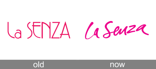
The logo presents a bold, magenta script, blending playfulness with sophistication. “la” is in lowercase, whimsically tilted, offering a casual flair. The uppercase “SENZA” follows, asserting confidence with its strong, straight lines and uniformity. This contrast in style highlights a blend of approachability and authority, while the vibrant color suggests a brand that’s both energetic and chic. The simplicity of the design ensures memorability and reflects a modern, fashion-conscious identity.
Today
The logo features a whimsical, cursive script with a vivacious hot pink hue, conveying a sense of youthful energy and playful femininity. The typography curves gracefully, suggesting elegance and movement, while the bold color choice speaks to confidence and a spirited brand personality. The lack of additional embellishments or icons keeps the focus purely on the brand name, ensuring immediate recognition and a clean, modern aesthetic.


