 When you describe a graph, your essay should consist of 3 parts: introduction, overview (summary) and the main part. The conclusion is not necessary in this piece of writing.
Introduction is the easiest part: just paraphrase the question of the task (don’t copy!!!, but paraphrase, that is write the same thing with your own words).
For example, your task is: The chart below shows the proportion of the employment in the tourism sector .
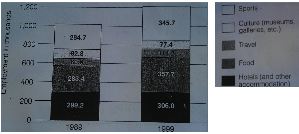
In your introduction you should write: The bar chart demonstrates the number of people employed in different tourism-related areas. (it’s the same idea but different words)
The overview is very important, because it will get you up to band 5. If you write a good overview and don’t write anything else, you will get band 5! See how important it is. Of course, if you need a higher a band, you should work on the rest of your essay as well.
Here is the strategy for the overview: Right after the introduction, write one or two sentences to show the relationship between the data or to comment on the main trend (OVERVIEW! NO DETAILS!!!). It must show a general trend, not just a fact. This sentence (or two sentences) must describe the main change in the range of the given period. You must demonstrate that you understand how this two (or more) graphs are related.
Look at the sentences below:
- On the left of the graph are employment figures, and on the bottom are the years 1989 and 1999. (this is not an overview. It doesn’t describe a trend, doesn’t show the relationship between the two charts, but just states a fact).
- The graph shows people who worked in tourism in 1989 and 1999 (this is not an overview. This sentence is too general and could be suitable for the introduction, and again it doesn’t describe a trend).
- The biggest industry in 1989 was hotels, which employed 299.2 thousand people (this is not an overview. This sentences describes a particular fact. It is suitable for the main part of the essay, when you compare different trends).
- From 1989 to 1999 there was a significant increase in the number of people employed in tourism-related industries. (this is a good overview, because it describes the dominant trend. This sentence shows the main development in this chart).
