Hey folks. I had deadlines to smash through the past couple of weeks and it meant I didn't have like an hour to spare to type up my thoughts on cool drawings for one of these posts last week, so this week you get a double helping. I apologize in advance for the long post, but I have 10 pieces picked out and I could've gone like 15, honestly, but it's always a little more work than I anticipate to pull together coherent thoughts.
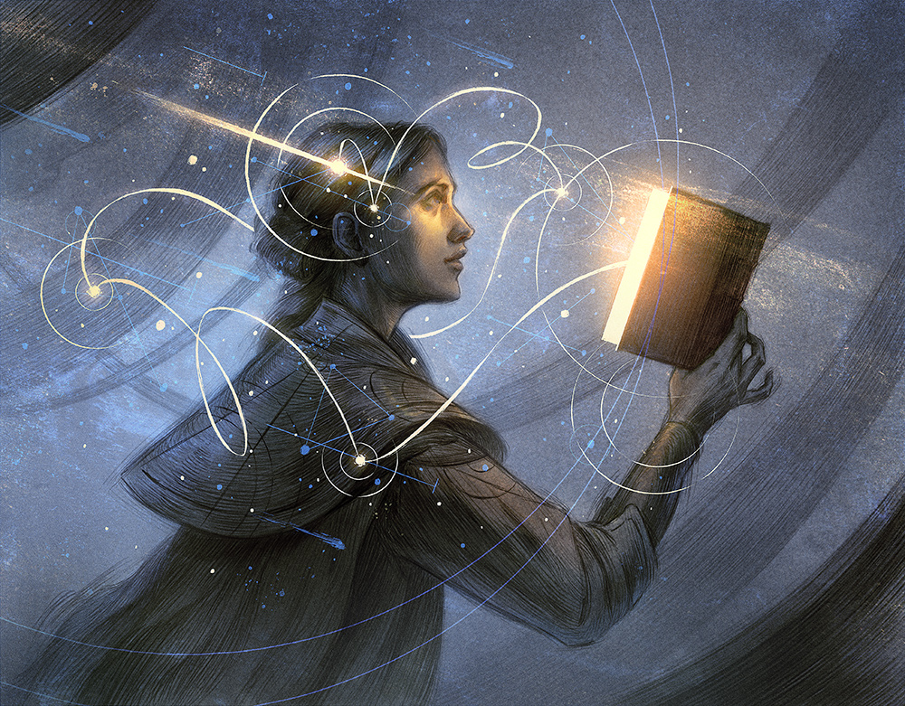
Magic the Gathering has, in the last few years, been (finally) expanding their roster to include illustrators who do not subscribe to their house style and the result has been that we get to see pieces from illustrators like the Hugo-award winning Rovina Cai, whose work I would describe as being flowing, graphite lines in grey and gold forming a really Janine-Hawkins-core aesthetic of gothic/Victorian surreal horror. Every one of those lines is really meticulously placed, there's very little overlap between them and it gives her pieces such an incredible sense of movement and flow. I really recommend looking at more of Rovina's work because it is all incredible.
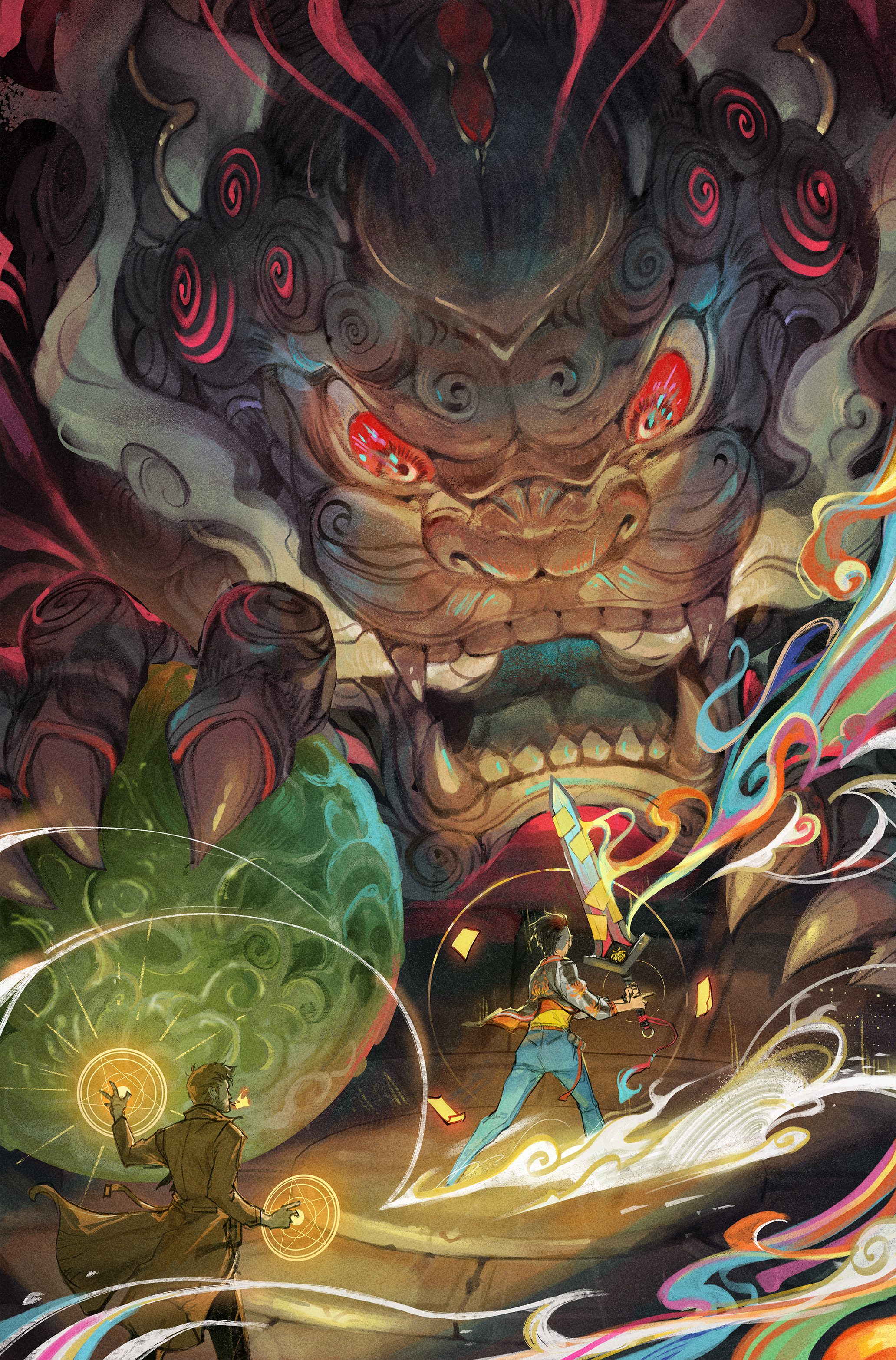
Jessica Fong has been doing comic covers for a couple of years now and they are consistently so high quality, but this was a particular standout to me. Her work is always dynamic, vibrant and texturally rich. This is a piece about circles and spirals, all over the place. Repeated shapes that tie the whole thing together despite its eclectic palette. I love the little touches of blue in the grey stone of the creature's body that help the whole thing pop and become instantly more readable at a glance in spite of its complexity.
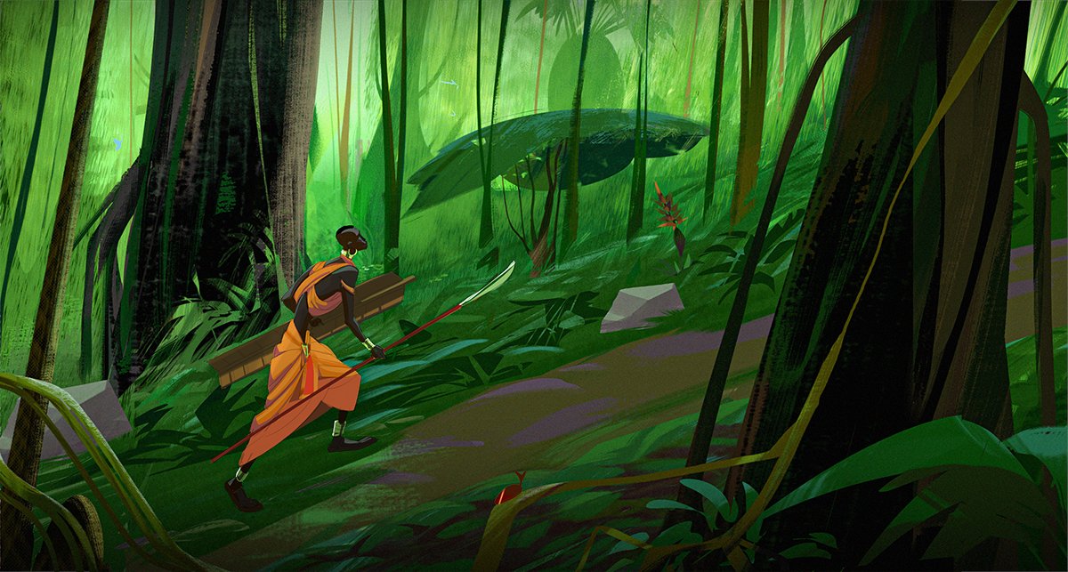
Manny is an artist whose work I found when looking for inspiration on a project I was art directing in early 2021. He is young and very talented at storyboarding, vis dev, character design. If I was tasked with building a team for that, Manny would be among my first choices. Obvious notes on this piece for the great colour choices to make the figure pop. More subtly, there are singluar small touches of red and orange in the environment that functionally help the figure not feel totally divorced from their surroundings. Incredible use of brush texture and simple blocking to create a feeling of density without losing the clean readability of these large shapes.

Tran Nguyen is a multi-gold medal Spectrum fantasy illustration-winner and its easy to see why. She works in pencil crayon and acrylics, and it comes through in the texture of her colours. I love this collage for a few aspects: how simple the blocking is on the woman in the headdress, how intertwined the tiger and the woman with the sword are and the reflected shapes of the snake and the smoke. The smoke here is fulfilling a hugely important contrast roll, by being both the most high-value colour by a lot and also being one of the only instances of a cool colour, temperature-wise in the whole thing. Without it the piece would work, but it really helps the eye move around the different aspects of this image montage.
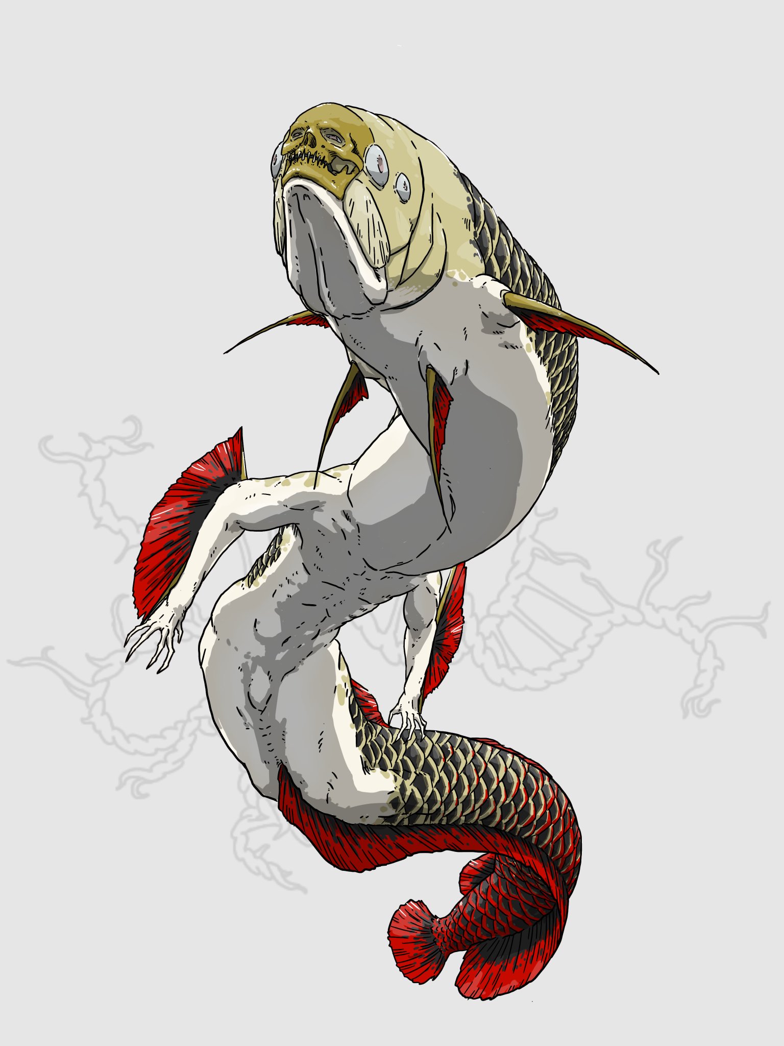
I love a good riff on mermaids and this is one of the coolest I've seen in a minute. More mermaids with actual fish heads, please. More mermaids that look like they actually swim well. Terrifying design. Five Stars.
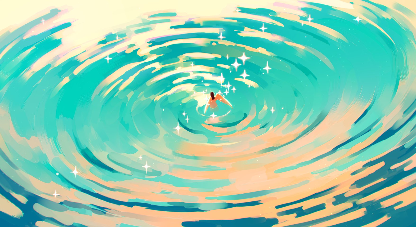
If you read my piece about Amei Zhao then my enjoyment of this piece probably comes as no surprise to you. Jauni is beautifully using that combination of pastels hues, the movement of water and the way light blooms off of it to shoot a bullseye directly at the kind of work I love. Compositionally, just look at the way the whole thing is arranged to go from the bottom left to top right. Each band of colour and even the sparkles are supporting this particular read.
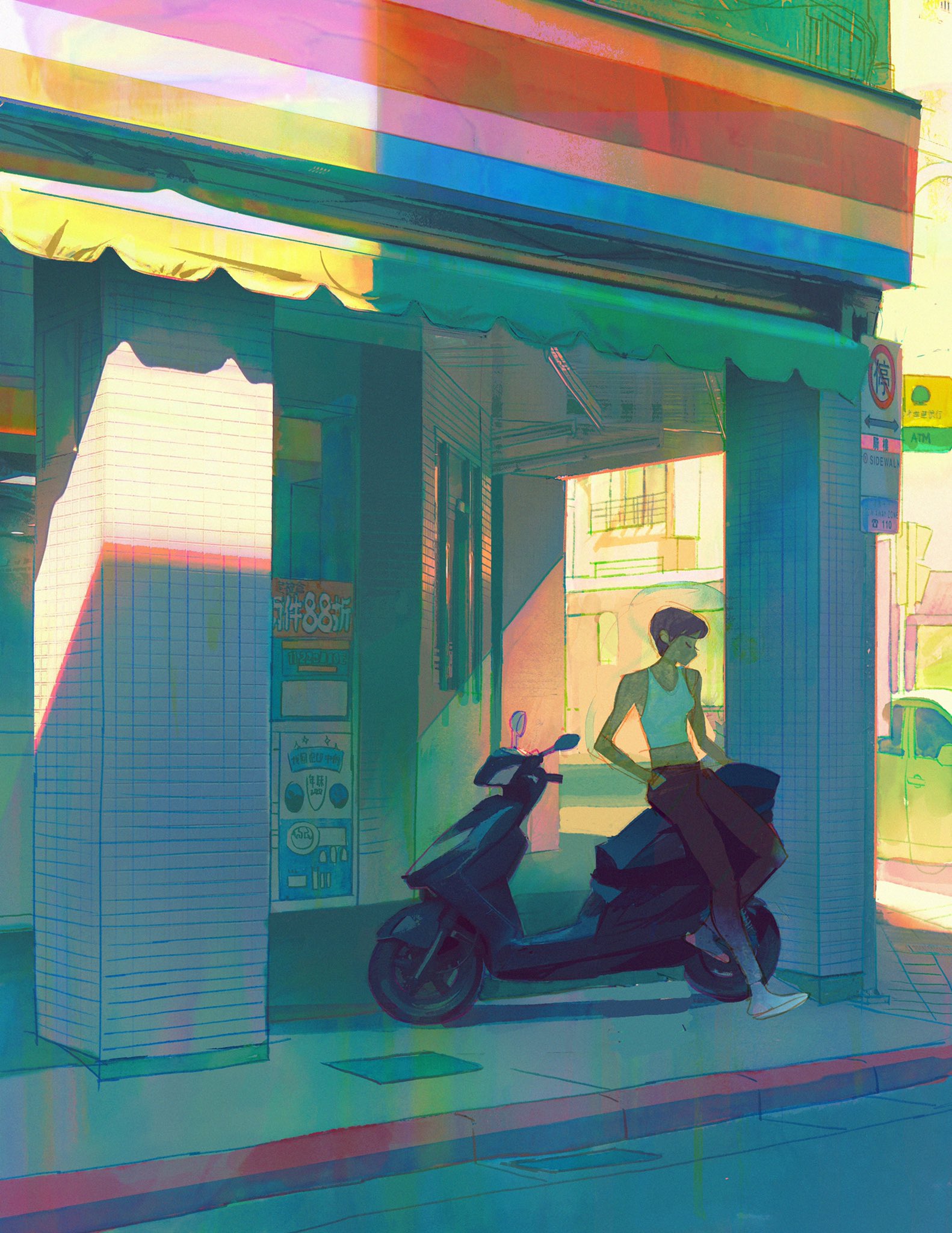
This is a great example of how a relatively simple line drawing supported by great colour and lighting can be really elevated. Kat's lighting is incredible here. There is so much light bouncing off of surfaces in the light and splashing colour into areas of shadow. There's great attention to keeping the shadowed areas relatively low contrast to let the light areas really shine and help silhouette our main figure (note how much darker the scooter is than everything else in the image). I also want to shout out the vertical brushstroke texture on this whole thing that is giving this texture and colour aberration over the whole piece. I watched video of Kat creating this Kat approaches this whole thing like watercolour, just layering transparent layers over the whole thing and it really shows in the vibrance and depth of colour, throughout. I am deeply jealous of the mastery colour and light in this piece.
Welcome to the Mech Zone of my Mutuals whose work I really like
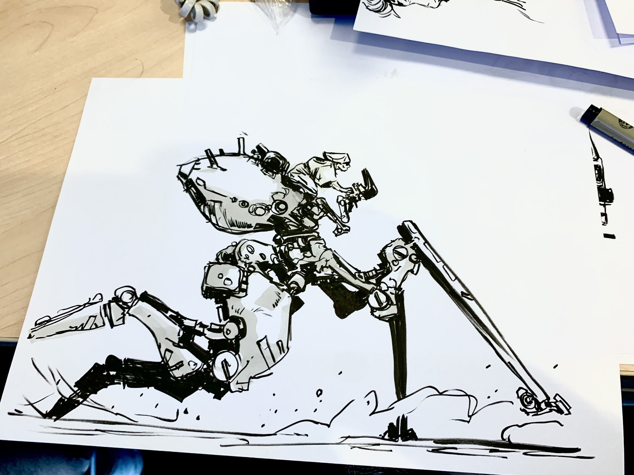
Utopie's marker sketches are wonderful. There's a lot of siplified details that work really well to kind of let your brain fill in the complexity in the shadows. I love the structure of this runner, and the sketch has a gestural quality that really helps you picture this in motion.
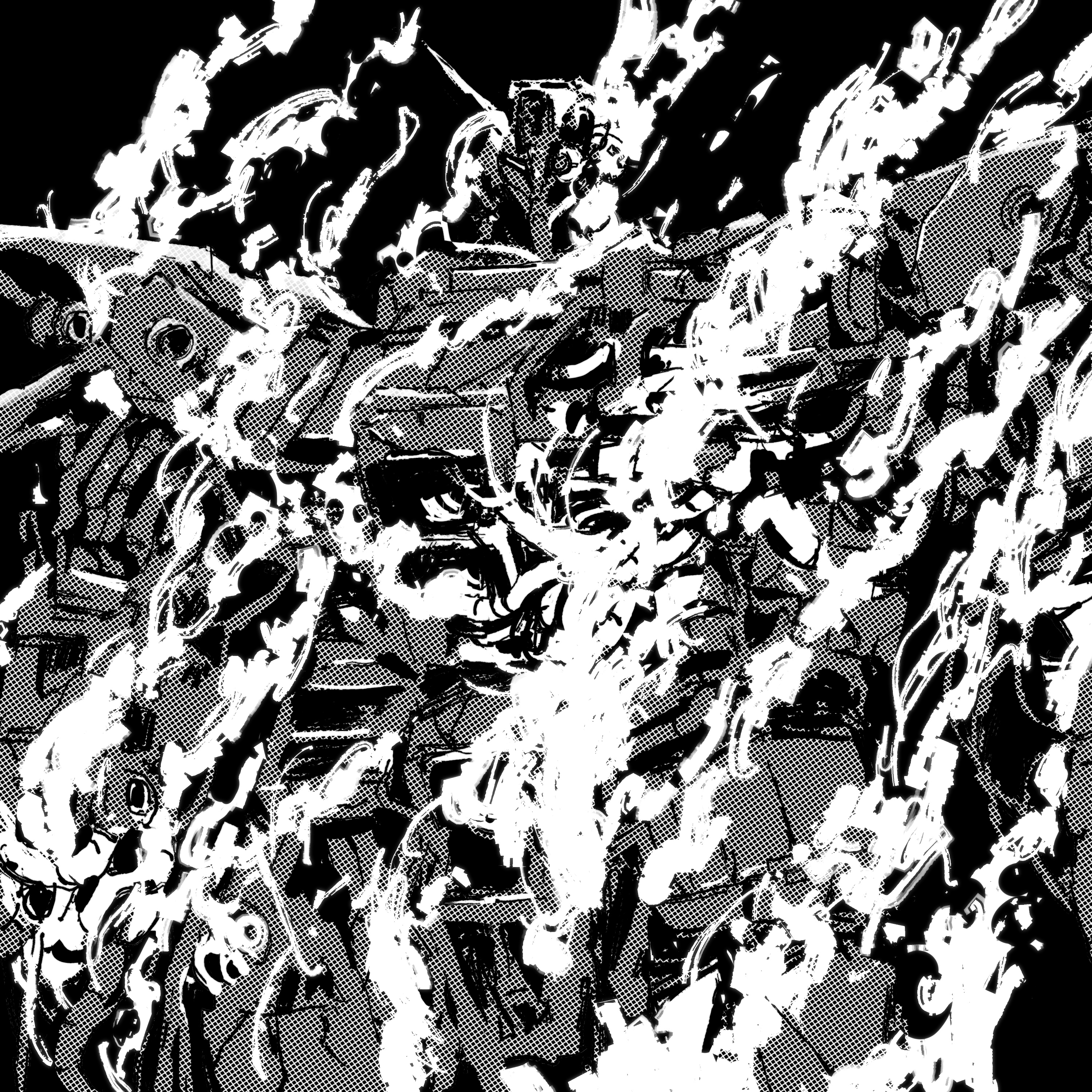
Gryme has been improving their mechs over the last few months a ton. I really like this rendering of the Psycho Gundam Mk II in particular. The messy textural white brushstrokes obfuscate the mech in such a way that feels like it just landed, generating a huge cloud of smoke, and that smoke is just now clearing, revealing its terrifying visage. I think it does an excellent job really selling how existentially scary this thing is in the context of Zeta and ZZ.
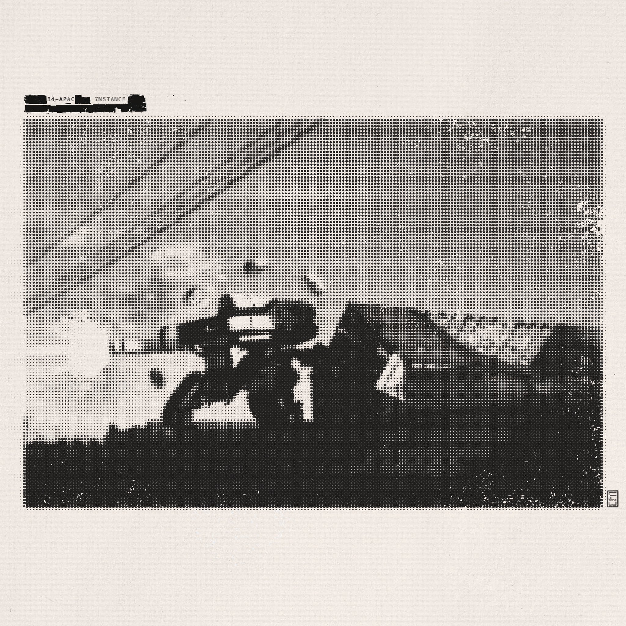
I am constantly amazed by Conner's style experiments, and his latest one is incredible at generating photorealistic mechs rendering in highly artifacted style as though you have taken a photograph of a CRT monitor. Conner's work is not just impressive because they have a great design sense and ability to execute on a technical level, but also because of the attention to detail given to presentation. The paper texture, the damage to the photo, the damage to the lettering and the imperfections of the marker redacting the text all work in service of creating this mode where you feel not like you're looking at a digital illustration but at a scan of a found document yellowing in a file of some bureaucracy.