By Design: The Art of Jim Steranko
So I’ve been doing some thinking recently about Jim Steranko.

With only a handful of comics stories to his credit, most of them done 50 years ago, he’s cast a long shadow on funnybook art, spawning imitators even today. And that’s not because he’s one of the all-time great illustrators. His linework isn’t masterful, his storytelling’s not always crystal clear, his figures are kind of stiff, his anatomy’s often wrong…

click to embiggen
…but you don’t care so much because what he surrounds it with is so eye-popping and great. Still, taken from a classical illustration perspective… He’s a mess. Which is not to say that he’s not capable of illustrative flourishes. Here’s a piece with tons of fine detail, where he seems to be channeling Bernie Wrightson and Gene Colan simultaneously:

But that’s not his forte. No, what makes Steranko so great is his sense of design. He understands layout, composition, and color to a degree that not many funnybook artists achieve. Check out this three-panel sequence depicting a car race:
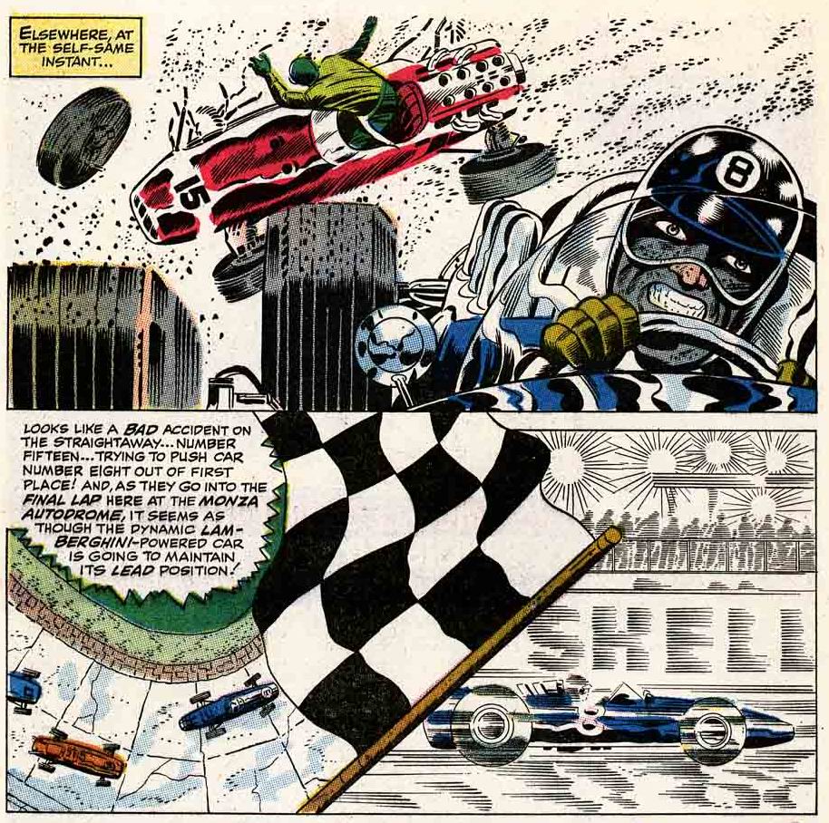
It’s eye-catching stuff, unafraid of white space, and using it to great effect. But look at the face on that driver in panel one! The concentration! The gritted teeth! The intense, eye-bugging fear as another car just goes tipping crazily through the air behind him! Then the checkered flag to signal the winner, off-set on one side by a very still, stagey line of cars, and on the other side by sheer raw speed! Damn! That’s good stuff! A dynamic sequence capturing the FEEL of the race more effectively than a more realistic depiction might be capable of.
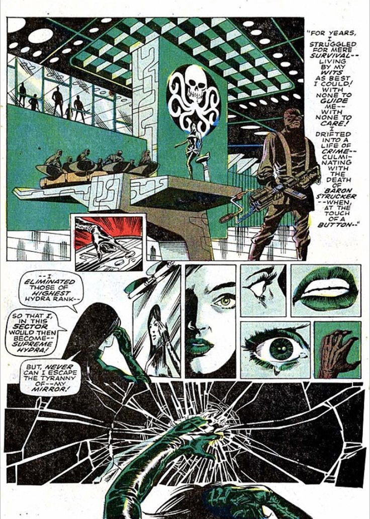
He was also fond of using tiny close-up images to get a point across, such as on this page, where he employs a cluster of four small panels to get across the Viper’s horror at her own scarred face:
Then there’s this, the first page of Steranko art I ever saw:

That’s the splash page to Captain America #111, a comic that belonged to my older brother, who’d gotten it very young and promptly read the cover off it. So for me, that WAS the cover to that issue. And it captured my imagination so greatly that I’d often sneak peeks at it from his shelf when he wasn’t looking. And what greeted my eyes when I got a few pages in?


GUH.
That’s heavy stuff when you’re a kid. But I would stare at those pages for hours, fascinated and wanting more. It took me a while to get it, though. By the time I discovered him, Steranko had mostly moved on from comics. It wasn’t until they reprinted his Cap stories in the 80s that I discovered he had done Nick Fury, as well. And, hoo boy, did he ever go batshit on that book, with even more blatant surrealism…
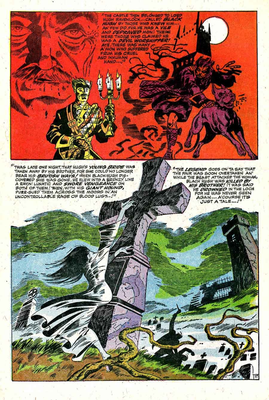
…striking horror imagery…
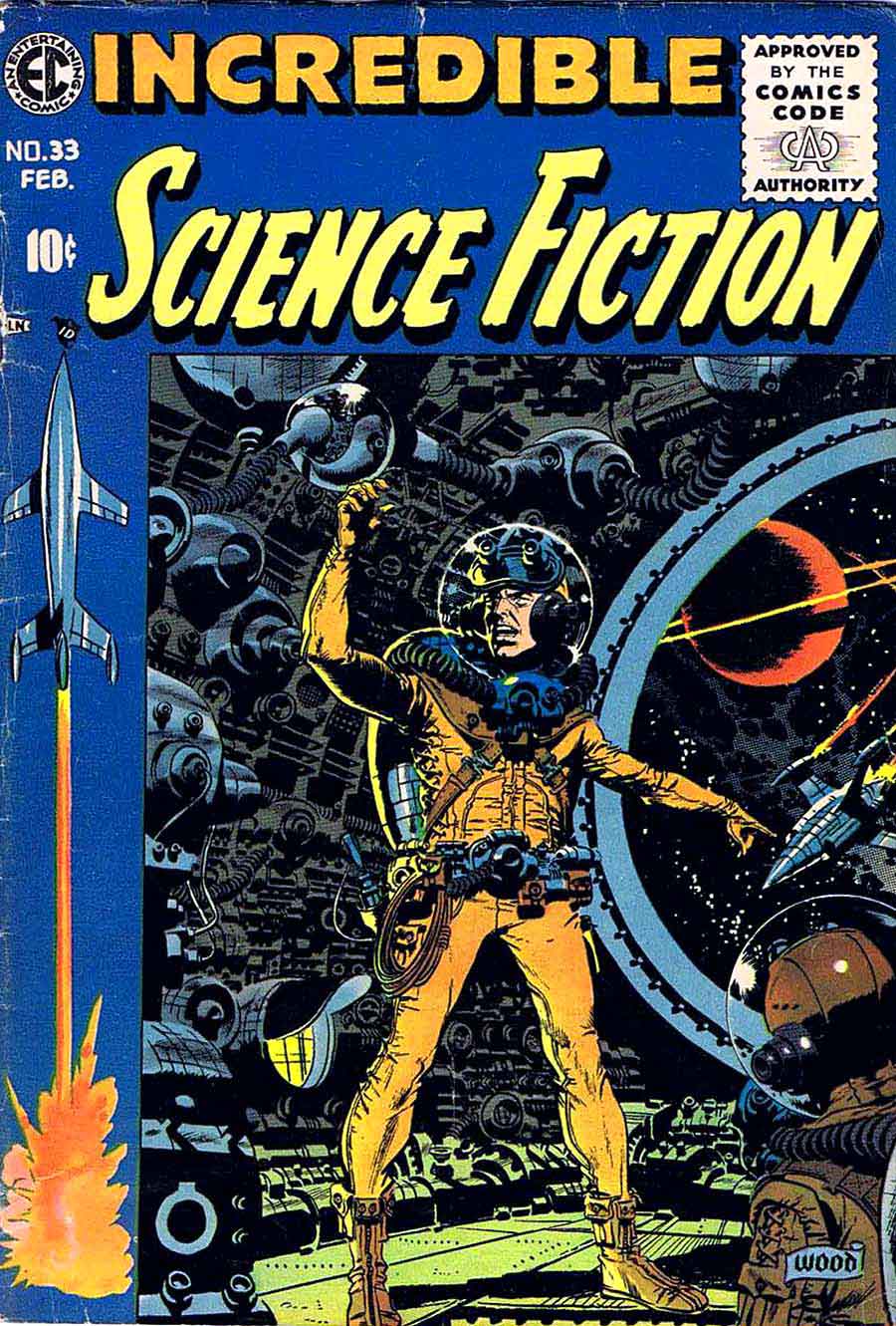
…and strangely affecting sci-fi designs…
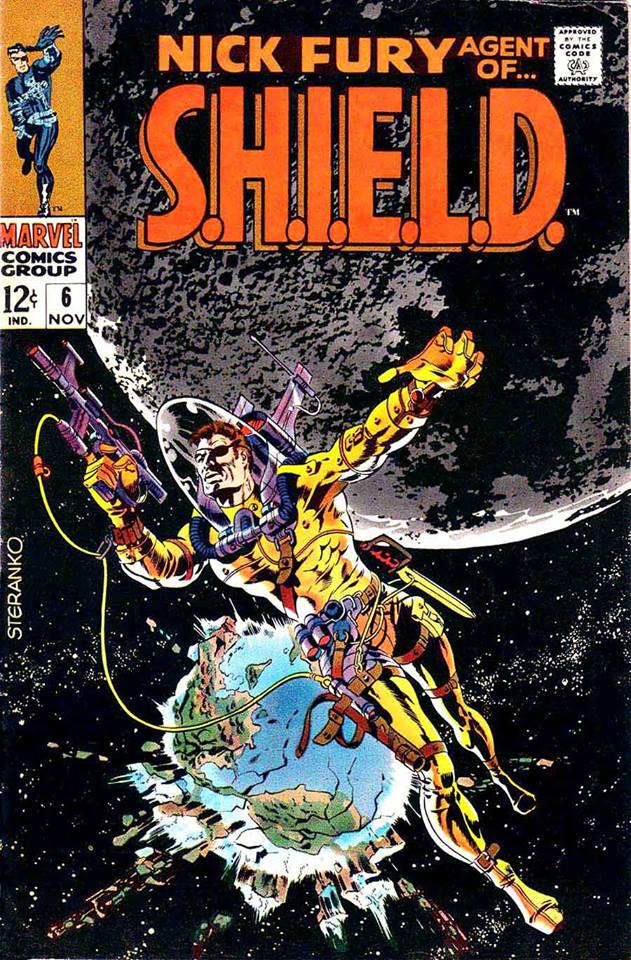
…that I only realized later he was mostly cribbing from Wally Wood:
Steranko was nothing if not an earnest imitator, though. He followed Jack Kirby on the Nick Fury strip, and his early issues channeled the King like nobody’s business.

He did it really well, though, understanding Kirby’s wild inventiveness better than most, and using it to fill the page with some of the most insane action spreads in comics history.
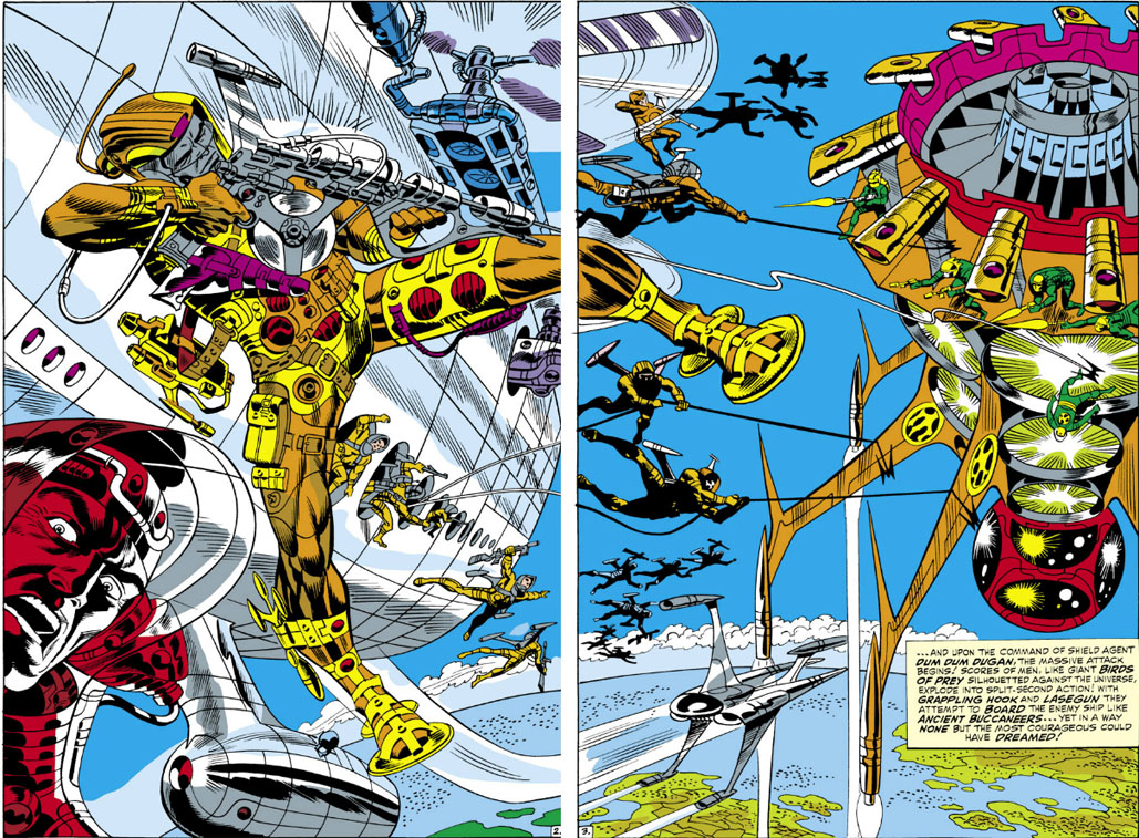
The most famous of those is probably this one, a massive four-page action spread featuring the entire cast of SHIELD agents facing off against the forces of the Yellow Claw! I’ve left this one extra-big for you, too. So click on that sumbitch, and just scroll around to check out all the action going on:
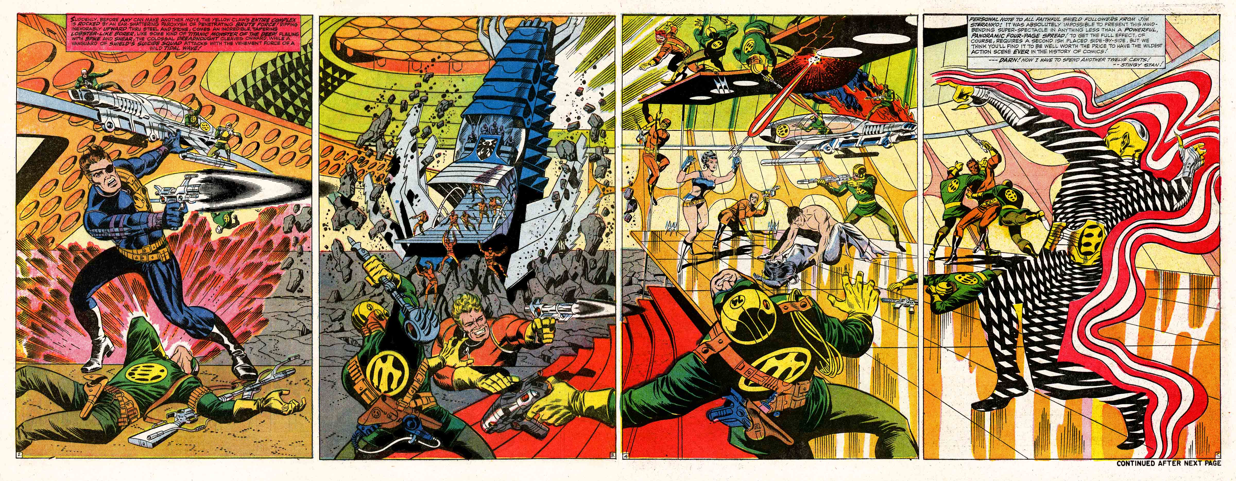
One detail to note, in particular, is Steranko’s use of Op Art effects, most noticeably on the Claw himself. Along with the surrealism, this is what his 1960s work is most noted for. There’s lots of it in that first cover image up above, but as you can see here, he also used it as a storytelling special effect, usually to depict strange energy fields. Like this one, from the Scorpio storyline:

But this one’s always struck my fancy, too, just for the graininess of it:

Then there’s… whatever the hell’s going on here:
click to embiggen
After he left the grind of monthly comics, Steranko moved on to a number of different projects. Painted covers for paperback novels, movie production art (he famously designed the look for Indiana Jones), and even a cheesecake calendar featuring bare-breasted women dressed as familiar funnybook heroes. He also published a history of comics, an art portfolio or two, and a magazine about comics called Comixscene. He never quite left visual storytelling behind, though. He applied his considerable skill with stark chiaroscuro to produce Red Tide, a noir detective story told in full-page splash images.
He took that full-splash storytelling idea further with an adaptation of the Sean Connery sci-fi movie Outland, published in Heavy Metal. It’s an interesting experiment, mixing text narration and word balloons with illustrations, using a variety of visual methods to break the action up, only sometimes resorting to traditional panel borders. It’s gorgeous to look at, at the very least. And I’d recommend reading it over actually watching the movie.
click to embiggen
He used the same techniques for a back-up strip in the 400th issue of Superman, a generations-spanning epic telling the story of Superman’s descendants going into the far future. It’s kinda nutty, and I don’t think I entirely got it when it was originally published.

But, much like my first Steranko comic, it’s one of those stories I’ve never forgotten. Which is as good a description of Steranko’s career as any, I suppose: Once you see him, you’re not likely to forget him.
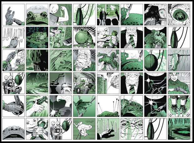
The same holds true for the most recent Steranko story I’ve run across, called “Frogs.” This one’s sort of the opposite of those full-spread stories. Though it’s also a two-page spread, it’s broken up into a tight grid of small panels. Steranko says that it can be read in any direction. Forwards, backwards, horizontally, vertically, even in a spiral. And I suppose he’s right about that. I do have a favorite reading order for it, but I’ll keep that to myself, and let you decide on your own…

My first exposure to the artistic genius of Steranko is a reprint of Captain America#113. It was one of the those audio books they put out in late ’89 and 90. So for a couple bucks, you could read along with cassette tape narrating the whole thing. To this day, 1). I still have that Cap issue tape and 2). Whenever I see any of the panels from that issue, I hear it in the voice of the actors who voiced those roles.
To say that a guy like Steranko was ahead of his time, is a cliché, albeit a true one, because he really was. Even Stan Lee admits it.
It’s just too bad he never allowed himself to work a monthly in a consistent basis like his peers did. Nonetheless he influenced countless generations, and how could he not when you see examples of his op art.
Plus he inspired Kirby’s Mister Miracle based off his work as an escape artist.
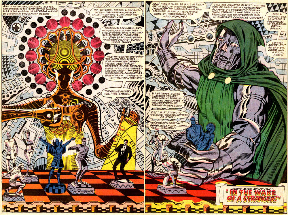
Also, and maybe I’m wrong, but I do believe Grant Morrison and Jae Lee do an homage to that Dr. Doom panel you posted.
I don’t know if you ever read Morrison’s only FF work (a damn shame in and off itself) the Marvel Knights mini, FF: 1,2,3,4, but there’s a couple scenes with Reed locked in his room by Doom, talking about chess. And all throughout the mini-series, Doom takes each member of the FF off his chess board. Good stuff, that does not get a lot of love these days.
LikeLiked by 1 person
Yeah, I’ve definitely read 1234. Keep meaning to revisit it, actually, because I remember thinking there was something lacking in it at the time. But I suspect I’ll like it better now. Really need to find out soon.
I didn’t know they’d done a book and record (well, book and TAPE) for that Steranko Cap issue. I might have to track a copy of that down…
LikeLike
You definitely should on both accounts, although your enjoyment may vary on that audio book. I didn’t mind it as a kid, but as an adult…it’s kinda’ cringe-worthy. Idk. maybe it’s just me.
There was a Spider-Man one, which at the time was more recent since it had Todd McFarlane art in it. I think it was AMZ#303.
Here’s a link to the 3 Spider-Man issues they did:
https://comicbookrealm.com/series/36790/0/the-amazing-spider-man-book-and-cassette-set-mini
There’s at least 3 Cap ones too. I had the Steranko issue and then there was Cap#326, “The Haunting of Skull House” and a reprint of Cap#255.
https://www.mycomicshop.com/search?TID=23478979
LikeLike