
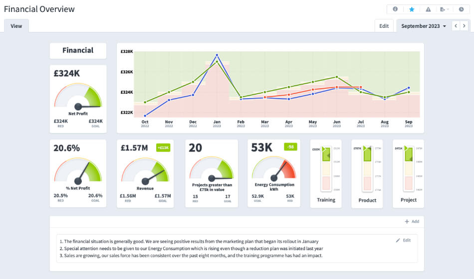
Data stands as a cornerstone of informed decision-making. However, raw data’s sheer volume and intricacies can make it an unwieldy asset. The solution? Effective visualization. Transforming complex datasets into organized visuals allows businesses to grasp essential insights swiftly. A KPI Dashboard, in this context, serves as an invaluable instrument. Like a vehicle’s dashboard providing crucial information to the driver, a well-designed business dashboard offers a consolidated view of performance metrics, enabling leaders to navigate their organization’s trajectory with precision. This article aims to elucidate the principles behind successful dashboards and the art of data visualization. Through a comprehensive exploration, we will underscore the characteristics that elevate a dashboard from merely functional to genuinely impactful. As we progress, you’ll better appreciate the transformative power of adeptly visualized data in the business landscape.
The Power of Visualization
When we think of data, rows of numbers and spreadsheets often come to mind. But how much can one truly grasp by staring at sheets filled with numbers? Only a little, unless you have a penchant for deciphering complex matrices in seconds. For most of us, understanding such data needs something extra: visualization. Check out our sample dashboard page. Let’s take a simple example. Imagine you’re given a list of numbers showing monthly sales for a year. Instead of that list, picture a line graph representing the same data. Which one gives you a quicker understanding of the sales trend? For most, the graph wins hands down. That’s because our brains are wired to process visual information much faster than textual data. Studies have shown that the human brain can identify images seen for just 13 milliseconds. This rapid processing means that visuals, like charts or graphs, allow us to swiftly understand large volumes of data. It’s not just about speed, though. Visualization also helps detect patterns, relationships, and anomalies that might go unnoticed in raw data. Visualization transforms data from a challenging puzzle into a clear picture. KPI Dashboards provide the solution.
Critical Components of KPI Dashboards
A KPI dashboard is more than just a collection of charts and graphs. When designed right, it’s a powerful tool that communicates key insights efficiently. But what makes a dashboard genuinely effective? Here are some core components to consider:
- Data Accuracy: Imagine basing crucial decisions on incorrect data. Sounds risky. The foundation of any dashboard is the data it displays. Ensuring data accuracy is paramount. It’s like building a house; if the foundation is weak, the entire structure can crumble. Regularly cross-checking and validating data sources ensures your dashboard stands on firm ground.
- Relevance: Have you ever been lost in a maze of irrelevant information? An effective dashboard avoids this by focusing only on what’s truly important. While it might be tempting to add every available metric, it’s essential to filter out the noise. Display only those metrics that align with business goals or answer critical questions. Think of it as curating a playlist; you only want the best songs that fit the mood.
- Simplicity: A cluttered dashboard can be as confusing as no dashboard. The goal is to present data straightforwardly. Less often means more. Use clear labels and consistent colour schemes, and avoid overcrowding. It’s like writing a good story; you want to keep your audience engaged without overwhelming them with too many details.
- Interactivity: A static image can tell a story, but an interactive tool lets users explore the narrative independently. By allowing users to drill down into specific metrics or time frames, you empower them to gain deeper insights tailored to their needs. It’s akin to exploring a city; sometimes, you want to zoom in on a particular neighbourhood to understand it better.
While designing a dashboard, always keep the end-user in mind. An effective dashboard isn’t just pretty—it’s functional, relevant, and empowers users with the information they need when needed.
Examples of Effective KPI Dashboards
Seeing is believing, right? Let’s dive into a couple of examples that showcase what great KPI dashboard design looks like:
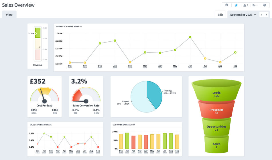
- Sales Performance Dashboard: Imagine a clean, organized display showing monthly sales figures alongside yearly targets. The use of a line graph makes it easy to spot trends. Below it, there’s a pie chart breaking down sales by region, allowing a quick view of which areas are performing best. On one side, a bar graph compares the performance of different products. What makes this dashboard stand out? Its clarity. A sales manager can grasp the overall sales health, regional contributions, and top-selling products with just a glance. It’s like having a map that shows where you are and where you need to go.
- Customer Service Dashboard: Picture this: A main gauge displays the overall customer satisfaction score. Surrounding it are smaller metrics such as average response time, resolved issues, and pending tickets. A colour-coded system—green, yellow, red—indicates performance levels. There’s also a section for customer feedback, highlighting positive comments and areas for improvement. This dashboard shines because it offers a holistic view. A team leader can quickly gauge overall satisfaction, identify potential bottlenecks in response times, and tap into direct customer feedback. It’s like having a health check-up report; you know what’s working well and what needs attention.
What’s the common thread in these examples? Both dashboards are concise, focused, and visually engaging. They don’t just throw data at the viewer but present it in a way that tells a clear story. Remember, a well-crafted dashboard is like a skilled storyteller—it makes complex data narratives simple and engaging.
Pitfalls to Avoid in KPI Dashboard Design
Creating a compelling KPI dashboard is more about avoiding common mistakes than implementing best practices. Let’s discuss some pitfalls that can impede the effectiveness of a dashboard and how to steer clear of them:
- Overloading with Data: In the enthusiasm to provide comprehensive insights, cramming too much data into one dashboard is easy. Consider it a buffet; while variety is good, many dishes can confuse diners. Limiting metrics to the most pertinent ones ensures clarity and focus.
- Neglecting Mobile Optimization: Today, many users use tablets or smartphones to access dashboards on the go. A dashboard that looks splendid on a desktop might become unreadable on a smaller screen. It’s essential to ensure designs are responsive. Think of it like a book; whether paperback or e-reader, the content should be clear and accessible.
- Inconsistent Use of Colors: Colours can enhance understanding, but when used inconsistently, they can lead to confusion. Having a green indicator mean “good” in one chart and “bad” in another is a recipe for misunderstanding. Stick to a consistent colour palette. It’s similar to traffic lights; the meanings of red, yellow, and green are universally understood.
- Failing to Update Regularly: Data can change rapidly, and outdated information can lead to misguided decisions. Ensure KPI dashboards reflect the most current data. It’s akin to checking the weather; today’s forecast might not be accurate for tomorrow.
- Overcomplicating Visualizations: While using intricate graphs or advanced visualizations might be tempting, simplicity often wins. A complex 3D pie chart might look fancy but can distort data perception. Choose the simplest visual representation that conveys the data effectively. It’s like explaining a concept; simpler words often lead to better understanding.
- Ignoring User Feedback: Who better to provide insights on a dashboard’s usability than its users? Regular feedback can highlight areas for improvement. Consider it a conversation; you create a tool tailored to user needs by listening and adjusting.
While the allure of creating a visually stunning dashboard is natural, function should always precede form. By avoiding common pitfalls, you ensure that your dashboard remains a trusted, insightful tool for decision-making.
The Subtle Art of KPI Dashboard Customisation
One size rarely fits all, especially in dashboard design. While certain principles remain universal, the needs of every organization, and even individual departments within, can vastly differ. Customization emerges as a powerful ally. Let’s delve into the nuances of tailoring dashboards to meet specific needs:
- Understanding User Profiles: Different roles within a company have distinct data needs. A marketing manager might prioritize metrics related to campaign effectiveness, while a finance head focuses on budgetary controls. Start by understanding the data necessities of each user profile. Consider it as tailoring a suit; it should fit the wearer perfectly.
- Layered Access: Not every piece of data is relevant to every user. Instead of overwhelming users with excess information, consider layered access. Entry-level staff might see basic metrics, while executives access a comprehensive view. It’s similar to having different book editions, each tailored to its audience.
- Flexible Time Frames: Some users prefer a snapshot of recent performance, but others might need a broader historical perspective. Offering the flexibility to adjust time frames ensures users get insights pertinent to their analysis. Imagine a zoom function on a camera; it allows for close-ups and wide-angle shots.
- Custom Alerts: Every department has its key performance indicators (KPIs). Allowing users to set custom alerts for their KPIs ensures they remain in the loop about significant shifts. It’s like setting an alarm for a necessary appointment; you’re informed right on time.
- Personalized Visual Preferences: Visual appeal plays a role in user engagement. Customizing colour schemes, graph types, and layouts can increase dashboard usage. Consider it akin to decorating one’s workspace; it’s more inviting when it reflects personal taste.
- Integration Capabilities: For many businesses, data sources are diverse. A customizable dashboard should offer seamless integration capabilities, ensuring users get a consolidated view, irrespective of where the data originates. Think of it as a universal adapter; it should connect varying inputs seamlessly.
Customization bridges a standard tool and one that feels like it’s crafted just for you. Embracing this subtlety ensures dashboards remain relevant, engaging, and truly insightful.
Harnessing Modern Solutions
There are myriad tools and software that promise precision and performance. One such tool which deserves a special mention is Spider Impact. Without delving too deep into product specifics, it’s crucial to understand the underlying principles modern solutions like Spider Impact bring.
- User-Centric Design: Modern tools prioritize user experience. They recognize that a dashboard is as good as its usability. With intuitive interfaces and straightforward navigation, tools like Spider Impact ensure that even those who need to be better-versed in data can derive insights effortlessly. It’s similar to driving a well-designed car; the journey becomes smoother.
- Real-time Data Access: The pace of business today is rapid. Decisions can’t always wait. Platforms like Spider Impact ensure real-time data access, ensuring the information you view is current and actionable. Think of it as reading today’s newspaper, not last week’s.
- Collaborative Features: Today’s business environment is collaborative. Modern dashboard tools understand this and offer features that allow teams to share, comment, and collaborate on data. It’s akin to a brainstorming session but with data at its core.
While the principles of effective dashboard design remain timeless, the tools we use evolve. Harnessing modern solutions can elevate our data visualization endeavours, ensuring we’re in tune with the times and a step ahead.
Best Practices in Dashboard Design
For KPI dashboard design, certain principles must be adhered to to communicate insights effectively. While creativity has its place, the primary aim is clarity and user engagement. Here are some best practices to keep in mind:
- Consistency is Key: Consistent use of colours, fonts, and symbols across the dashboard plays a pivotal role. As in a well-written document where headings, subheadings, and body text have defined and consistent styles, dashboards should use colour and typography to guide the viewer’s eye and interpret information. For example, if red indicates a drop in performance in one chart, it shouldn’t represent a positive trend elsewhere. This reduces cognitive load and eliminates confusion.
- Mobile Optimization: With the proliferation of smartphones and tablets, it’s no longer enough for a dashboard to look good only on a desktop. It should be as legible and functional on a mobile device as on a larger screen. This involves responsive design, ensuring that charts, graphs, and text resize and rearrange to fit smaller screens. It’s akin to reading a newspaper versus a mobile news app; the content remains the same, but the presentation changes to suit the medium.
- Regular Updates: Business goals, market conditions, and strategies aren’t static. They evolve. Similarly, the dashboards that track them should be fluid. As KPIs change, dashboards should be updated to reflect new priorities. It’s about updating the data and ensuring that the tracked metrics align with current business goals. This ensures that the dashboard remains a relevant tool for decision-making rather than a static snapshot of a bygone era.
- User-Centric Design: A dashboard’s primary audience is its users. Design choices should be guided by their preferences and needs. Regular feedback sessions can ensure that the dashboard remains user-friendly and continues to serve its intended purpose.
Designing an effective dashboard isn’t just about aesthetics or data representation. It’s a delicate balance of design principles, business priorities, and user needs. Adhering to these best practices ensures that the dashboard remains an invaluable tool in the decision-making arsenal.
The Power of Effective Dashboards
The central tenet has been evident throughout this exploration: effective dashboards are more than just aesthetic data arrangements. They are a nexus of clarity, functionality, and strategy. By embracing the principles of consistency, ensuring mobile optimization, and regularly updating with evolving business goals, dashboards transcend from mere tools to pivotal decision-making instruments. Every facet of the KPI dashboard design communicates a narrative. This narrative guides business leaders, managers, and even frontline employees, giving them the insights to make informed decisions. A well-crafted dashboard doesn’t just report data; it tells a story, highlighting successes, pinpointing areas of improvement, and charting a course for the future. As you ponder the insights shared here, consider whether your current dashboard serves its true purpose. If there’s room for improvement, now is the time to act. Explore modern tools, like Spider Impact, that prioritize these best practices and embark on a journey to more precise insights and better decision-making. Remember, in business, knowledge isn’t just power; it’s the path to progress.