Kiviat Charts
Many times, it takes more than one metric to understand, evaluate or control a software project, product, process, or service. One way to show a summary view of a set of metrics is to use a Kiviat chart, also called a polar chart, radar chart or spider chart. In a Kiviat chart, each “spoke” represents a metric with the metric’s value plotted on that spoke. The outer circle on a Kiviat chart can be used as the objective or threshold or inner and outer circles can be used to depict valid ranges.
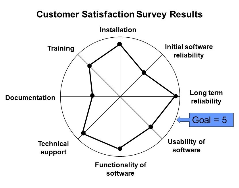
Figure 1 illustrates an example of a Kiviat chart that summarizes a set of customer satisfaction scores. From this chart, it is fairly easy to identify documentation as the area that is farthest away from the outer circle goal of having a 5 (very satisfied) as a satisfaction score. Therefore, documentation presents the best opportunity for process improvement according to this chart.

A Kiviat chart can also be used to compare several different items across several parameters against the ideal by plotting additional sets of point. For example, Figure 2 illustrated the comparison of two different project’s customer satisfaction results with Project A being the solid line and Project B being the dashed line. Note that project B has a much better customer satisfaction score for documentation than project A. This might indicate an area where project A can benchmark the documentation practice of project B to aid in their process improvement initiative. On the other hand, project B might benchmark project A’s software usability methods, where project A has a better satisfaction score. A similar Kiviat chart could also be used to compare Project A’s customer satisfaction score for two different time periods to determine the impacts of process improvement efforts.

Suppose our customers were asked to rank our company against one of its competitors on various customer satisfiers, a Kaviat chart like the one in Figure 2 could be used to make comparisons between our companies scores (solid line) and our competitor’s scores (dashed line). For example, even though our company had an acceptable satisfaction score in training, there might still be a concern if our competitors are scoring even higher than we are with our customers.
Another example for a comparison Kiviat chart like this might be to compare the scoring of different vendors on a set of evaluation criteria used in vendor evaluation prior to vendor selection. The Kiviat chart would help summarize the strengths and weaknesses of each vendor.
Alternately, the Kiviat chart can be combined with a stoplight chart by adding red/yellow/green bands to the chart. This combination is illustrated in Figure 3.

______________________________________________________________
Invest in yourself and your career: Become a Software Excellence Academy's All-Access Member
Get access to:
- 9 online, on-demand classes taught by Linda Westfall
- 6 online, on-demand classes taught by Robin Goldsmith
- Agile Training series from Scott Duncan
- Registration to all of our online, live classes
- Access to all the webinars in our webinar vault (over 150+ webinars)
- Monthly Q&A calls with Linda Westfall
For More Information or to Register as an All-Access Member
______________________________________________________________
Upcoming webinars from the Software Excellence Academy:
July 2023 - Topic of the month is Analysis Methods & Tools
- 7/19/2023 – RCA: Fault Tree Analysis presented by Barbara Armstrong
- 7/26/2023 – Cause & Effect Diagrams presented by Linda Westfall
For more information about our webinars or to register for one or more of these webinars click here.
_____________________________________________________
The following webinar recordings are currently available for free on our website:
- Applied Tools for Quality Improvement presented by Grace Duffy
- Leading Distributed Teams presented by Scott Duncan
- What If People Came With Instructions presented by Diana Alt
- Meeting Management for Maximum Effectiveness presented by Linda Westfall
- Power Skills Bootcamp: Teamwork presented by Tom Henricksen
- How to Avoid a Project Death March presented by Neil Potter
- Constructing a Software Work Breakdown Structure, presented by Dennis Frailey
- Project Reviews - Why, When, Who & What, presented by Linda Westfall
To watch these webinars click here and scroll down to the recordings.
_____________________________________________________
© 2023 Westfall Team. All Rights Reserved
Quality Manager | Agile Practitioner | Release Management | Scrum Master | Data Protection | Product Owner | | Team Building | Hiring...
9moLinda Westfall, This is really helpful