Best Colour Wheel Charts | Pick A Beautiful Colour Scheme
As our planet tears through space, countless beams hit it from every imaginable angle. Parts of those beams bounce off objects, and other parts are absorbed by them, which produces the glorious flourishes of colour you see around you.
Graphic designers and other professionals use these colours to create beautiful and effective assets like websites, adverts, and brand style guides. They need a strong understanding of the basics of colour, colour wheel charts, and the types of colours that help them to produce quality work. For the rest of us, having a basic understanding of colour can help us to design gorgeous homes, produce charming paintings, and make our cat utterly adorable by picking the right colour jumper for them.
In this article, we’ll explore one of the most common colour wheel charts for designers: RYB (red, yellow, and blue—the primary colours), and provide some background colour theory to help you pick the right scheme for your project.
Colour theory—the basics of colour
To talk about colour theory and the basics of colour, the first thing we need to understand is light. Light is a wave that can be broken down into seven distinct wavelengths, with each wavelength corresponding to a colour. Isaac Newton was the first person to discover this, after he passed a beam of light through a prism and saw the various colours emerge from the other side, similar to the illustration below.
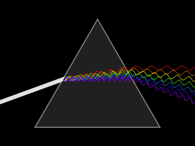
A light beam can be broken down into seven wavelengths. The longest is red, and the shortest is violet, with the various colours in between:
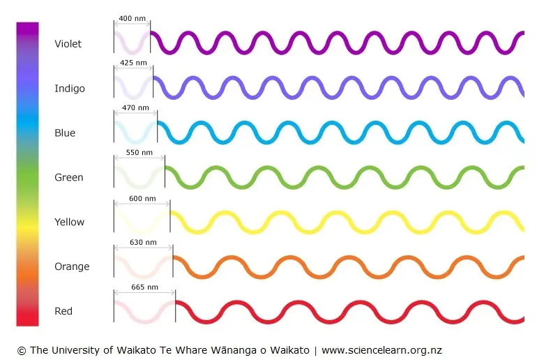 Image from The University of Waikato Te Whare Wananga o Waikato
As humans, we have photoreceptors called rods and cones in our eyes, which convert light into signals that our brains can understand. We look at an object, and our brain recognises it as red or yellow or a murky brown that reminds us of the vindaloo we ate last night.
But why are these objects different colours? Well, that depends on their arrangement of electrons, which determines which wavelengths the object absorbs or reflects. Tomatoes, for example, absorb all wavelengths of light except red, which it reflects. That’s why you see a red tomato and not a blue tomato, green grass instead of purple grass, and a blue sky instead of a grey one (unless you’re English).
After Isaac Newton conducted his prism experiment and laid the foundation for colour theory, he went on to create the world’s first colour wheel, broken down by the seven wavelengths that shone out of the glass.
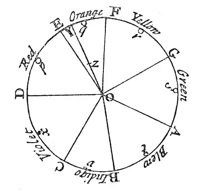
The first colour wheel, created by Isaac Newton in 16651
This led the way for the more complete colour wheels that we use today. There are a few modern versions used for purposes like electronics or printing. But in this article, we’ll stick to the subtractive colour model that has been used by artists and designers for decades: RYB (red, yellow, blue). This model uses 12 base colours, which can be broken down into the following:
- Primary colours: red, yellow blue
- Secondary colours: green, orange, and violet
- Tertiary colours:yellow-green, yellow-orange, red-orange, red-violet, blue-violet, blue-green
Of course, there’s many more colours than 12, and their huge variety comes from a combination of mixing colours, adding black (shading) or white (tinting), or adding both black and white to increase a colour’s saturation (toning).
Separate from the wheel system in colour theory is the classification of a colour’s temperature. You are probably already familiar with this: red, orange and yellow are called warm colours, and green, blue, and purple are cool colours. Warm colours may remind us of sunlight, warmth, and energy, and cool colours nature, cold, and calm. Because of our experience with various objects in the world, every colour and shade can evoke a particular emotion, and designers need to have a good understanding of these emotions to create effective designs.
If you have the responsibility of selecting colours for a design project, how do you do it? Well, you usually want to pick harmonious colours.
Colour harmony
For graphic designers (or anyone using colour in their professional or personal lives), the goal is usually to create colour harmony—a combination of colours that are pleasing to look at, and a fundamental component of colour theory. This can vary depending on where you are from, how old you are, personal preferences, and other factors, however there are three reliable systems for selecting harmonious colours:
Complementary colours in colour theory
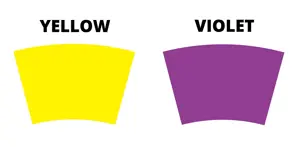 Yellow and violet are examples of complementary colours
Complementary colours exist opposite each other on a colour wheel, like yellow and violet, or orange and blue. Because they are polar opposites, they balance each other perfectly and feel stable. They also create a high level of contrast which can catch the eye.
There’s also split-complementary colours, which also use colours on the opposite side of the wheel, but shifts one of the colours to the left or right to add more visual interest.
Analogous colours
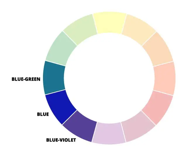
An example of analogous colours
Analogous colours are a combination of colours that are close together on the wheel, like blue, blue-green, and blue-violet. They work well together because they share the same base colours.
Analogous colours can feel like the most harmonious and peaceful combinations, but might also seem a little boring, so may need to have another complementary colour thrown in to add interest. When using these systems, designers often pick a single primary colour as the dominant hue, and then other colours as secondaries or accents.
Monochromatic colours in colour theory
A monochromatic colour wheel, which uses different shades of the same colour
Monochromatic colours are based on a single hue, with variations created by adding black (shading) or white (tinting). For example, you might create a monochromatic palette with three colours by using blue as your base, blue with white as your second colour, and blue with black as your third colour. These schemes can feel a little dull because they’re all based on a single hue, and are often combined with other colours to make them more agreeable.
Triads
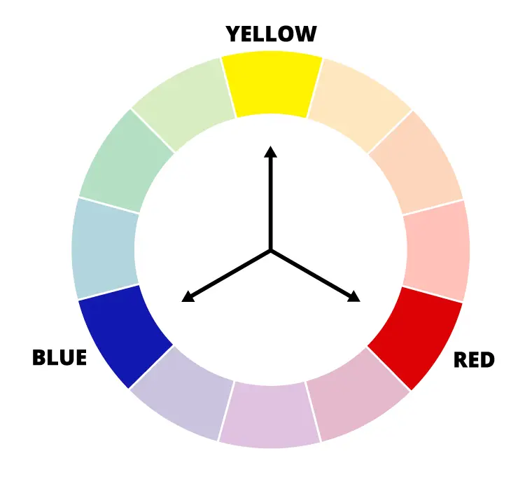 The primary colours are an example of triads
Triads use colours that are equidistant to each other on the colour wheel. A common example is the three primary colours, which have three other colours in between each of them on the wheel. They tend to produce a highly vibrant effect, which can make a design feel like it’s bursting with energy. You can also tone down the hues by adding white or black, to create something more subtle.
If you’d like some help picking a harmonious colour scheme, check out our article on aesthetic colour palettes. There’s plenty to choose from!
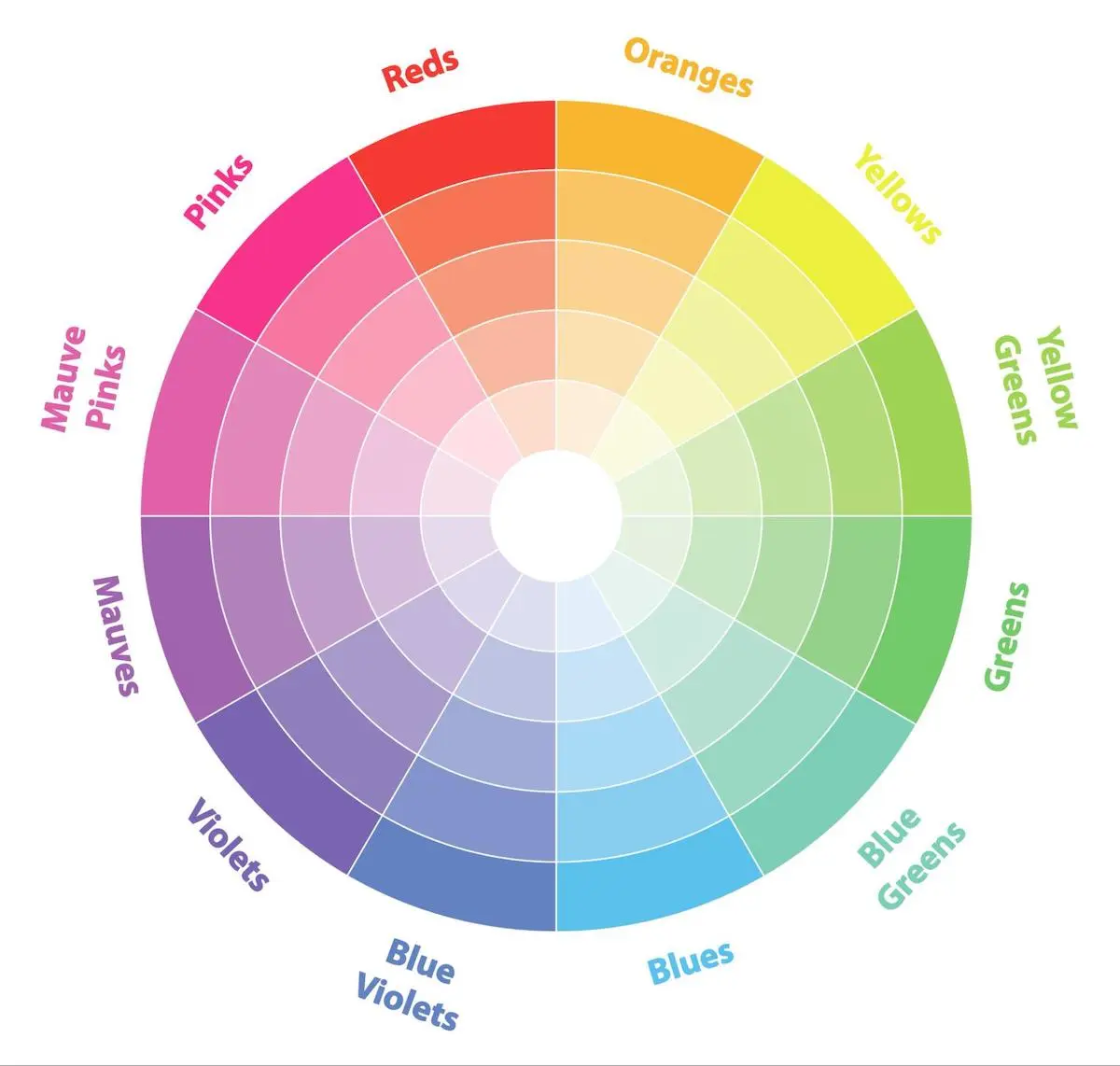
Colour wheel charts
Now that you know about the basics of colour, we can move onto the RYB colour wheel. A colour wheel is simply a way to logically arrange colours, so that you can see what’s available and use systems like analogous colour selection to find harmonious combinations.
The wheel itself is a marvel of design and functionality, consisting of 12 colours that can be mixed and matched to produce an almost infinite variety of hues. Here it is in its full glory:
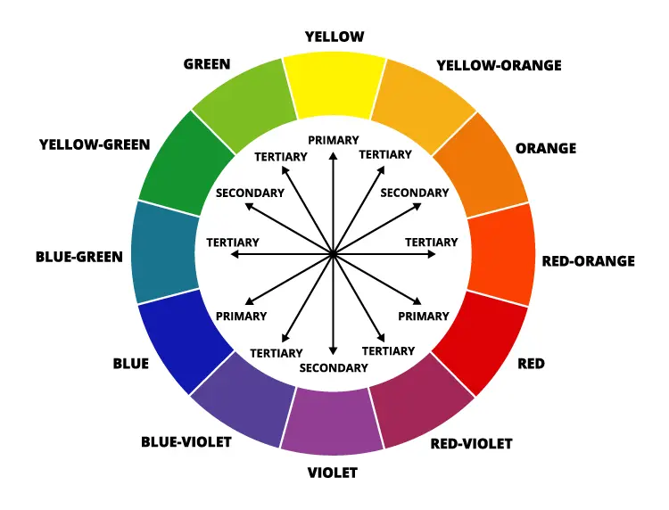
Within the wheel there are three groupings: primary colours, secondary colours, and tertiary colours.
Primary colour wheel
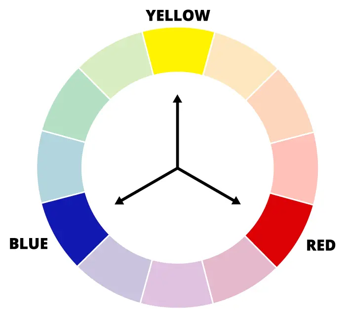
There are three primary colours: red, yellow, and blue. They are equidistant (the same distance) from each other on the wheel, and are the basis of all other colours. When you add these colours together, they produce a darker hue, as shown in the following illustration:
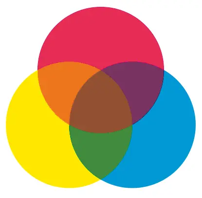
Subtractive primary colours. Image from Wikimedia Commons (CC BY-3.0)
Primary colours aren’t a fundamental property of light—they don’t exist outside of our experience. Instead, they are a response to how our eyes perceive light, which makes them ideal for selecting colour combinations for other humans. If you were designing a website for dogs, you’d want to select colours blues, yellows, and combinations of the two, because those are the only hues they can see.
Secondary colour wheel
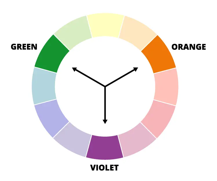
As with primary colours, there are three secondary colours on the wheel. These are green, orange, and violet, and they are also equidistant. Secondary colours are created by combining the other primary colours together. You get green by combining blue and yellow, orange by combining red and yellow, and violet by combining red and blue.
Tertiary colour wheel
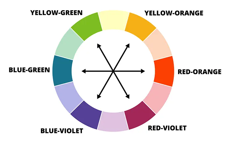
Tertiary colours (also known as “intermediate” colours) are created by mixing a primary colour with a secondary colour that is next to it on the colour wheel. Red and violet mixes to become red-violet (magenta), yellow and orange mix to become yellow-orange (amber), etc. There are six tertiary colours in total.
Complimentary colour wheel
As discussed above, complimentary colours are a system for selecting harmonious colours that people enjoy looking at. They are selected by pairing colours that are polar opposites on the wheel, so the easiest way to display them is side by side as below.
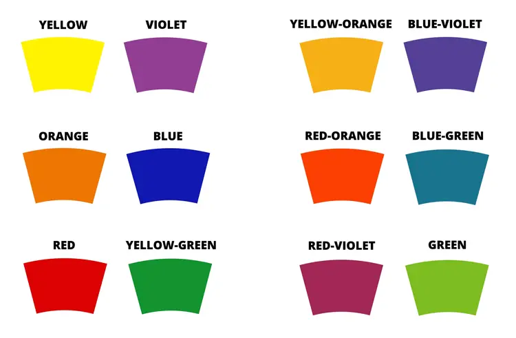 Complimentary colour groupings
There are six complementary colour pairings in total, which are:
- Yellow and violet
- Yellow-orange and blue-violet
- Orange and blue
- Red-orange and blue-green
- Red and yellow-green
- Red-violet and green
Complimentary colours provide the strongest sense of contrast possible, also referred to as “simultaneous” contrast. This extreme difference can make the two colours much more vivid and interesting when used together, and is also the reason why contrasting colours are often used sparingly for projects like websites, where the final result is usually clean but still stimulating (check out our article on minimal graphic design to learn more about this style). They are commonly chosen as accent colours instead.
Every set of contrasting colours include one warm colour and one cool colour, which can create a more balanced and “complete” look that tends to be appealing. Nineteenth century impressionism was the first art movement to recognise the importance of these colour pairings, which noted that shadows are not a neutral black or grey, but instead combinations of other colours.2
Colour wheel charts—summary
Colour wheel charts are an excellent way to see which hues are available for a design project, and select some based on what suits. You can use pre-existing systems like complementary or analogous schemes, or go wild with a random selection. Colour is beautifully versatile, and palettes can be as simple or complex as you like. Good luck!
References
- Ashley P.Taylor, 2017, Newton’s Color Theory, ca. 1665, The Scientist Magazine
- Complementary colours, Tate