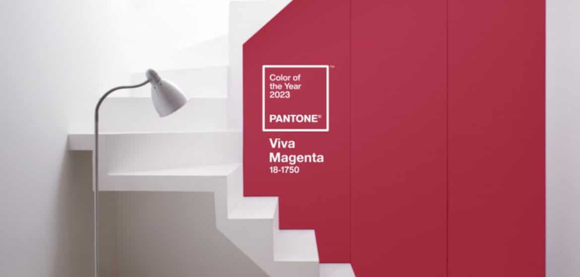
VIVA MAGENTA - PANTONE COLOUR OF THE YEAR 2023
A vivid, intense crimson red is colour of the year 2023. Pantone describes it as rebellious and powerful, but with a core of softness. Compassion and fierceness, wrapped up in the same colour.
It’s going to be everywhere, this colour, so why not get to know it? Use the table of contents to jump straight to your Season if you like, and you can see the whole video, too!
Fuchsia and magenta

Magenta is very similar to fuchsia. Fuchsia is more pink and closer to purple than magenta, which is more red. I found a lot of information on the website Color Psychology. Check it out, it has lots of interesting stuff about all kinds of colours.
Pantone Viva Magenta 18-1750

Magenta is not a primary colour, but a purplish-red that is created by mixing violet-blue and red, with absolutely no green in the mix. There is a difference between the French magenta and American magenta. American magenta being more pink, and French magenta more red.
Fun fact: The colour is named after the battle of Magenta, the battle was fought in 1859 and the magenta dye was invented in the same year and was named after the battle, which the French-Sardinian army under Napoleon the third won a very important victory in the second Italian war for independence. This is possibly why the French version of this colour is more blood-red than the American version?

To me it seems like the Pantone Viva Magenta is a lot more red than other versions of magenta that I was able to find on the internet.
And… though we often think of magenta as an inherently intense hue, it does have room for other varieties. Which will also come in handy when we try to find versions of magenta to fit in the 12 colour palettes of the seasons.
Pantone suggests using Viva Magenta as an accessory, to wake up your neutrals for instance pairing it with pale grey, or to use it with blue or pastels.
Pantone goes on to call the colour “universally flattering”, which would be the equivalent to type 0 blood that can be given to all human beings. So let’s have a look at how Viva Magenta looks like with the palettes of the 12 Seasons, here's the video:
Viva Magenta for the 12 Seasons
Dark Winter
Dark Winter can definitely make use if magenta in many ways, both as an accessory and in clothing.

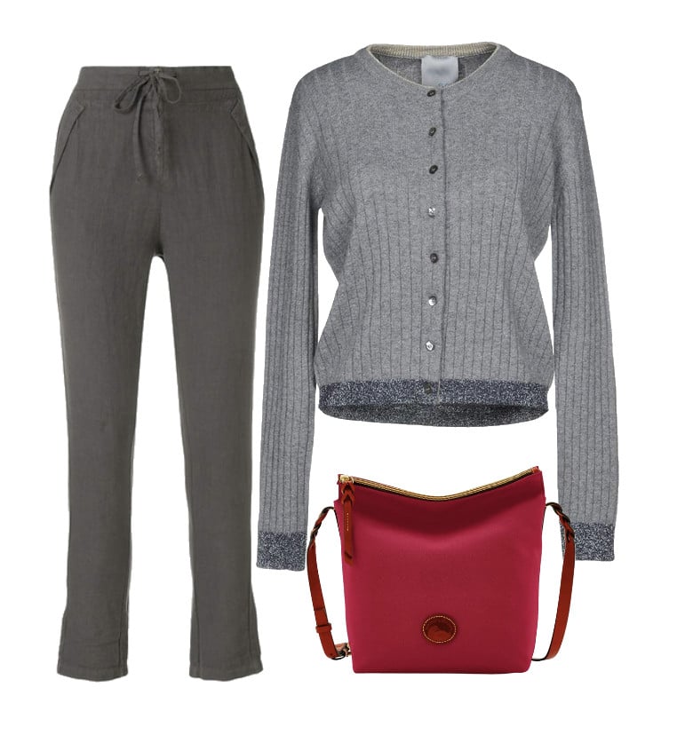
Here's an example of a version of magenta used in a handbag, combined with grey pants and cardigan. This bag could quickly become a staple in your Dark Winter wardrobe long after the fad of magenta as colour of the year is over.
True Winter
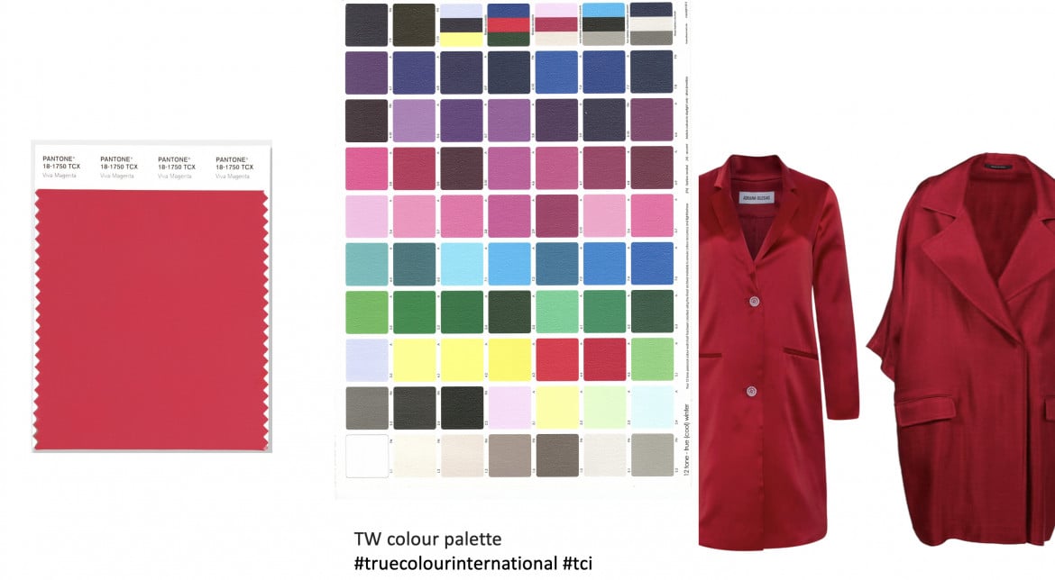
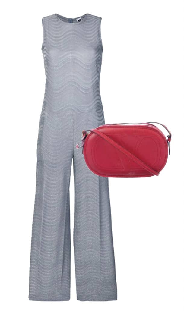
Same as for the other two Winters, Viva Magenta packs enough coolness and intensity to be in harmony with True Winter.
And as an accessory, look how the intense Viva magenta perks up this steel grey pantsuit for True Winter.
This will be a staple colour for True Winter, not just a fad, so 2023 might be a good time to invest in a magenta red handbag, or shoes, or belt, if you're a True Winter.
Bright Winter
Almost a no brainer, there's no doubt that Viva Magenta lends itself to the vibrant and brilliant Bright Winter palette.
I've explored the darker end of the Bright Winter reds for this illustration, so if you're a Bright Winter looking to invest in a red statement coat, you might be able to find one in the shops in 2023.
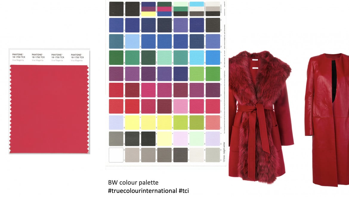

If you don't feel quite ready to wear a full length coat in this intense magenta red, why not consider a smaller accessory like a handbag or red shoes, or a short bolero that you can use to liven up an all neutral outfit.
This colour harmonises so well with your colour palette, 2023 will be a really great opportunity to expand your wardrobe with red statement shoes or a bag in this perky hue.
Bright Spring
There are lots of reds in the Bright Spring palette but as you can see, they are leaning more over towards bright tomato red and electric apricot in addition to the cooler end of this vibrant colour palette, where we can actually see a cooler magenta. Viva Magenta is not totally off next to this palette, and I think you might find items that are a warmer version of magenta if that floats your boat.

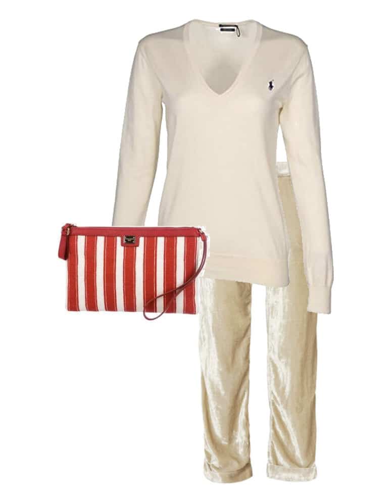
But if you are the kind of Bright Spring who prefers red in smaller portions, there is lots to choose from that will bring a good dose of energy into an outfit in your vanilla ice cream and pale caramel neutrals, like I've put together for you in this collage.
Like this perky little handbag, with happy stripes in sunny white and a clear, warm magenta red.
Complete the outfit with some lip gloss, gently tousled hair, a bright cheery headband and you'll be ready for that champagne breakfast on the cruise.
True Spring
The sunshine is getting warmer. Viva Magenta is starting to look too cool and dark and a little out of place next to the True Spring juicy fruit sunny palette. Instead of Viva Magenta, I suggest hunting for something a little more on the tropical tomato side of red:
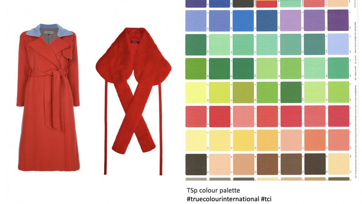

Or better yet, see if you can find something in the coral/apricot range. It will support the greens and yellows of your palette so much better than Viva Magenta, which looks harsh next to the rich True Spring colours.

The same goes for accessories. The corals and apricots are better alternatives if you wish to invest in a brightly coloured handbag to set off your True Spring Custard cream and toffee brown.
Light Spring
The delicate palette of Light Spring is not exactly the first Season that springs to mind when thinking about how to use Viva Magenta.
Viva Magenta would appear too cool, dense and heavy next to these beautiful light and fresh colours. I think it's better to stick to the vivid coral and the sunny oranges if you're a Light Spring looking for outerwear in a perky colour.

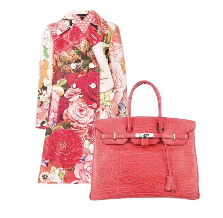
The same goes for handbags and other accessories.
I love this coral for a Light Spring statement handbag.
And you're a Spring, so choosing a multi-coloured floral coat in your colours will never be wrong.
Light Summer
Light Summer is light, but not quite as light as Light Spring, and on the cooler side of neutral, so it comes as no big surprise that Viva Magenta is slightly more at home here than with the Light Spring palette.
In this collage I've chosen a couple of coats from the dark raspberry hues that combine well with the Light Summer palette, for the Light Summer who wishes to use the full range and make use of the darker end of her colour palette:


What got me thinking about Light Summer for this handbag was not only the shade of red, but also that it's a wicker handbag, and wicker always gives me summer vibes.
Somewhere between umbrella drink coral and suave raspberry, this might be a fun addition to your Light Summer handbag collection.
True Summer
Next to the Spring palettes Viva Magenta appears cool, but next to the muted ultra cool palette of True Summer, Viva Magenta is a little too warm and a lot too intense.
If you're looking for a statement coat in one of your reds, I would look for soft burgundy or muted rose instead. They will be so much more in harmony with accessories in your neutrals and your other True Summer colours.

The same goes for accessories: Find a clutch in cool, hazy deep lavender or softly textured vintage rose and you're all set.
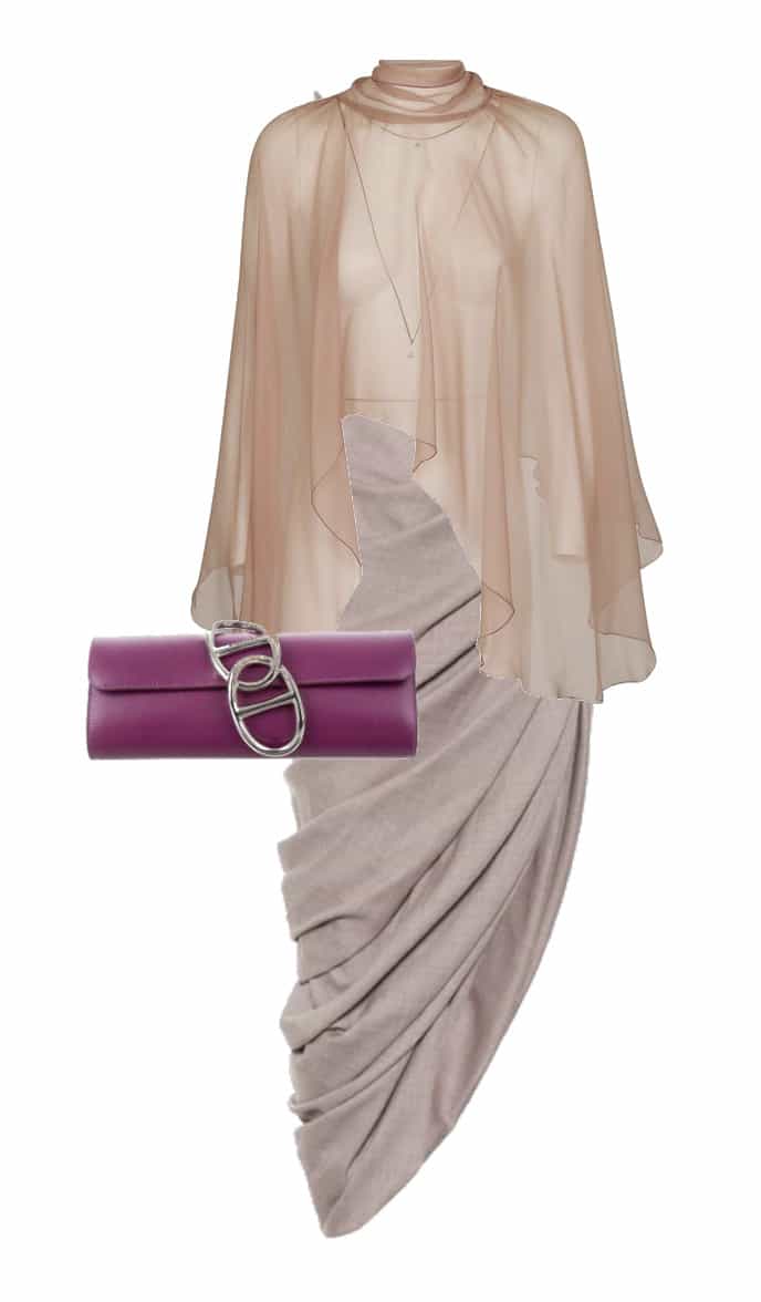

Soft Summer
As I say in the video, there are a lot of different versions of magenta out there, and since Pantone's Viva Magenta obviously is a little too "viva" for the subtly elegant Soft Summer, we'll bring out some other varieties of magenta to see if they work better, and luckily that's not very difficult:
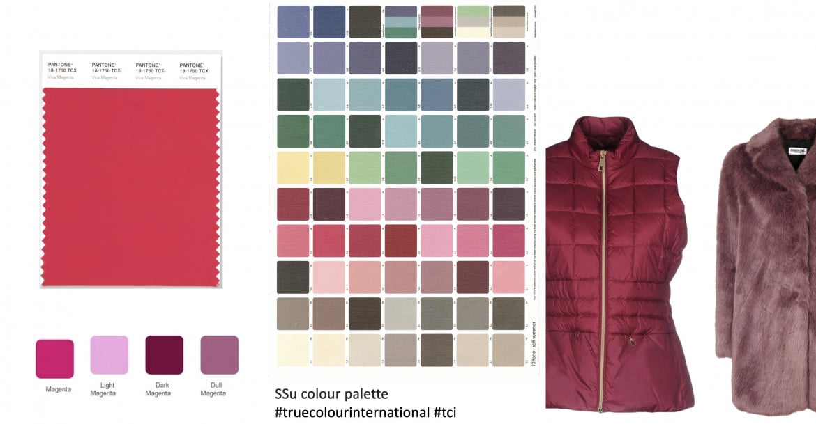

I fell head over heels in love with this subdued clutch for Soft Summer. Elegantly combining taupe and dusty lavender, it's the epitome of softspoken elegance.
Soft Autumn
I'm not even going to bother showing you the Viva Magenta swatch next to the lovely Soft Autumn palette. Leave Viva Magenta alone, and focus on finding something in your rich terracotta red or deep burnished rose instead!


The same goes for accessories.
Hunt for a handbag in a rosy rust, it will work so well to balance and bring a glow to all your neutrals, and will combine nicely with your greens and the Autumn blues and teals of your palette.
True Autumn
The warm golden True Autumn palette has no need for the cool and brash Viva Magenta. The deep bright rust is a better alternative, because then scarves and hats in warm olive and golden mustards will look so vibrant next to them:
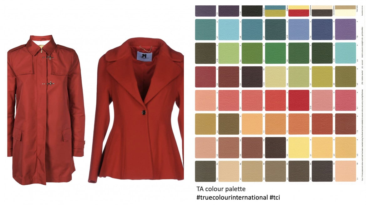

Look how beautiful this bright rust handbag looks with this deep mustard yellow dress.
A rust handbag would be an asset in every True Autumn wardrobe.
Dark Autumn
The richest and spiciest of the 12 Seasons. How does the intensity of Viva Magenta hold up next to the palette of Dark Autumn?
To me, Viva magenta seems a little too tomato red next to the browned reds of Dark Autumn. Too much pink, too little spice.

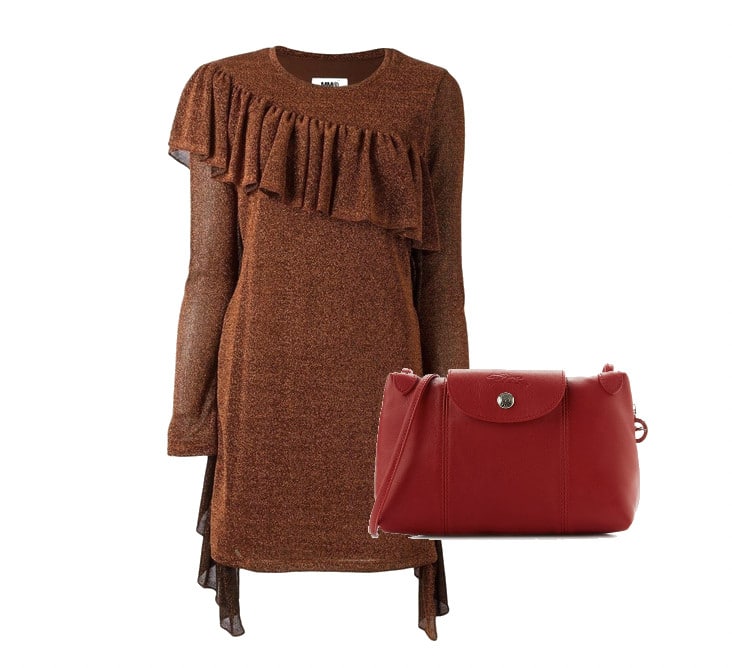
We need to carry the spiciness with us into the accessories as well.
The rust is deeper, the hue a little browner, and there is a dark intensity to this rust, not a clear red like the magenta.
This is a handbag that will serve a Dark Autumn for many years.
Pantone has picked Viva Magenta as the colour of their year.
But if you know our Season, you will take it with a grain of salt, judge it next to your colour palette and if you decide to ride the magenta wave, you will pick versions of magenta that vibe with the essence of your Season.
Or perhaps you will make a conscious choice to avoid it and rather wait until one of your particular versions of red becomes colour of the year.


Thank you for clearing up the color difference between the French and American versions. Being American I think of magenta as a purple red and was surprised at times at the color variation I was seeing online.
HI Joy, I’m so glad you found it useful to read about the different versions of Magenta in various countries! It can be very confusing indeed. I was surprised myself discovering this when researching this topic.
Using all 12 palettes to show which could incorporate and which should avoid Viva Magenta was absolutely brilliant!!! Thank you, Jorunn.
Thank you, Janet, how wonderful that you liked it!
Loved this post, thank you!
I’m so glad to hear this!
Wonder Bar
I’m so glad you liked it!