Politics
This Fascinating World Map was Drawn Based on Country Populations
View this giant map in full resolution to see details
This World Map was Drawn Based on Country Populations
To view this map at a higher resolution to see countries and data with detail, click here
It’s likely you’re very familiar with the standard world map.
It’s shown practically everywhere – you’ll see it online, on the news, in books, and even as a part of company logos. In fact, the world map is so ubiquitous that we don’t even really think about it much at all, really.
The economist Max Roser from Our World in Data argues that this familiarity with the world map may lead to complacency in understanding global matters. After all, the typical world map shows us the basic geography of countries and continents, but it doesn’t give any indication of where people actually live!
Introducing: The Cartogram
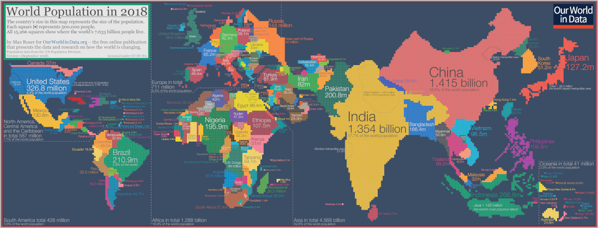
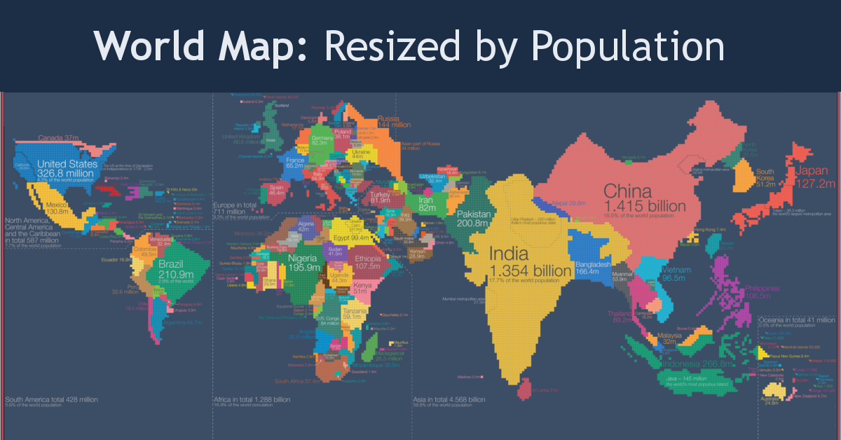
To get around the challenges of relying on the standard world map, Roser instead has made a population cartogram based on 2018 population figures.
What’s a population cartogram?
A cartogram is a visualization in which statistical information is shown in diagrammatic form. In this case, it’s a population cartogram, where each square in the map represents 500,000 people in a country’s population.
In total there are 15,266 squares, representing all 7.633 billion people on the planet.
Countries like Canada or Russia – which have giant land masses but small relative populations – appear much smaller on this kind of map. Meanwhile, a country like Bangladesh grows much bigger, because it has a large population living within a smaller area.
The Regional View
Let’s zoom in on some continental regions to get a sense of what we can learn from a population cartogram done in this fashion.
Asia and Oceania
Where did Australia go? The continent is completely dwarfed by neighboring Indonesia and the Philippines.
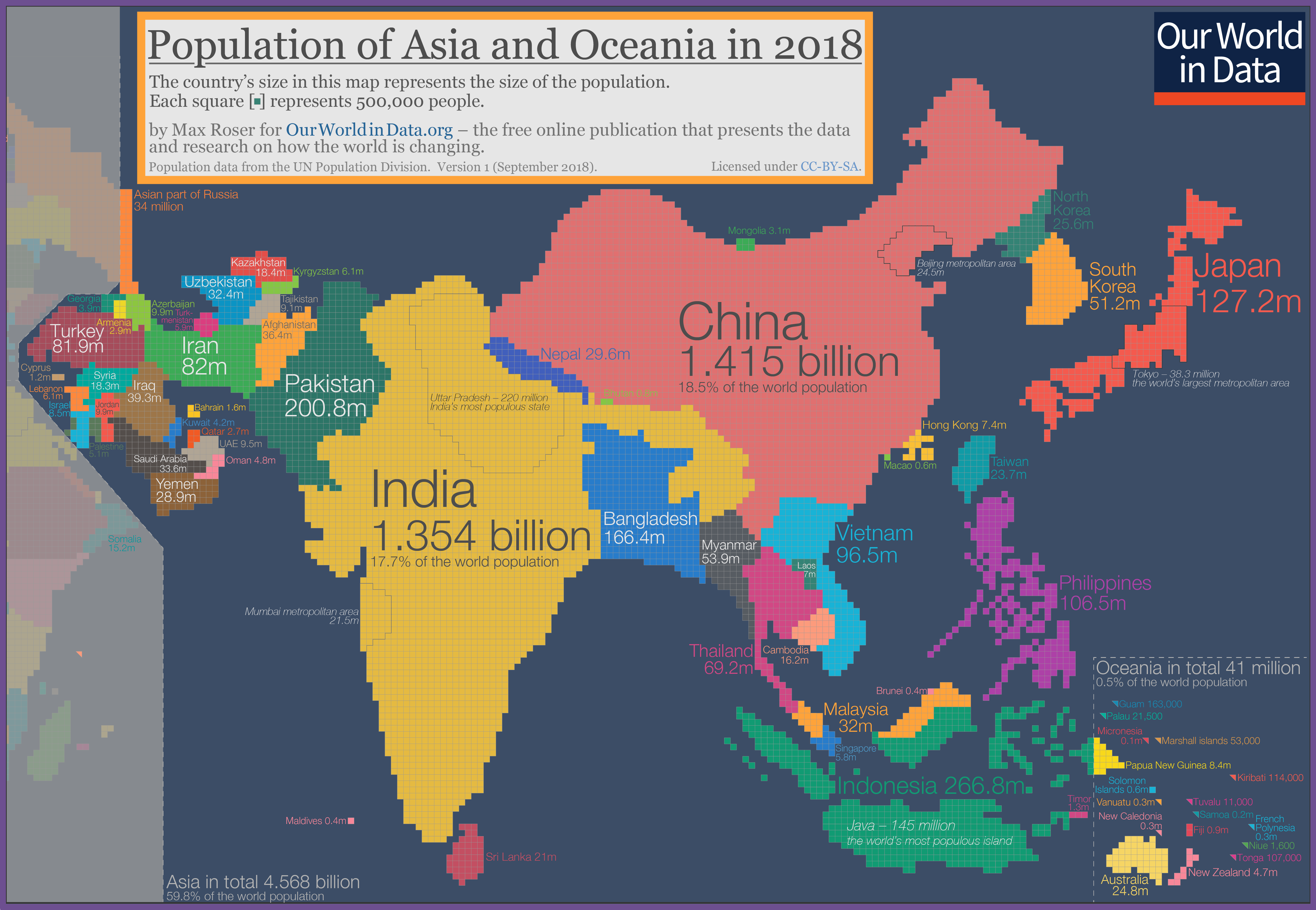
Not surprisingly, India and China are the biggest countries on this cartogram, especially looking oversized in comparison to countries in the Middle East like Saudi Arabia, Afghanistan, or the United Arab Emirates.
Europe
Geographically, Russia is a pretty massive country – but when resized based on population, the nation looks closer in size to many other European nations.
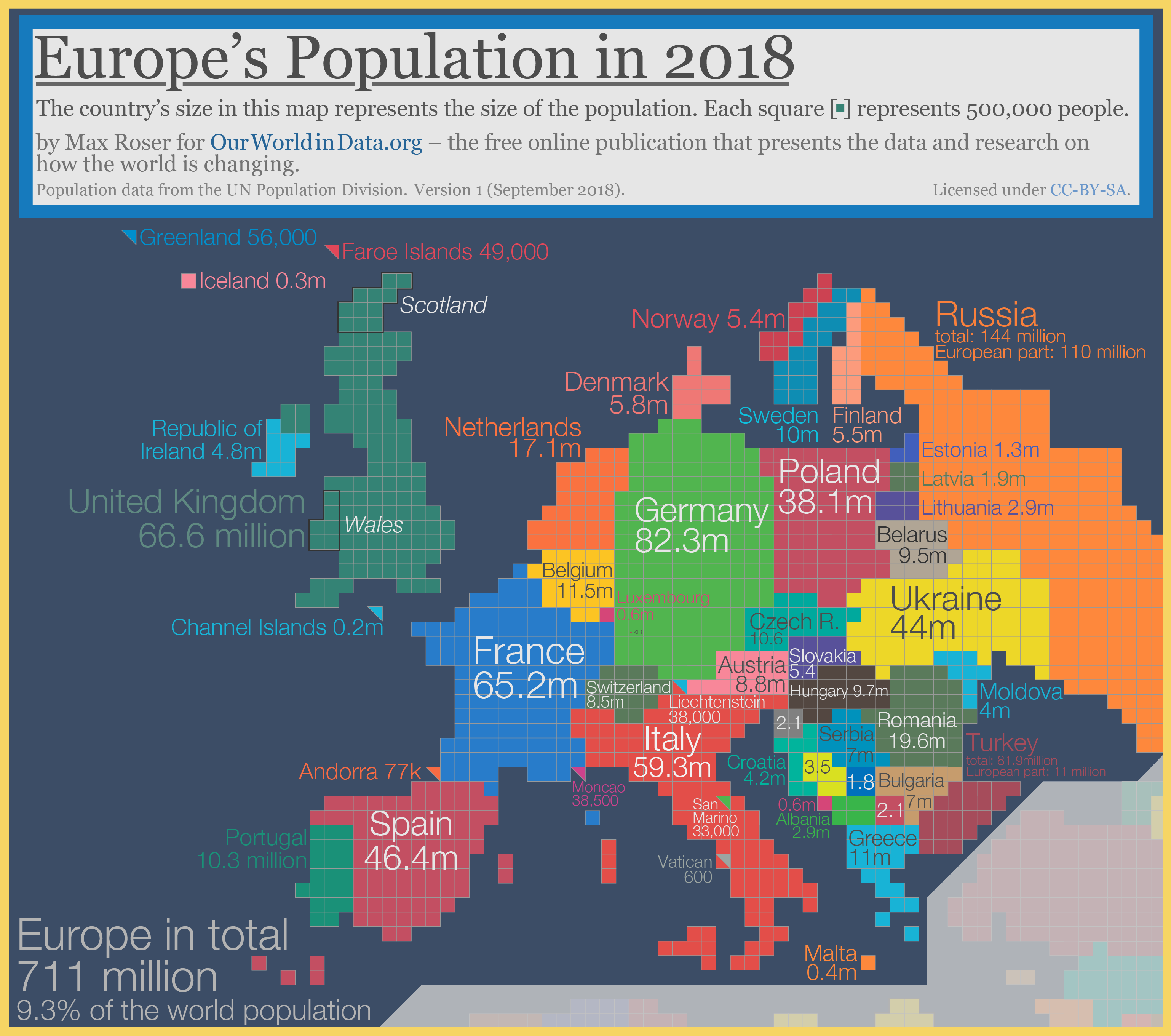
The Netherlands and Belgium, two countries with higher population densities than most European nations, also appear more prominent on this style of map.
The Americas
On the map below, Mexico has exploded to almost 4X the size of Canada. That’s because although the Great White North is the world’s second largest country in size, it only has a fraction of the population of Mexico.
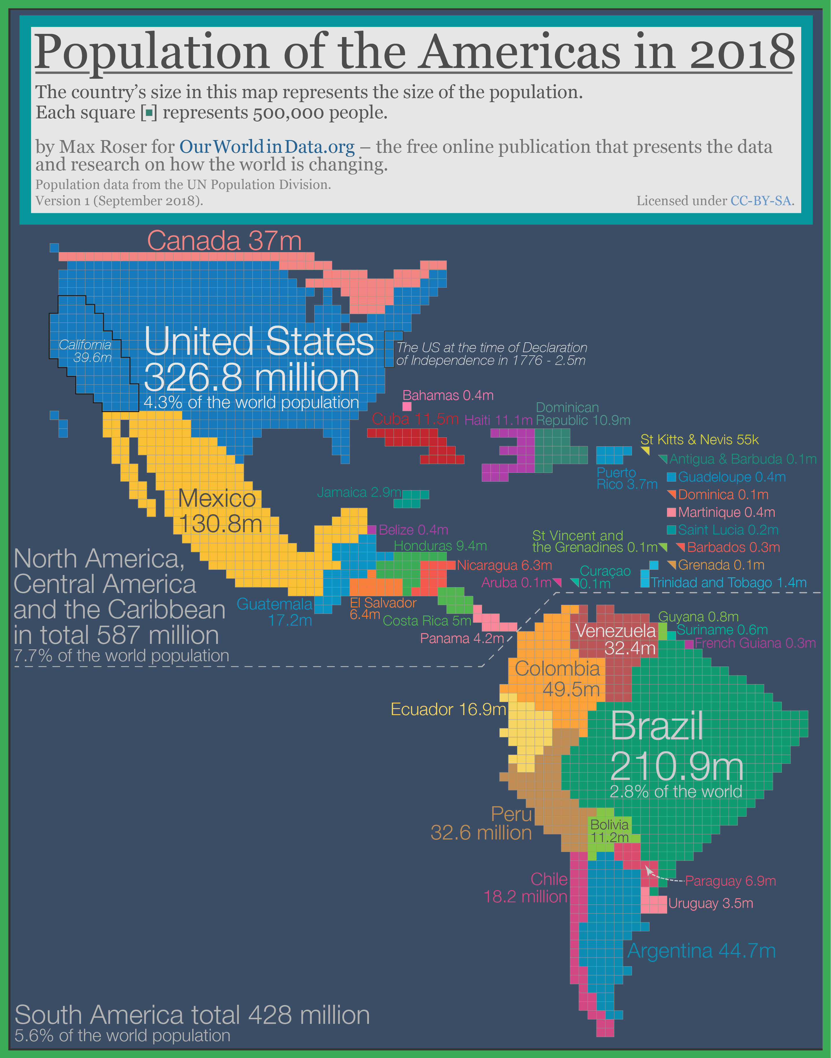
Meanwhile, it’s evident that Argentina’s population is lower than the country’s giant landmass leads on.
Africa
Finally, we’ll look at Africa, which is in the middle of a massive population boom.
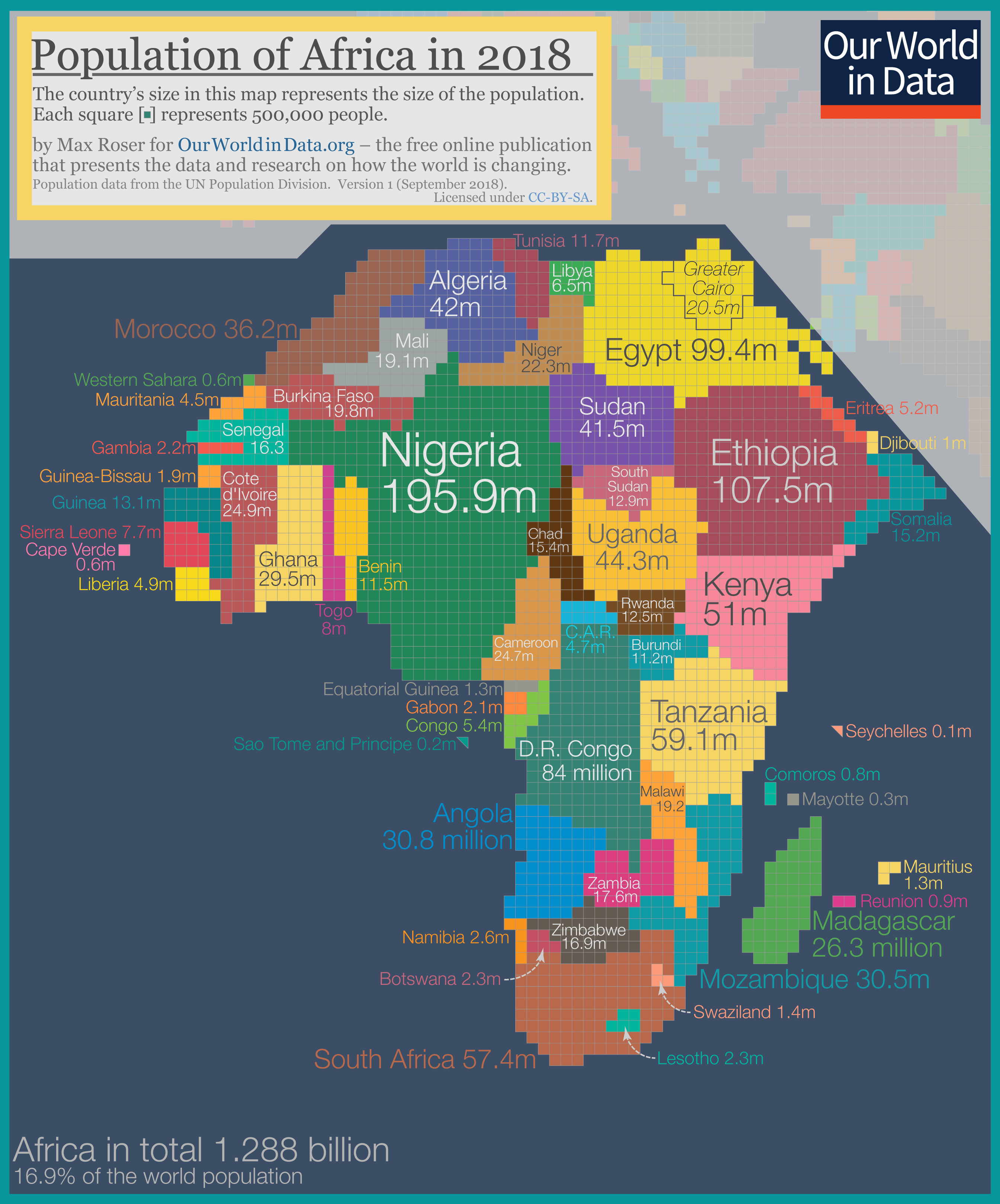
Countries like Namibia, Botswana, and Chad almost disappear.
Nigeria, which is expected to have the world’s largest city by 2100 with over 88 million residents, is the largest country in Africa using this cartogram method.


Public Opinion
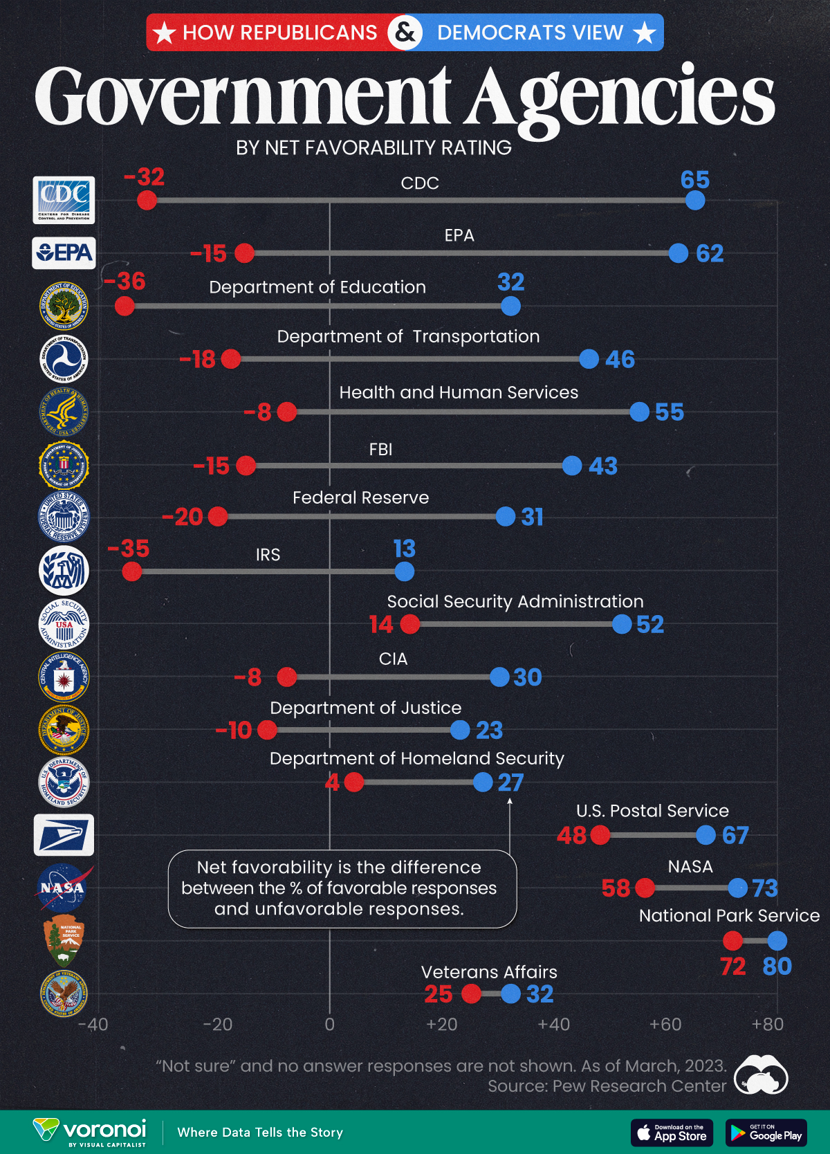
Charted: How Democrats and Republicans View Government Agencies
Predictably, results diverge when both Democrats and Republicans are asked to rate key government agencies in the United States.

How Democrats and Republicans View Government Agencies
This was originally posted on our Voronoi app. Download the app for free on iOS or Android and discover incredible data-driven charts from a variety of trusted sources.
Forget the presidential race, the partisan divide in America can also be seen by how Democrats and Republicans feel about key government agencies.
We visualize the net favorability ratings of 16 federal government agencies, based on respondent party affiliation.
To find this data, Pew Research Center surveyed more than 10,000 adults, between March 13-19, 2023. View their methodology page for more details about the survey, the questions asked, and the results obtained.
Republicans Don’t Like How the CDC Handled the Pandemic
The division in net favorability is deepest for three federal government agencies. While the CDC garnered a net favorability rating of 65 from Democrats, more Republicans rated the agency unfavorably, leading to a net favorability rating of -32.
Similarly, with the EPA and the Department of Education, the difference in net favorability between the two voting sides is as high as 70–80 points.
| Federal Agency | Republican Net Favorability Rating | Democrat Net Favorability Rating |
|---|---|---|
| 🔬 CDC | -32 | 65 |
| 🌿 EPA | -15 | 62 |
| 📚 Department of Education | -36 | 32 |
| 🚗 Department of Transportation | -18 | 46 |
| 💉 Health and Humans Services | -8 | 55 |
| 💰 Federal Reserve | -20 | 31 |
| 🕵️ FBI | -15 | 43 |
| 💼 IRS | -35 | 13 |
| 💼 Social Security Admin | 14 | 52 |
| 🕵️♂️ CIA | -8 | 30 |
| ⚖️ Justice Department | -10 | 23 |
| 🛡️ Homeland Security | 4 | 27 |
| 📮 USPS | 48 | 67 |
| 🚀 NASA | 58 | 73 |
| 🏞️ Park Service | 72 | 80 |
| 🎖️ Veterans Affairs | 25 | 32 |
Pew Research Center notes that Republicans didn’t always view the CDC quite so unfavorably, though a direct comparison is impossible.
Nevertheless, per the source, in March 2020, 84% of surveyed Republicans expressed positive views of the CDC’s performance. By October 2022, just 32% said the CDC had done an excellent or good job of handling the pandemic.
Meanwhile, there are a few agencies the two sides do agree on: the National Park Service, the Postal Service, and NASA.
And they both agree on Veterans Affairs as well: though neither share a particularly high opinion of the organization.
Finally, Democrats consistently rate all sixteen agencies on the survey more favorably than Republicans, showing consistency about how each side views the government in general.

-
 Demographics6 days ago
Mapped: U.S. Immigrants by Region
-
 United States2 weeks ago
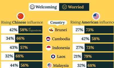
Charted: What Southeast Asia Thinks About China & the U.S.
-

 United States2 weeks ago
The Evolution of U.S. Beer Logos
-

 Healthcare2 weeks ago
What Causes Preventable Child Deaths?
-
 Energy1 week ago
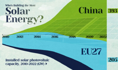
Who’s Building the Most Solar Energy?
-

 Markets1 week ago
Mapped: The Most Valuable Company in Each Southeast Asian Country
-

 Technology1 week ago
Mapped: The Number of AI Startups By Country
-
 Healthcare1 week ago
Life Expectancy by Region (1950-2050F)