

the pleasure of showing & looking at words - Belle Lettere
the pleasure of showing & looking at words - Belle Lettere
the pleasure of showing & looking at words - Belle Lettere

You also want an ePaper? Increase the reach of your titles
YUMPU automatically turns print PDFs into web optimized ePapers that Google loves.
THE PLEASURE OF SHOWING & LOOKING<br />
AT WORDS<br />
by Manfredo Massironi<br />
THE ENTRY<br />
Calligraphy has always had complic<strong>at</strong>ed and transversal rel<strong>at</strong>ionshÔs<br />
w⁄h many <strong>of</strong> <strong>the</strong> events, proceßes, discoveries, techniques and arts<br />
with which it has been required to live, or <strong>at</strong> least interaÀ. `ese rel<strong>at</strong>ionshÔs,<br />
which are always slightly out <strong>of</strong> phase, regard:<br />
1. rel<strong>at</strong>ionships with <strong>the</strong> text – writing and reading – and <strong>the</strong>refore<br />
with <strong>the</strong> press, <strong>of</strong>ten dialectical and occasionally even conflictual.<br />
2. bonds <strong>of</strong> kinship with <strong>the</strong> world <strong>of</strong> art, and <strong>the</strong>refore frequent rel<strong>at</strong>ionships<br />
<strong>of</strong> contiguity with o<strong>the</strong>r means <strong>of</strong> expression, communic<strong>at</strong>ion,<br />
and aes<strong>the</strong>tic research.<br />
3. different rel<strong>at</strong>ionships <strong>of</strong> funÀional⁄y in di°erent cultures.<br />
Due to <strong>the</strong> vast dimensions <strong>of</strong> <strong>the</strong> subject and <strong>the</strong> limits to my knowledge,<br />
a system<strong>at</strong>ic consider<strong>at</strong>ion <strong>of</strong> <strong>the</strong> complic<strong>at</strong>ed questions summarized<br />
in <strong>the</strong> three points above will not be possible. The prepar<strong>at</strong>ion<br />
<strong>of</strong> a series <strong>of</strong> cards dealing ra<strong>the</strong>r casually with a number <strong>of</strong> <strong>the</strong>ir<br />
aspects must neceÊarily represent something <strong>of</strong> a short-cut for me,<br />
in which I hope to draw <strong>at</strong>tention to <strong>the</strong> elements <strong>of</strong> gre<strong>at</strong>est curiosity<br />
and interest in an <strong>at</strong>tempt to cultiv<strong>at</strong>e th<strong>at</strong> certain “lightness” th<strong>at</strong><br />
Calvino aÇrms as being <strong>the</strong> prerog<strong>at</strong>ive <strong>of</strong> good liter<strong>at</strong>ure, and which<br />
I believe to be one <strong>of</strong> <strong>the</strong> essential elements and <strong>pleasure</strong>s <strong>of</strong> calligraphy<br />
as well.<br />
THE ORIGINS, BUT NOT THE BEGINNING<br />
The first singularity <strong>of</strong> calligraphy regards its <strong>of</strong>ficial birth during a<br />
period <strong>of</strong> <strong>the</strong> Renaißance. We can all easily imagine th<strong>at</strong> calligraphy<br />
was already alive and flourishing <strong>at</strong> <strong>the</strong> time, with <strong>the</strong> awareness provided<br />
by <strong>the</strong>ir discoveries and inventions and <strong>the</strong> reassurance <strong>of</strong> <strong>the</strong>ir<br />
geometry and <strong>the</strong> truths <strong>of</strong> <strong>the</strong>ir proportions th<strong>at</strong> <strong>the</strong> Italian artists<br />
and humaniÌs <strong>of</strong> <strong>the</strong> Renaissance decreed its cre<strong>at</strong>ion. Most probably,<br />
in <strong>the</strong> approxim<strong>at</strong>ely 4500 years between <strong>the</strong> first appearance <strong>of</strong> writ-<br />
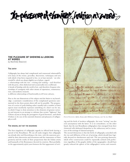
FELICE FELICIANO, Alfabeto, Roma 1460 (Biblioteca V<strong>at</strong>icana, cod. V<strong>at</strong>. l<strong>at</strong>. 6852)<br />
ing and <strong>the</strong> birth <strong>of</strong> modern calligraphy, <strong>the</strong> term “writing” was also<br />
even synonymous with <strong>the</strong> l<strong>at</strong>ter. It is no coincidence, on <strong>the</strong> o<strong>the</strong>r<br />
hand, th<strong>at</strong> <strong>the</strong> new Renaißance calligraphers th<strong>at</strong> emerged from <strong>the</strong>ir<br />
cloistered cells dedic<strong>at</strong>ed <strong>the</strong>mselves to <strong>the</strong> rediscovery and re-invention<br />
<strong>of</strong> <strong>the</strong> writings <strong>of</strong> classical antiquity.<br />
The second distinction is th<strong>at</strong> <strong>the</strong> birth <strong>of</strong> calligraphy coincided with<br />
<strong>the</strong> rise and diffusion <strong>of</strong> <strong>the</strong> art <strong>of</strong> printing, which should have logically<br />
decreed its obsolescence and end. The new printing characters,<br />
which aÓer construction could be repe<strong>at</strong>edly utilized with perfection<br />
regardless <strong>of</strong> <strong>the</strong> graphic ability <strong>of</strong> <strong>the</strong> typographer, should have<br />
gre<strong>at</strong>ly reduced <strong>the</strong> sphere <strong>of</strong> <strong>the</strong> calligrapher's action and research.<br />
XXV
Precisely <strong>the</strong> opposite occurred, however. European calligraphers,<br />
first <strong>of</strong> whom <strong>the</strong> Italians, provided <strong>the</strong> German printers who had<br />
come to Italy with newer, elegant and better proportioned characters<br />
than <strong>the</strong> crudely formed approxim<strong>at</strong>ive letters <strong>the</strong>y were accustomed<br />
to using.<br />
GEOFROY TORY, Champ fleury, Lettres <strong>at</strong>tiques, 1529<br />
We owe <strong>the</strong> oldest work to reach modern times – in which <strong>the</strong> geometrical<br />
struÀure <strong>of</strong> <strong>the</strong> letters is performed on <strong>the</strong> basis <strong>of</strong> <strong>the</strong><br />
square and circle – to <strong>the</strong> Veronese Humanist Felice Feliciano, who<br />
derived his charaÀers first published in 1463 from his studies <strong>of</strong><br />
Roman inscriptions.<br />
Thanks to ano<strong>the</strong>r farsighted mechanism <strong>of</strong> hiÌory – those th<strong>at</strong><br />
make things proceed differently than <strong>the</strong> way <strong>the</strong> myopia <strong>of</strong> human<br />
logic might o<strong>the</strong>rwise indic<strong>at</strong>e – <strong>the</strong> invention <strong>of</strong> <strong>the</strong> printing press<br />
promoted, ra<strong>the</strong>r than discouraged, <strong>the</strong> production and popularity<br />
<strong>of</strong> manuals <strong>of</strong> calligraphy. By expanding <strong>the</strong> supply <strong>of</strong> liter<strong>at</strong>ure, <strong>the</strong><br />
printing press also increased <strong>the</strong> demand for access to writing.<br />
Writing was a tool for <strong>the</strong> HumaniÌs, whose beauty, utility and decor<br />
was based on proportions, or <strong>the</strong> hidden rel<strong>at</strong>ionships <strong>of</strong> arithmetic-geometric<br />
n<strong>at</strong>ure destined to reveal <strong>the</strong> perfeÀion and harmony<br />
th<strong>at</strong> governs <strong>the</strong> universe, from <strong>the</strong> celestial spheres to <strong>the</strong> humble<br />
letters <strong>of</strong> <strong>the</strong> alphabet. Some <strong>of</strong> <strong>the</strong> leading artists and scientists <strong>of</strong><br />
<strong>the</strong> Renaissance, such as L.B. Alberti, L. Pacioli, and A. Dürer,<br />
dedic<strong>at</strong>ed serious effort to character design and architeÀure. The true<br />
master calligraphers, such as Ludovico Arrighi (known as Vicentino),<br />
who perfected and gave final form to <strong>the</strong> Chancellery script and<br />
Sigismondo Fante da Ferrara, <strong>the</strong> author <strong>of</strong> an important tre<strong>at</strong>ise on<br />
<strong>the</strong> shapes and proportions <strong>of</strong> <strong>the</strong> principal scripts published in 1514,<br />
developed <strong>the</strong> basic texts on <strong>the</strong> geometrical rules governing character<br />
design th<strong>at</strong> came to constitute a point <strong>of</strong> reference for all <strong>the</strong> calligraphers<br />
in Europe.<br />
The numbers and <strong>the</strong> geometrical correspondence th<strong>at</strong> confirm<br />
<strong>the</strong> choices, however, were first identified and manipul<strong>at</strong>ed by <strong>the</strong><br />
Renaissance designers on <strong>the</strong> basis <strong>of</strong> esoteric, mythological, and<br />
astrological justific<strong>at</strong>ions.<br />
Choices made on <strong>the</strong> basis <strong>of</strong> magic and mystery remain in place only<br />
as long as <strong>the</strong>y continue to be supported by faith, while explan<strong>at</strong>ions<br />
dict<strong>at</strong>ed by faith can permit <strong>the</strong>mselves <strong>the</strong> luxury <strong>of</strong> being r<strong>at</strong>ionally<br />
inconsiÌent.<br />
XXVI<br />
`is aı⁄ude – which toge<strong>the</strong>r with <strong>the</strong> demonstr<strong>at</strong>ion provided by<br />
Fante's book, <strong>the</strong> `eorica et pr<strong>at</strong>ica, set <strong>the</strong> standard for <strong>the</strong> European<br />
calligraphers <strong>of</strong> <strong>the</strong> day – can be sÕn in <strong>the</strong> amusing di<strong>at</strong>ribe provided<br />
by <strong>the</strong> French calligrapher Ge<strong>of</strong>roy Tory in his handsome book<br />
entitled Champ Fleury raised in regard to L. Pacioli, S. Fante, and L.<br />
Vicentino. Tory's work deals with «The Art and science<br />
<strong>of</strong> <strong>the</strong> appropri<strong>at</strong>e shape and proportion <strong>of</strong> Attic<br />
letters, also known as Ancient letters or even Roman<br />
letters in common speech». Tory claims th<strong>at</strong> Bro<strong>the</strong>r<br />
Luca Pacioli had designed Attic letters without saying<br />
anything or providing explan<strong>at</strong>ions on his method,<br />
and this was no marvel, Tory continues, upon hearing<br />
th<strong>at</strong> Pacioli had taken his letters from old Leonardo<br />
da Vinci, who had recently expired in Amboise.<br />
This explains why <strong>the</strong> characters <strong>of</strong> <strong>the</strong> monk were not<br />
drawn in <strong>the</strong> correct proportions th<strong>at</strong> Tory himself<br />
would provide as examples in his book.<br />
In <strong>the</strong> same way, nei<strong>the</strong>r had <strong>the</strong> classic letters <strong>of</strong><br />
Sigismondo Fante or Ludovico Vicentino been<br />
drafted correctly in Tory's view. He also st<strong>at</strong>ed th<strong>at</strong><br />
although he was unaware if Dürer had provided his<br />
own <strong>the</strong>ories in regard, <strong>the</strong>y could not have been<br />
anything but fallacious, given th<strong>at</strong> it was clear th<strong>at</strong> <strong>the</strong><br />
German artist had made miÌakes in <strong>the</strong> proportions<br />
<strong>of</strong> numerous letters presented in his book on perspective.<br />
Tory resumes <strong>the</strong> subject fur<strong>the</strong>r, complete<br />
with his technical commentary. After first explaining how <strong>the</strong> leıer<br />
“A” must be drawn, and juÌiÃing his choice with<br />
…as I have already said, th<strong>at</strong> A, if it be made according to art, must have ⁄s right leg as<br />
thick as <strong>the</strong> tenth part <strong>of</strong> its height, which is <strong>the</strong> breadth <strong>of</strong> one <strong>of</strong> <strong>the</strong> ten units contained<br />
between <strong>the</strong> eleven equidistant lines drawn in its square, and not as thick as <strong>the</strong> ninth part<br />
LUCA PACIOLI, Divina proportione, Venezia 1509
<strong>of</strong> its height, as Frere Lucas Paciolus <strong>of</strong> Bourg SainÀ-Sepulchre says in <strong>the</strong> Divina proportione<br />
which he says th<strong>at</strong> he wrote. His own <strong>words</strong> in vulgar Italian are as follows:<br />
Questa letera A si cava del tondo, e del suo quadro. La gamba da man<br />
drita vol esser grossa de la nove parti luna de lalteza. Th<strong>at</strong> is to say: “This<br />
letter A is partly rounded and partly square. The right leg must be as thick as one <strong>of</strong> nine<br />
parts <strong>of</strong> its height.” He divides his square into only nine parts & gives no reason <strong>the</strong>refor;<br />
wherefore, under correction, it seems to me th<strong>at</strong> he speaks ignorantly, going astray with <strong>the</strong><br />
very first letter, & so with all <strong>the</strong> rest. I have been told th<strong>at</strong> all th<strong>at</strong> he did in this m<strong>at</strong>ter he<br />
took secretly from <strong>the</strong> l<strong>at</strong>e Messire Leonardo da Vinci, who was a gre<strong>at</strong> ma<strong>the</strong>m<strong>at</strong>ician,<br />
painter, and image-maker. Sigismund Fante, a nobleman <strong>of</strong> Ferrara, who, as I have said,<br />
strives to teach how to make divers sorts <strong>of</strong> letters, gives no reasons for <strong>the</strong> proportions <strong>of</strong> his<br />
said letters, especially for <strong>the</strong> Antique letter. He, too, has gone astray in <strong>the</strong> A, <strong>the</strong> E, <strong>the</strong> L,<br />
<strong>the</strong> Q, <strong>the</strong> S, <strong>the</strong> T, and <strong>the</strong> X, which are not made as <strong>the</strong>y should be, ei<strong>the</strong>r in dimensions<br />
or in shape. The keen eye <strong>of</strong> <strong>the</strong> learned & studious man will be able easily to perceive this<br />
in <strong>the</strong> book which <strong>the</strong> said Sigismund has printed, entitled `eorica et pr<strong>at</strong>ica.<br />
But wh<strong>at</strong> are <strong>the</strong> elements Tory uses to base his certainties? We find an<br />
example <strong>at</strong> <strong>the</strong> end <strong>of</strong> his third book, which explains how punctu<strong>at</strong>ion<br />
marks are drawn:<br />
I here describe & draw <strong>the</strong>se three kinds <strong>of</strong> points only, according to <strong>the</strong> fashion <strong>of</strong> <strong>the</strong><br />
ancients, and according as <strong>the</strong> Attic letter demands, knowing full well th<strong>at</strong> <strong>the</strong> writers on<br />
grammar in <strong>the</strong> L<strong>at</strong>in tongue tre<strong>at</strong> <strong>of</strong> several o<strong>the</strong>r points, <strong>of</strong> which Aulus Antonius Orobius<br />
mentions eleven di°erent kinds, which are Punctum suspensivum, Geminum<br />
punctum, Semipunctum, Hypopliroma, Comma, Colon, Periodus,<br />
Interrog<strong>at</strong>ivum, Responsivum, Admir<strong>at</strong>ivum, & Paren<strong>the</strong>sis. Th<strong>at</strong><br />
is to say, <strong>the</strong> suspensive point, <strong>the</strong> double point, <strong>the</strong> half-point, <strong>the</strong><br />
hooked point, <strong>the</strong> incisive point, <strong>the</strong> bre<strong>at</strong>hing point, <strong>the</strong> concluding<br />
point, <strong>the</strong> point <strong>of</strong> interrog<strong>at</strong>ion, <strong>the</strong> responsive point, <strong>the</strong> point <strong>of</strong><br />
admir<strong>at</strong>ion, and <strong>the</strong> interposing point. All <strong>of</strong> <strong>the</strong>se, to <strong>the</strong> number<br />
<strong>of</strong> eleven, secretly & in divine fashion confirm me th<strong>at</strong> I have justifiably<br />
divided my square within which to make <strong>the</strong> Attic leıers, into<br />
eleven points, which is a manifest token th<strong>at</strong> I have not gone astray,<br />
but have studiously and surely discovered <strong>the</strong> secret <strong>of</strong> <strong>the</strong> even & odd<br />
numbers, th<strong>at</strong> is to say, <strong>of</strong> eleven points containing between <strong>the</strong>m ten<br />
uniform units, required according to <strong>the</strong> divine, and yet heret<strong>of</strong>ore<br />
almost unknown, opinion <strong>of</strong> excellent ancients.<br />
The days in which bitter polemics were waged on whe<strong>the</strong>r letters were<br />
to be divided in 9 parts or 11 have decidedly passed. The certainties<br />
th<strong>at</strong> one is prepared to advoc<strong>at</strong>e <strong>at</strong> all costs have decreased, and not<br />
only in regard to <strong>the</strong> geometrical grids in which <strong>the</strong> letters <strong>of</strong> <strong>the</strong><br />
alphabet were designed. There is no regret in this observ<strong>at</strong>ion and<br />
no nostalgia for aßurances lost, even if <strong>the</strong> odd minute certainty here<br />
and <strong>the</strong>re provides a support th<strong>at</strong> might help us to stay on our feet.<br />
We must learn to accustom ourselves to <strong>the</strong> support provided by only<br />
<strong>the</strong> smaller certainties and distrust <strong>the</strong> larger, however.<br />
The works on display in Cittadella and collected in this volume provide<br />
evident testimony <strong>of</strong> this st<strong>at</strong>e <strong>of</strong> affairs. Alongside <strong>the</strong> works<br />
inspired by <strong>the</strong> shapes and content <strong>of</strong> classical calligraphy, re-proposing<br />
<strong>the</strong>m in <strong>the</strong>ir personalized versions with all <strong>the</strong> <strong>pleasure</strong> <strong>of</strong><br />
rediscovering and reviving <strong>the</strong>ir internal harmony, <strong>the</strong>re are o<strong>the</strong>rs in<br />
which <strong>the</strong> leıers and script demonstr<strong>at</strong>e <strong>the</strong> search for o<strong>the</strong>r m<strong>at</strong>erials<br />
where pen and ink are not used, and <strong>the</strong> quest for new m<strong>at</strong>erials to<br />
replace <strong>the</strong> sheaf <strong>of</strong> paper; <strong>the</strong>re are works in which <strong>the</strong> text reluctantly<br />
concedes itself to reading. Everyone is aware th<strong>at</strong> aes<strong>the</strong>tic research<br />
must necessarily pass through <strong>the</strong> valley <strong>of</strong> <strong>the</strong> shadow <strong>of</strong> doubt, and<br />
thus here in C⁄tadella we may witness calligraphy as it plays <strong>at</strong> hideand-seek<br />
with <strong>the</strong> text, on one hand, and with painting or instal-<br />
BARTOLOMEO SANVITO, PADOVA 1495<br />
l<strong>at</strong>ions on <strong>the</strong> o<strong>the</strong>r. In <strong>the</strong>se cases, <strong>the</strong> letters and <strong>the</strong> <strong>words</strong> claim<br />
priority by aßuming <strong>the</strong> space <strong>of</strong> an unexpected monument (Paolo<br />
Marcolongo), or dissolve to become phantasms which openly declare<br />
<strong>the</strong>mselves incapable <strong>of</strong> bearing <strong>the</strong> weight <strong>of</strong> any specific reference.<br />
CALLIGRAPHY AND CALLIGRAPHIES<br />
If <strong>the</strong> entirely Western prejudice th<strong>at</strong> denigr<strong>at</strong>es calligraphy to <strong>the</strong> role<br />
<strong>of</strong> a minor art could ever be overcome and a comprehensive study on<br />
<strong>the</strong> world history performed, <strong>the</strong> starting point would invariably<br />
be <strong>the</strong> three gre<strong>at</strong> civiliz<strong>at</strong>ions <strong>of</strong> writing: <strong>the</strong> Chinese, whose ideographic<br />
scripture goes far beyond <strong>the</strong> realm <strong>of</strong> spoken language, and<br />
<strong>the</strong> Arabic and Western, with <strong>the</strong>ir common Semitic origin in <strong>the</strong><br />
Phoenician phonetic alphabet.<br />
Understanding all <strong>the</strong> implic<strong>at</strong>ions and meaning th<strong>at</strong> calligraphy has<br />
had in Far Eastern cultures is not easy for us WeÌerners. By <strong>the</strong> same<br />
token, even if Arabic culture is much more similar to ours, we can<br />
speak <strong>of</strong> Arabic calligraphy only in very superficial terms.<br />
SIGISMONDO FANTE, Theorica et pr<strong>at</strong>ica, Venezia 1514<br />
XXVII
None<strong>the</strong>less, in lieu <strong>of</strong> explan<strong>at</strong>ions, I believe it is worthwhile proposing<br />
a number <strong>of</strong> aspects th<strong>at</strong> evoke <strong>the</strong> charms <strong>of</strong> <strong>the</strong>se two marvellous<br />
worlds <strong>of</strong> calligraphy th<strong>at</strong> are not too far removed from <strong>the</strong> research<br />
conducted by several <strong>of</strong> <strong>the</strong> artists in display here in Cittadella.<br />
First <strong>of</strong> all, <strong>the</strong> difference in <strong>the</strong> texts to which calligraphy has lent its<br />
<strong>at</strong>traction must be noted. In <strong>the</strong> Chinese and Japanese worlds, calligraphy<br />
was considered a manifeÌ<strong>at</strong>ion <strong>of</strong> art in its own right, while <strong>the</strong><br />
texts were viewed purely as liter<strong>at</strong>ure, and poetry, in particular, found<br />
its expressive complementariness in <strong>the</strong> quality <strong>of</strong> <strong>the</strong> writing, or calligraphy.<br />
Arabic calligraphy is almost exclusively dedic<strong>at</strong>ed to religious<br />
faith.<br />
The surahs <strong>of</strong> <strong>the</strong> Koran are written and re-written throughout <strong>the</strong><br />
surface and <strong>the</strong>ir meaning – known and memorized by heart – are<br />
renewed by <strong>the</strong> invention and rhythm <strong>of</strong> every re-edition. If, on <strong>the</strong><br />
o<strong>the</strong>r hand, <strong>the</strong> <strong>the</strong>mes most dear to Western calligraphy were to be<br />
indic<strong>at</strong>ed, <strong>the</strong> selection would include <strong>the</strong> military, <strong>the</strong> religious<br />
and <strong>the</strong> moralistic-captional. One wonders if it is mere chance th<strong>at</strong><br />
one <strong>of</strong> <strong>the</strong> most renowned types <strong>of</strong> Western calligraphy is known as<br />
“Cancelleresca”, with <strong>the</strong> allusions to <strong>the</strong> world <strong>of</strong> bureaucracy <strong>the</strong><br />
term contains. The transcrÔtion <strong>of</strong> moral formulas, dedic<strong>at</strong>ions to<br />
<strong>the</strong> high and mighty authorities and <strong>the</strong> praise <strong>of</strong> <strong>the</strong>ir dynasties and<br />
exploits are among <strong>the</strong> topics to which Western calligraphy most commonly<br />
and willingly lent its letters.<br />
The charm and seduction <strong>of</strong> Far Eastern calligraphy – Japanese, to<br />
be specific – is skilfully depicted by GrÕnaway in his film entitled<br />
The Pillow Book, where <strong>the</strong> true leading protagonist is calligraphy. The<br />
film's title is taken from a literary work written around 1000 years ago<br />
by a Japanese courtesan, Sei Shonagon.<br />
The story told by Greenaway is a far cry from <strong>the</strong> contents <strong>of</strong> <strong>the</strong><br />
book, a combin<strong>at</strong>ion <strong>of</strong> reportage, diary, and novel <strong>of</strong> life <strong>at</strong> <strong>the</strong><br />
Emperor's Court. Wh<strong>at</strong> <strong>the</strong> two works share in common, however,<br />
is <strong>the</strong> <strong>at</strong>tention, interest, curiosity, presence, and significance <strong>of</strong> <strong>the</strong><br />
continual references to calligraphy.<br />
The same direÀor had previously evoked <strong>the</strong> charm <strong>of</strong> Western calligraphy<br />
in a film inspired by Shakespeare's Tempest entitled ProÍero's<br />
Book. In both films, one <strong>of</strong> <strong>the</strong> most important and suÎeÌive elements<br />
is <strong>the</strong> hand <strong>of</strong> <strong>the</strong> calligrapher as filmed during <strong>the</strong> elegant dance<br />
<strong>of</strong> <strong>the</strong> letters over <strong>the</strong> page. The hand in question is th<strong>at</strong> <strong>of</strong> Brody<br />
Neuenschwander, <strong>the</strong> winner <strong>of</strong> this year's first edition <strong>of</strong> <strong>the</strong> “<strong>Belle</strong><br />
<strong>Lettere</strong> Award”. The consistency <strong>of</strong> his work and <strong>the</strong> wealth <strong>of</strong> his<br />
inventions, and <strong>the</strong> choice <strong>of</strong> m<strong>at</strong>erials imported majestically combine<br />
<strong>the</strong> tension <strong>of</strong> <strong>the</strong> most intense visual research with <strong>the</strong> memory<br />
and allusion <strong>of</strong> <strong>the</strong> past.<br />
ALBRECHT DÜRER, GERM ANY 1528<br />
XXVIII<br />
CALLIGRAPHY AND PLEASURE<br />
We shall return to <strong>the</strong> charm th<strong>at</strong> calligraphy has exerted over Japanese<br />
society. The five basic schools <strong>of</strong> Chinese calligraphy had already<br />
reached Japan by <strong>the</strong> end <strong>of</strong> <strong>the</strong> 4th Century. These five were completed<br />
by a completely Japanese vari<strong>at</strong>ion introduced during <strong>the</strong> 8th<br />
Century composed by kana characters, which were in net contrast with<br />
<strong>the</strong> ideograms <strong>of</strong> Chinese origin because <strong>the</strong>y expreÊed <strong>the</strong> sounds <strong>of</strong><br />
<strong>the</strong> language ra<strong>the</strong>r than concepts.<br />
Three types <strong>of</strong> kana were subsequently developed: manyogana, hiragana,<br />
and k<strong>at</strong>akana. Before this system gained dominance, a number <strong>of</strong><br />
Japanese poems were written in Chinese ideograms utilized phonetically,<br />
while o<strong>the</strong>r were written in Chinese characters used sometimes<br />
phonetically and o<strong>the</strong>r times ideographically, and it was from this<br />
l<strong>at</strong>ter th<strong>at</strong> <strong>the</strong> hiragana and k<strong>at</strong>akana scripts were derived by means <strong>of</strong><br />
drastic simplific<strong>at</strong>ions.<br />
Thanks to <strong>the</strong> fundamental contributions made by <strong>the</strong> Japanese<br />
noble-women, <strong>the</strong> hiragana script evolved into <strong>the</strong> elegant, proportioned<br />
and unique style <strong>of</strong> Japanese calligraphy. It is interesting to<br />
note, by <strong>the</strong> way, in regard to women and calligraphy, th<strong>at</strong> approxim<strong>at</strong>ely<br />
50% <strong>of</strong> <strong>the</strong> work on display in Ciıadella this year was made by<br />
women artists.<br />
I am unable to provide an explan<strong>at</strong>ion for this positively singular<br />
fact, apart from saying th<strong>at</strong> for some unknown reason th<strong>at</strong> would be<br />
interesting to investig<strong>at</strong>e, today’s women find <strong>the</strong>mselves just as much<br />
<strong>at</strong> ease in this cre<strong>at</strong>ive medium as <strong>the</strong> Japanese noble-women so many<br />
centuries ago.<br />
In both Japanese and Chinese society, <strong>the</strong> meaning <strong>of</strong> written poetry<br />
cannot be completely expressed unless it is rendered in elegant calligraphy<br />
th<strong>at</strong> is consonant with <strong>the</strong> significance <strong>of</strong> <strong>the</strong> poem. In <strong>the</strong> same<br />
way th<strong>at</strong> a poetic text must be read with <strong>the</strong> right emphasis and scansion,<br />
a written text must be visually finished with skill and sensitivity.<br />
`is is an aspect th<strong>at</strong> is completely ignored by Western culture, in<br />
which <strong>the</strong> abstraction <strong>of</strong> <strong>the</strong> word is considered sufficient to transmit<br />
its content independently from <strong>the</strong> pictorial illustr<strong>at</strong>ion <strong>of</strong> <strong>the</strong> visual<br />
represent<strong>at</strong>ion.<br />
Below, we provide some examples <strong>of</strong> <strong>the</strong> <strong>at</strong>tention dedic<strong>at</strong>ed to calligraphy<br />
by <strong>the</strong> 10th Century Japanese Court th<strong>at</strong> show how its every<br />
aspect was appreci<strong>at</strong>ed, beginning with <strong>the</strong> selection <strong>of</strong> <strong>the</strong> type and<br />
colour <strong>of</strong> <strong>the</strong> paper. Such painstaking consider<strong>at</strong>ions are entirely<br />
lacking in our culture. Court life – as described by Sei Shonagon<br />
– was charaÀerized by a whirling exchange <strong>of</strong> letters, notes, poems,<br />
and poetic recitals and tournaments filled with oblique references to<br />
both ancient and modern poetry in which <strong>the</strong> ladies, courtesans, and<br />
intellectuals <strong>of</strong> <strong>the</strong> Court were requested not only to judge without<br />
hesit<strong>at</strong>ion <strong>the</strong> defects and values <strong>of</strong> each text, but also to<br />
respond in kind.<br />
We cite a few lines seleÀed <strong>at</strong> random:<br />
from Chapter 23<br />
…His Majesty <strong>the</strong>n recounted: «In <strong>the</strong> days <strong>of</strong> <strong>the</strong> Emperor Murakami lived<br />
Her Highness, <strong>the</strong> Lady-in Waiting <strong>of</strong> <strong>the</strong> Pavilion <strong>of</strong> Light, which as you<br />
certainly all know was <strong>the</strong> daughter <strong>of</strong> <strong>the</strong> Gre<strong>at</strong> Minister <strong>of</strong> <strong>the</strong> LeÓ Hand<br />
faction.<br />
When she was still a young princess, her fa<strong>the</strong>r instructed her with this command:<br />
“Practise, above all, calligraphy, and <strong>the</strong>n learn to play <strong>the</strong> sevenstringed<br />
koto […], and <strong>the</strong>n learn by heart all twenty volumes <strong>of</strong> <strong>the</strong> AntholoË<br />
<strong>of</strong> Ancient and Modern Japanese Poetry. Your educ<strong>at</strong>ion must be based on<br />
<strong>the</strong>se three cardinal points”.»
In Chapter 31, entitled “Pleasant things”<br />
To succÕd in wr⁄ing a leıer on fine, spotless Chinese paper with slender characters, despite<br />
<strong>the</strong> large tip <strong>of</strong> <strong>the</strong> brush.<br />
In Chapter 82<br />
…as I awaited who knows wh<strong>at</strong> wr⁄ten declar<strong>at</strong>ion <strong>of</strong> love […], I took out <strong>the</strong> epistle and<br />
observed it closely: it was fine rice paper in a pale blue tint written with pure and harmonious<br />
characters, but <strong>the</strong> contents were unfortun<strong>at</strong>ely not such to cause my heart to tremble,<br />
inasmuch as <strong>the</strong> flowing meÊage was written in Chinese: «…in <strong>the</strong> season <strong>the</strong> flowers in<br />
<strong>the</strong> capital bloom, you stand behind <strong>the</strong> curtain <strong>of</strong> brocade» and below th<strong>at</strong>, in Japanese<br />
«Can you tell me how <strong>the</strong> poem continues?». Perplexed, I thought th<strong>at</strong> if only His<br />
Majesty were here, I could show <strong>the</strong> letter to him and request his advice, <strong>the</strong>reby avoiding<br />
committing humili<strong>at</strong>ing errors in an ambitious <strong>at</strong>tempt to follow suit.<br />
In Chapter 89, entitled “Refined Particulars”<br />
A letter written on light blue tinted rice paper and bound with recently budded utsugi<br />
branches [Japanese gardenia]… A letter sealed with violet paper, bound by a long cluster<br />
<strong>of</strong> wisteria flowers may also be said to be refined…<br />
In Chapter 133, where mention is made <strong>of</strong> a note Sei receives<br />
It was written in such a stupendous hand th<strong>at</strong> I immedi<strong>at</strong>ely went to show it to His Majesty,<br />
who praised it by saying «It is written marvellously well and is also elegant and humorous»<br />
[…] I <strong>the</strong>n whispered to His Majesty «How must I reply?», and sent a message<br />
<strong>of</strong> <strong>the</strong> following <strong>words</strong> on flaming pink paper: «The servant who did not come to present<br />
me with this message personally seems an extremely cold man to me». I bound <strong>the</strong> paper<br />
toge<strong>the</strong>r with <strong>the</strong> branch <strong>of</strong> a plum tree and sent it o°.<br />
In Chapter 138<br />
…when she opened it, she was amazed to see a hazel-nut coloured paper with a poem<br />
written in <strong>the</strong> stupendous calligraphy <strong>of</strong> <strong>the</strong> monks: «Once again I carry in memory this<br />
handful <strong>of</strong> flowers [<strong>of</strong> <strong>the</strong> type used for <strong>the</strong> dyeing <strong>of</strong> mourning gowns] when <strong>the</strong> leaves are<br />
already turning colour in <strong>the</strong> capital [signiÃing th<strong>at</strong> <strong>the</strong> mourning period is over]».<br />
In Chapter 143<br />
…I opened it trembling uncontrollably: <strong>the</strong> page was white, but contained a petal <strong>of</strong> yamabuki<br />
flower on which <strong>the</strong> <strong>words</strong> «think without saying» were penned.<br />
In <strong>the</strong> fragments added to <strong>the</strong> appendix<br />
The colours th<strong>at</strong> I prefer in thin, fine-grain paper are white, violet, red, freshly-cut grass<br />
green, and sky blue.<br />
The box for writing must be th<strong>at</strong> <strong>of</strong> lacquered wood with inserts <strong>of</strong> mo<strong>the</strong>r-<strong>of</strong>-pearl and<br />
designs <strong>of</strong> clouds and birds.<br />
The best pens for <strong>the</strong> winter are those made with camel hair th<strong>at</strong> are easy to use and pretty<br />
to see, and also those <strong>of</strong> hare are good.<br />
The most precious ink sticks are <strong>the</strong> round ones.<br />
Compared to this continuous <strong>at</strong>tention for <strong>the</strong> ways, forms, and<br />
instruments <strong>of</strong> Far Eastern calligraphy, <strong>the</strong> only similar mention I<br />
have found in our tradition lies in a well-known sonnet by Guido<br />
Cavalcanti in which <strong>the</strong> tools <strong>of</strong> writing are transformed into <strong>the</strong><br />
interpreters and heralds <strong>of</strong> <strong>the</strong> poet's su°ering:<br />
We are <strong>the</strong> saddened pens,<br />
The aching scissors and knife<br />
Th<strong>at</strong> painfully transcribed<br />
The <strong>words</strong> you have heard.<br />
WANG WEI (1555–1636), A SINGLE<br />
CHARACTER IN A P OEM<br />
CALLIGRAPHY AND FAITH<br />
Fearful th<strong>at</strong> figur<strong>at</strong>ive art might encourage idol<strong>at</strong>ry, <strong>the</strong> <strong>the</strong>ocracy<br />
<strong>of</strong> Islam chose and promoted <strong>the</strong> art <strong>of</strong> calligraphy as <strong>the</strong> privileged<br />
form <strong>of</strong> reliÿous expression, where it is used primarily for <strong>the</strong> tireless<br />
repetition <strong>of</strong> prayers, and <strong>the</strong> writing and rewriting <strong>of</strong> <strong>the</strong> divine<br />
messages <strong>of</strong> <strong>the</strong> Koran on every poßible surface. But in this rewriting,<br />
for as redundant and commonplace as <strong>the</strong> message might be, <strong>the</strong><br />
text is visually renewed through <strong>the</strong> abÌract beauty <strong>of</strong> <strong>the</strong> lines th<strong>at</strong><br />
constantly invent different ways to transmit <strong>the</strong> flowing energy <strong>of</strong> <strong>the</strong><br />
letters and <strong>the</strong> blank spaces in between. The idea <strong>of</strong> this flow <strong>of</strong> energy<br />
shared by all works <strong>of</strong> Arabic calligraphy is not immedi<strong>at</strong>ely evident to<br />
<strong>the</strong> untrained eye more concerned perhaps with <strong>the</strong> analysis <strong>of</strong> <strong>the</strong><br />
contents <strong>of</strong> <strong>the</strong> text. Wh<strong>at</strong> <strong>the</strong> calligrapher writes is not as important<br />
as <strong>the</strong> way it is wr⁄ten. The control <strong>of</strong> <strong>the</strong> energy th<strong>at</strong> will autom<strong>at</strong>ically<br />
guide <strong>the</strong> calligrapher in writing and th<strong>at</strong> is evident in <strong>the</strong> work<br />
is achieved through tireless repetition in which punctu<strong>at</strong>ion signs,<br />
letters, and <strong>words</strong>, recognizable or illegible, are repe<strong>at</strong>ed thousands<br />
<strong>of</strong> times and even superimposed over <strong>the</strong> same sheet, as in <strong>the</strong> Turkish<br />
practice known as karalama, talim, and mesk. One important aspect <strong>of</strong><br />
each exercise regards <strong>the</strong> control <strong>of</strong> <strong>the</strong> bre<strong>at</strong>h, which must be suited<br />
to follow <strong>the</strong> rhythm <strong>of</strong> <strong>the</strong> writing, «<strong>the</strong> gestures <strong>of</strong> pushing or pulling<br />
will never be <strong>the</strong> same if performed while inhaling or exhaling.<br />
[…] If <strong>the</strong> calligrapher wants <strong>the</strong> line to remain pure, he must hold<br />
his bre<strong>at</strong>h […] <strong>the</strong> pauses in writing are precise and standardized<br />
and serve to fill <strong>the</strong> lungs with air and <strong>the</strong> pen with ink» (Ayah Issa<br />
Khassaf).<br />
Arabic calligraphy has its own rules <strong>of</strong> proportion for its letters, but<br />
<strong>the</strong>se all regard <strong>the</strong> interiors <strong>of</strong> <strong>the</strong> signs traced, and not <strong>the</strong> exteriors<br />
on <strong>the</strong> basis <strong>of</strong> <strong>the</strong> abstract and absolute geometry revealed by <strong>the</strong><br />
<strong>words</strong> <strong>of</strong> Tory. The Arabic rules are based on <strong>the</strong> size <strong>of</strong> <strong>the</strong> alif (<strong>the</strong><br />
first letter <strong>of</strong> <strong>the</strong> Arabic alphabet, essentially a straight vertical sign),<br />
whose height, which varies depending on di°erent styles and calligraphies,<br />
can range from 3 to 12 points on <strong>the</strong> scale. The point, square<br />
in shape, was obtained by pressing <strong>the</strong> tip <strong>of</strong> <strong>the</strong> pen or brush on <strong>the</strong><br />
paper, and <strong>the</strong>refore depended on <strong>the</strong> way in which <strong>the</strong> ink-stand had<br />
been cut and <strong>the</strong> pressure exerted on <strong>the</strong> page. One important aspect<br />
<strong>of</strong> Arabic calligraphy is <strong>the</strong> expressive fullness <strong>of</strong> <strong>the</strong> empty volumes:<br />
every space, regardless <strong>of</strong> whe<strong>the</strong>r it is composed <strong>of</strong> characters or just<br />
<strong>the</strong> bottom <strong>of</strong> <strong>the</strong> page, must find its own force. Gre<strong>at</strong> <strong>at</strong>tention is<br />
given to <strong>the</strong> rel<strong>at</strong>ionship between <strong>the</strong> shape <strong>of</strong> <strong>the</strong> black letters and<br />
<strong>the</strong> forms th<strong>at</strong> <strong>the</strong> white spaces around <strong>the</strong>m aÊume. The control <strong>of</strong><br />
<strong>the</strong>se rel<strong>at</strong>ional aspects is performed not only through <strong>the</strong> vari<strong>at</strong>ion <strong>of</strong><br />
<strong>the</strong> shapes <strong>of</strong> <strong>the</strong> letters and <strong>the</strong> <strong>words</strong> but also through <strong>the</strong> vari<strong>at</strong>ion<br />
<strong>of</strong> <strong>the</strong>ir positions in space. Leıers and <strong>words</strong> can ei<strong>the</strong>r be condensed<br />
into dense and apparently intric<strong>at</strong>e knots or extended and stretched<br />
in length: <strong>the</strong>y can be folded to cre<strong>at</strong>e angles or used to design a curve<br />
in moments <strong>of</strong> balance continually loÌ and regained between <strong>the</strong><br />
force <strong>of</strong> <strong>the</strong> st<strong>at</strong>ic forms and <strong>the</strong> dynamism <strong>of</strong> <strong>the</strong> movement. While<br />
Western calligraphy rarely breaks <strong>the</strong> rule th<strong>at</strong> obliges characters and<br />
<strong>words</strong> to follow each o<strong>the</strong>r <strong>at</strong> equally measured intervals along horizontal<br />
lines positioned parallel on <strong>the</strong> page, Arabic calligraphy utilizes<br />
<strong>the</strong> space provided by <strong>the</strong> support with much gre<strong>at</strong>er freedom.<br />
Western calligraphy is based on a rigidly sequential concept <strong>of</strong> time,<br />
on a “beginning” th<strong>at</strong> starts <strong>at</strong> <strong>the</strong> left and an “aÓerwards” th<strong>at</strong> lies<br />
progressively fur<strong>the</strong>r to <strong>the</strong> right. Arabic calligraphy, while having<br />
similar rules <strong>of</strong> its own where <strong>the</strong> only difference is th<strong>at</strong> <strong>the</strong> text reads<br />
from right to left, is much less restricted by such formalities and has<br />
gre<strong>at</strong>er freedom to ignore <strong>the</strong>m. Space grants cre<strong>at</strong>iviÙ all its direc-
MAGHRIBI, Koran, 1560<br />
tions, while present time makes no claims on <strong>the</strong> future. This is wh<strong>at</strong><br />
we see in <strong>the</strong> few examples available <strong>of</strong> <strong>the</strong> karalama exercises mentioned<br />
previously. These works – which did not aspire to perfection,<br />
and whose purpose was not to exceed <strong>the</strong> works <strong>of</strong> o<strong>the</strong>r calligraphers<br />
or <strong>the</strong>mselves in order to reach <strong>the</strong> highest heights <strong>of</strong> art because<br />
<strong>the</strong> letters and <strong>the</strong> <strong>words</strong> had been rendered illeÿble by being thickly<br />
written one <strong>at</strong>op <strong>the</strong> o<strong>the</strong>r – come closer than ever to <strong>the</strong> spirit <strong>of</strong><br />
modern artistic research. These exercises, which may be rightly considered<br />
among <strong>the</strong> most important cre<strong>at</strong>ions <strong>of</strong> <strong>the</strong> calligraphers over<br />
<strong>the</strong> span <strong>of</strong> <strong>the</strong> centuries are works <strong>of</strong> art in <strong>the</strong>mselves. We may agree<br />
with Ferit Edgü when he defines <strong>the</strong>m as absolute works <strong>of</strong> art in <strong>the</strong>ir<br />
own right because <strong>the</strong>y express no intention <strong>of</strong> leading us anywhere<br />
and refer to no o<strong>the</strong>r meaning than <strong>the</strong>ir own. «These examples<br />
represent an obsessive rebellion <strong>of</strong> <strong>the</strong> letters, almost as if <strong>the</strong> speed<br />
<strong>of</strong> <strong>the</strong> hand th<strong>at</strong> cre<strong>at</strong>ed <strong>the</strong>m had been freed from <strong>the</strong> control <strong>of</strong> <strong>the</strong><br />
mind and human awareness.»<br />
More than a few <strong>of</strong> <strong>the</strong> works on display Cittadella <strong>of</strong>fer similar<br />
analogies to <strong>the</strong> karalama writing. In <strong>the</strong> works <strong>of</strong> Jan Roald, Sandra<br />
Schilling, Kennedy Hansen, Michael Hiemann, Helga Ladurner, and<br />
Glen Epstein, Gerald Geffert, it is not diÇcult to see an analogous<br />
freedom <strong>of</strong> research, an occasionally complete independence from<br />
<strong>the</strong> text and its legibility accompanied by a complete submission to <strong>the</strong><br />
charm <strong>of</strong> <strong>the</strong> letters and <strong>the</strong>ir construÀion. The leıers are redrawn,<br />
transformed, and str<strong>at</strong>ified into gre<strong>at</strong>er levels <strong>of</strong> depth, and distributed<br />
throughout space freed from <strong>the</strong> sequentiality <strong>of</strong> reading in a new<br />
“rebellion against literacy” th<strong>at</strong> is unprecedented in our tradition,<br />
but as we have seen, corrobor<strong>at</strong>ed by ancient and noble predecessors<br />
in <strong>the</strong> past.<br />
Modern aes<strong>the</strong>tic research, in its continual thrust to explore <strong>the</strong> fur<strong>the</strong>st<br />
reaches <strong>of</strong> <strong>the</strong> poßibilities <strong>of</strong> expression, has paradoxically now<br />
come closer to one <strong>of</strong> <strong>the</strong> richest and most fascin<strong>at</strong>ing arts <strong>of</strong> a culture<br />
to which we are in debt for many <strong>of</strong> its teachings.<br />
XXX<br />
CALLIGRAPHY, WRITING, AND ART<br />
We have already mentioned <strong>the</strong> fact<br />
th<strong>at</strong> <strong>the</strong> birth <strong>of</strong> writing preceded<br />
<strong>the</strong> <strong>of</strong>ficial birth <strong>of</strong> Western calligraphy,<br />
but how exactly was writing<br />
born? This is no mere academic<br />
question, because we intend to<br />
show th<strong>at</strong> calligraphy has maintained<br />
something from its origin<br />
th<strong>at</strong> writing appears to have lost.<br />
In <strong>the</strong> <strong>words</strong> <strong>of</strong> Gelb, “Complete<br />
writing” is a means <strong>of</strong> expressing<br />
linguistic content through conventionalized<br />
visible signs. This is <strong>the</strong><br />
final end <strong>of</strong> long journey achieved<br />
by all forms <strong>of</strong> writing th<strong>at</strong> have<br />
reached <strong>the</strong> st<strong>at</strong>e <strong>of</strong> “completion”.<br />
At <strong>the</strong> heart <strong>of</strong> writing lies visual<br />
perception, th<strong>at</strong> cognitive process<br />
through which awareness <strong>of</strong> our<br />
surroundings is instilled inside us<br />
– here and now – through which<br />
we learn very quickly to interpret<br />
and recognize both permanence<br />
and changing phenomena. We must recall th<strong>at</strong> homo sapiens, <strong>at</strong> a certain<br />
point during its prehistory, included among its “permanencies” th<strong>at</strong><br />
stimul<strong>at</strong>ed memory even a number <strong>of</strong> signs th<strong>at</strong> it left ei<strong>the</strong>r accidentally<br />
or intentionally in <strong>the</strong> places it lived.<br />
In Europe, <strong>the</strong> earliest traces d<strong>at</strong>e back to 30.000 years B.C., and<br />
include <strong>the</strong> first drawings th<strong>at</strong> human beings both figur<strong>at</strong>ively and<br />
abstractly painted on <strong>the</strong> walls <strong>of</strong> <strong>the</strong>ir caves. The first blooming <strong>of</strong><br />
n<strong>at</strong>uralistic cave art occurred around 25.000 B.C., and includes a vast<br />
production <strong>of</strong> figures th<strong>at</strong> were not rarely drawn with skill and verisimilitude.<br />
Although it is very hard to say with precision just why human<br />
beings began drawing or etching figures, we might think <strong>of</strong> magic,<br />
religious, or aes<strong>the</strong>tic reasons, while also considering motives <strong>of</strong> commemor<strong>at</strong>ion,<br />
joy in existence, and narr<strong>at</strong>ion. The <strong>pleasure</strong> <strong>of</strong> <strong>the</strong><br />
display <strong>of</strong> uncommon artistry th<strong>at</strong> produces admir<strong>at</strong>ion in o<strong>the</strong>rs and<br />
which today we refer to as <strong>the</strong> artistic impulse could not certainly have<br />
been far removed from <strong>the</strong>se first performances. Communic<strong>at</strong>ion<br />
based on seeing is <strong>the</strong>refore independent <strong>of</strong> speaking, and becomes<br />
possible when <strong>the</strong> convention is established th<strong>at</strong> it is comprehensible<br />
not only to its authors, but to o<strong>the</strong>rs who share <strong>at</strong> least part <strong>of</strong> <strong>the</strong><br />
same experience as well.<br />
At <strong>the</strong> start, writing was only an approxim<strong>at</strong>ive <strong>at</strong>tempt <strong>at</strong> communic<strong>at</strong>ion<br />
through images. Its aßoci<strong>at</strong>ion with <strong>words</strong> was only vague and<br />
occasional. The written message did not entirely reflect <strong>the</strong> forms<br />
<strong>of</strong> <strong>the</strong> spoken language. Even if <strong>the</strong> message had a clear and unique<br />
meaning, it could be verbalized in many different forms by whoever<br />
happened to read it. Writing progressively evolved into a precise system<br />
for <strong>the</strong> transcription <strong>of</strong> <strong>the</strong> sounds issued by <strong>the</strong> tongue, or language.<br />
Writing became a system th<strong>at</strong> guarantÕd <strong>the</strong> conserv<strong>at</strong>ion, without<br />
alter<strong>at</strong>ion, <strong>of</strong> both <strong>the</strong> concepts expressed and <strong>the</strong> gramm<strong>at</strong>ical and<br />
syntactical struÀure <strong>of</strong> <strong>the</strong> language spoken and <strong>the</strong>refore <strong>the</strong>ir recall<br />
and e°ectiveness l<strong>at</strong>er on in time.<br />
By subjecting itself almost entirely to <strong>the</strong> service <strong>of</strong> <strong>the</strong> spoken word,<br />
writing gained gre<strong>at</strong> precision, on one hand, but lost its independence,<br />
on <strong>the</strong> o<strong>the</strong>r. It is stimul<strong>at</strong>ing, although perhaps not completely<br />
true, to think th<strong>at</strong> calligraphy is <strong>the</strong> component <strong>of</strong> writing th<strong>at</strong> has<br />
inherited this ancient independence from <strong>the</strong> word. `is explains why<br />
calligraphy has <strong>of</strong>ten sÕmed so willing to amuse itself <strong>at</strong> <strong>the</strong> expense <strong>of</strong><br />
<strong>words</strong>, twisting <strong>the</strong>m around and intentionally making <strong>the</strong>m harder to<br />
“understand”. This arises from <strong>the</strong> need to permit writing to regain<br />
gre<strong>at</strong>er space for its visual components, while reducing verbal content<br />
(<strong>the</strong> verbal ones).<br />
`is objeÀive is artfully achieved when calligraphy succeeds in seducing,<br />
with <strong>the</strong> enchanting spell woven by its forms, <strong>the</strong> total <strong>at</strong>tention <strong>of</strong><br />
<strong>the</strong> viewer, carrying her or him fur<strong>the</strong>r away from <strong>the</strong> text.<br />
The complic<strong>at</strong>ed rel<strong>at</strong>ionship between writing and calligraphy is due to<br />
<strong>the</strong>ir common origins, followed by <strong>the</strong>ir di°erent ends. Gelb speaks<br />
<strong>of</strong> <strong>the</strong>ir origins thus: «…The visual image is <strong>at</strong> <strong>the</strong> heart <strong>of</strong> all writing.<br />
This is evident not only due to <strong>the</strong> fact th<strong>at</strong> all modern primitive writings<br />
are picturesque in <strong>the</strong>ir charaÀers, but also because all <strong>the</strong> gre<strong>at</strong><br />
Oriental syÌems such as Sumeric, Egyptian, Hittite and Chinese, etc.<br />
were originally written with images, or ideograms».<br />
All <strong>the</strong> well-developed forms <strong>of</strong> writing have two types <strong>of</strong> character:<br />
one is <strong>the</strong> “formal script”, used in public monuments and <strong>of</strong>ficial<br />
documents and executed with careful <strong>at</strong>tention; <strong>the</strong> o<strong>the</strong>r “cursive”<br />
script is usually used in priv<strong>at</strong>e, and much more brusque, and fe<strong>at</strong>ures<br />
numerous abbrevi<strong>at</strong>ions and more schem<strong>at</strong>ic characters. Already in<br />
ancient Egypt, hieroglyphic writing was used primarily for display to<br />
<strong>the</strong> public, while two cursive scripts, <strong>the</strong> “solemn, or st<strong>at</strong>ely”, and <strong>the</strong>n<br />
<strong>the</strong> “demotic” were developed.
The aes<strong>the</strong>tic aspect receives gre<strong>at</strong>er <strong>at</strong>tention in formal scripts, which<br />
are also more conserv<strong>at</strong>ive, and continue to preserve in <strong>the</strong> shapes <strong>of</strong><br />
<strong>the</strong>ir charaÀers <strong>the</strong> memory <strong>of</strong> <strong>the</strong> figur<strong>at</strong>ive forms from which <strong>the</strong>y<br />
had origin<strong>at</strong>ed.<br />
Cursive scripts utilize linear forms in which <strong>the</strong> original pictorial<br />
components are no longer recognizable.<br />
In Western calligraphy, after its rebirth in <strong>the</strong> Renaißance and<br />
<strong>the</strong> geometric tailoring <strong>of</strong> its Roman “formal script”, <strong>the</strong> invention,<br />
development and virtuoso exhibition <strong>of</strong> its manual cursive<br />
script characterized <strong>the</strong> Baroque Period. Renaissance calligraphers<br />
had opened two fronts <strong>of</strong> interesting research in <strong>the</strong> visual form <strong>of</strong><br />
<strong>the</strong> writing: <strong>the</strong>y cast <strong>the</strong> basis and established <strong>the</strong> criteria for <strong>the</strong><br />
design <strong>of</strong> today's print charaÀers, criteria th<strong>at</strong> are still observed<br />
today by graphic designers; and <strong>the</strong>y re-organized and perfected <strong>the</strong><br />
Chancellery-type cursive script from which <strong>the</strong> funambul<strong>at</strong>ory play<br />
<strong>of</strong> Baroque calligraphy ensued. The two opposing tendencies th<strong>at</strong><br />
characterize <strong>the</strong> visual components <strong>of</strong> writing as a function <strong>of</strong> <strong>the</strong> legibility<br />
<strong>of</strong> <strong>the</strong> text are derived from <strong>the</strong>se two fronts. The first tendency<br />
is totally dedic<strong>at</strong>ed to <strong>the</strong> text, its legibility, and <strong>the</strong> elimin<strong>at</strong>ion <strong>of</strong><br />
any and all visual background noise. This is a type <strong>of</strong> homogeneous,<br />
public writing th<strong>at</strong> spurs any form <strong>of</strong> ostent<strong>at</strong>ion, and aspires <strong>at</strong> invisibility<br />
owing to its uniformity, which is not structured to <strong>at</strong>tract <strong>the</strong><br />
reader's aıention, in full awareness <strong>of</strong> <strong>the</strong> fact th<strong>at</strong> <strong>the</strong> less <strong>the</strong> letters<br />
in <strong>the</strong> <strong>words</strong> written are seen, <strong>the</strong> more <strong>the</strong> contents evoked by <strong>the</strong><br />
letters will be understood, and all <strong>the</strong> more better will <strong>the</strong> writing<br />
have done its job. This is <strong>the</strong> cold and indifferent writing, repetitive<br />
and constant in which books and <strong>the</strong> articles in newspapers – but not<br />
<strong>the</strong>ir titles – are written.<br />
The second tendency is, instead, exhibitionist, innov<strong>at</strong>ive, variable,<br />
and wants to <strong>at</strong>tract <strong>the</strong> <strong>at</strong>tention <strong>of</strong> <strong>the</strong> reader to its own forms more<br />
than <strong>the</strong> contents <strong>of</strong> <strong>the</strong> text. This tendency loves ambiguity and<br />
unexpected, and <strong>the</strong> more bl<strong>at</strong>ant and <strong>the</strong>refore visible – but not necessarily<br />
legible – <strong>the</strong> masquerade <strong>of</strong> its letters is, <strong>the</strong> gre<strong>at</strong>er appreci<strong>at</strong>ion<br />
it will win. It is unstable; on <strong>the</strong> contrary, it plays <strong>at</strong> hiding itself<br />
SÜLÜS KARALAMA, ISTANBUL 1731(?)<br />
in illegibility and <strong>the</strong>n re-emerging into meaning. This is <strong>the</strong> writing<br />
th<strong>at</strong> fights with itself in advertising graphic, and also <strong>the</strong> writing th<strong>at</strong><br />
occupies <strong>the</strong> hazy confines <strong>of</strong> modern calligraphy – an area in which<br />
medit<strong>at</strong>ion and visual invention are cultiv<strong>at</strong>ed, and one which also<br />
raises <strong>the</strong> questions on <strong>the</strong> role th<strong>at</strong> calligraphy is still capable <strong>of</strong> playing<br />
in <strong>the</strong> fields <strong>of</strong> art and communic<strong>at</strong>ion.<br />
The works collected here in Ciıadella o°er ample and convincing<br />
testimony th<strong>at</strong> <strong>the</strong>se question and medit<strong>at</strong>ions are still alive today.<br />
The accur<strong>at</strong>e and intelligent classific<strong>at</strong>ion <strong>of</strong> <strong>the</strong> works performed<br />
by Thomas Ingmire th<strong>at</strong> will accompany <strong>the</strong> reader in <strong>the</strong>se next few<br />
pages provides a handy guide to orient<strong>at</strong>ion in <strong>the</strong> complex terrain<br />
inhabited by both art and calligrafy.<br />
This final card began from very, very far away, <strong>at</strong> <strong>the</strong> dawn <strong>of</strong> <strong>the</strong><br />
origins <strong>of</strong> writing, nay, fur<strong>the</strong>r yet, <strong>the</strong> art <strong>of</strong> painting and art itself.<br />
Writing, thus, was a product, a consequence <strong>of</strong> visual art. `roughout<br />
its long life, it has certainly changed and evolved autonomously, but<br />
never completely independently <strong>of</strong> <strong>the</strong> routes taken and developments<br />
made by visual art.<br />
The area in which writing has preferred to develop and cultiv<strong>at</strong>e its<br />
research and ¬s<strong>the</strong>tic ambitions is calligraphy. This context has up<br />
until recent times bÕn kept separ<strong>at</strong>e and independent Ïom painting<br />
and <strong>the</strong> gre<strong>at</strong>er fine arts, both because calligraphy has always bÕn<br />
considered a minor art, and also because <strong>the</strong> calligraphers have cultiv<strong>at</strong>ed<br />
<strong>the</strong>ir independence on <strong>the</strong>ir own, due to <strong>the</strong> ample gr<strong>at</strong>ific<strong>at</strong>ion<br />
<strong>the</strong>y have always found in <strong>the</strong>ir work.<br />
When <strong>the</strong> artistic Avant-garde <strong>of</strong> <strong>the</strong> 1900s first broke down <strong>the</strong> barriers<br />
between various seÀors <strong>of</strong> artistic research, writing, on one hand<br />
(see <strong>the</strong> contribution to this volume by Tiziano Santi), and calligraphy,<br />
on <strong>the</strong> o<strong>the</strong>r returned as protagonists in <strong>the</strong> field <strong>of</strong> <strong>the</strong> visual<br />
arts in which <strong>the</strong>y first saw <strong>the</strong> light over 5000 years ago. Thus, <strong>the</strong><br />
circle closes again, but not without doubt, conflict and uncertainty.<br />
The Cittadella Exhibition is a particip<strong>at</strong>ory and well-informed witness<br />
to <strong>the</strong>se tensions and <strong>the</strong>ir expansion in every direction. Between<br />
<strong>the</strong> hyper-realistic and slightly obsessive reconstruction <strong>of</strong> <strong>the</strong> sabo-<br />
XXXI
taged Medieval code performed by Keith Adams, and <strong>the</strong> complete<br />
renunci<strong>at</strong>ion <strong>of</strong> characters, whose absence is displayed by <strong>the</strong> orphan<br />
and abstract page-making executed by Piero Brombin, <strong>the</strong> wide<br />
range <strong>of</strong> rel<strong>at</strong>ionship th<strong>at</strong> modern calligraphers enjoy with <strong>the</strong> text<br />
is presented. We can only hope th<strong>at</strong> <strong>the</strong> Cittadella Exhib⁄ion remain<br />
a privileged and aıentive observer for <strong>the</strong> continuous revision and<br />
growth <strong>of</strong> this C<strong>at</strong>alogue.<br />
It has all <strong>the</strong> cards in hands to do so.<br />
IL PIACERE DI MOSTRARE E GUARDARE<br />
LE PAROLE<br />
di Manfredo Massironi<br />
L’ENTRATA<br />
La calligrafia ha sempre avuto rapporti complic<strong>at</strong>i e diagonali con molti degli eventi<br />
– processi, scoperte, tecniche, arti – con cui si è trov<strong>at</strong>a a convivere o almeno ad interagire.<br />
Questi rapporti sempre un po’ sfas<strong>at</strong>i riguardano:<br />
1. I rapporti con il testo – scrittura e leıura – e quindi con la stampa, spesso dialettici, a<br />
volte conflittuali.<br />
2. I legami di parentela con l’arte, e quindi le frequenti relazioni di contiguità con l’espressività,<br />
la comunicazione e la ricerca estetica.<br />
3. I rapporti di funzionalità diversa a culture diverse.<br />
Non è possibile, per la vastità dell’argomento e per i limiti delle mie competenze, una tr<strong>at</strong>tazione<br />
sistem<strong>at</strong>ica delle complic<strong>at</strong>e questioni riassunte nei tre punti elenc<strong>at</strong>i. La stesura<br />
di alcune “schede” in cui verranno tr<strong>at</strong>t<strong>at</strong>i, in maniera asistem<strong>at</strong>ica, alcuni degli aspetti<br />
problem<strong>at</strong>ici sopra elenc<strong>at</strong>i, costituirà allora per me una sorta di utile scapp<strong>at</strong>oia, in cui<br />
privilegiare momenti particolari e curiosi, nel tent<strong>at</strong>ivo di coltivare quella “leÎerezza” che<br />
Calvino a°erma essere prerog<strong>at</strong>iva della buona leıer<strong>at</strong>ura, e che io ritengo sia anche uno<br />
dei modi e dei pregi della calligrafia.<br />
GLI INIZI, MA NON L’INIZIO<br />
Una prima singolarità della calligrafia riguarda la sua nascita “uÇciale”, che avvenne<br />
in epoca rinascimentale. Possiamo tutti ben immaginare che la calligrafia fosse già bell’e<br />
n<strong>at</strong>a allorché, con la consapevolezza delle loro scoperte e invenzioni, con la sicurezza<br />
delle loro geometrie e la verità delle loro proporzioni, gli artisti e gli umanisti italiani del<br />
Rinascimento ne decretarono la nascita. Probabilmente nei 4500 anni circa che separano<br />
la comparsa della scrittura dalla nascita della calligrafia moderna, il termine “scrittura”<br />
era anche sinonimo di “calligrafia”. Non a caso, inf<strong>at</strong>ti, i nuovi calligrafi rinascimentali,<br />
che non vivevano più nelle celle dei conventi, si dedicarono con passione alla riscoperta e<br />
reinvenzione della scrittura dell’antichità classica.<br />
La seconda singolarità è che la nascita della calligrafia sia coincisa proprio con il diffondersi<br />
della tecnica e dell’arte della stampa, che, a rigor di logica, ne avrebbe dovuto<br />
decretare l’inutilità, e quindi la fine. I nuovi car<strong>at</strong>teri che, una volta costruiti, erano riutilizzabili<br />
indipendentemente dall’abilità grafica del tipografo, avrebbero dovuto ridurre lo<br />
spazio d’azione e di ricerca del calligrafo. Invece avvenne il contrario.<br />
I calligrafi, e tra i primi quelli italiani, fornirono agli stamp<strong>at</strong>ori tedeschi che erano giunti<br />
in Italia nuovi, eleganti e proporzion<strong>at</strong>i car<strong>at</strong>teri, con cui sostituire quelli approßim<strong>at</strong>ivi e<br />
ineleganti delle produzioni iniziali.<br />
L’opera forse più antica che ci sia giunta, in cui la costruzione geometrica delle lettere<br />
è condotta sulla base del quadr<strong>at</strong>o e del cerchio, si deve all’umanista veronese Felice<br />
Feliciano, che derivò i suoi car<strong>at</strong>teri, pubblic<strong>at</strong>i nel 1463, dallo studio delle iscrizioni<br />
romane. Grazie ad uno di quei lungimiranti meccanismi della storia – quelli che fanno<br />
XXXII<br />
Letters from <strong>the</strong> alphabet <strong>of</strong> Antonotius<br />
andare le cose in maniera diversa da come la miopia della nostra logica potrebbe ritenere<br />
– accadde che l’avvento della stampa promoÊe, anziché inibire, la produzione e la divulgazione<br />
dei manuali di calligrafia. La stampa, dil<strong>at</strong>ando l’o°erta di leıura, incrementò la<br />
richiesta di accesso alla scr⁄tura.<br />
La scrittura era per gli umanisti uno strumento, la cui bellezza, utilità e decoro poggiavano<br />
sulle proporzioni, cioè su quelle relazioni nascoste di tipo aritmetico-geometrico destin<strong>at</strong>e<br />
a rivelare la perfezione e l’armonia che regola l’universo, dalle sfere celesti alle lettere dell’alfabeto.<br />
Artisti e scienzi<strong>at</strong>i fra i più importanti del Rinascimento, come Leon B<strong>at</strong>tista<br />
Alberti, Luca Pacioli, Albrecht Dürer, si dedicarono con impegno al disegno e<br />
all’architettura dei car<strong>at</strong>teri. I maestri calligrafi veri e propri, come ad esempio Ludovico<br />
Arrighi detto Vicentino, sistem<strong>at</strong>izz<strong>at</strong>ore della scrittura Cancelleresca, e Sigismondo<br />
Fante da Ferrara, estensore di un importante tr<strong>at</strong>t<strong>at</strong>o, pubblic<strong>at</strong>o nel 1514, sulle forme e<br />
proporzioni delle principali scritture, misero a punto testi basilari sulle regole geometriche<br />
che governano il disegno dei car<strong>at</strong>teri, che costituirono il punto di riferimento per tutta<br />
Europa. Ma i numeri, così come le corrispondenze geometriche che rassicurano le nostre<br />
scelte, erano individu<strong>at</strong>i e manipol<strong>at</strong>i dai disegn<strong>at</strong>ori rinascimentali sulla base di giustificazioni<br />
esoteriche, mitologiche e astrologiche.<br />
Ma le scelte oper<strong>at</strong>e in base alla magia e al mistero si reggono solo grazie al sostegno della<br />
fede. E le spiegazioni dett<strong>at</strong>e dalla fede possono permettersi il lusso di essere razionalmente<br />
inconsistenti. Questo <strong>at</strong>teggiamento – insieme alla dimostrazione che il libro di Fante,<br />
÷eorica et pr<strong>at</strong>ica, era divent<strong>at</strong>o un punto di riferimento per i calligrafi europei del-
l’epoca – si ritrova nella divertente polemica che il calligrafo francese Ge<strong>of</strong>roy Tory,<br />
nel bel libro intitol<strong>at</strong>o Champ Fleury, sostiene nei confronti del Pacioli, del Fante e del<br />
Vicentino. Il volume di Tory tr<strong>at</strong>ta «L’Arte e scienza delle appropri<strong>at</strong>e e vere proporzioni<br />
delle lettere <strong>at</strong>tiche, che sono altrimenti chiam<strong>at</strong>e lettere antiche e nel linguaÎio comune<br />
lettere romane». Tory sostiene che fr<strong>at</strong>e Luca Pacioli aveva disegn<strong>at</strong>o lettere aıiche senza<br />
dir niente su di esse e senza dare spiegazioni del suo metodo: non c’era di che meravigliarsi,<br />
argomentava il Tory, dal momento che aveva sentito dire che il Pacioli aveva sottr<strong>at</strong>to<br />
quelle lettere al vecchio Leonardo da Vinci, morto da poco ad Amboise. Si capiva così perché<br />
le lettere del fr<strong>at</strong>e non erano disegn<strong>at</strong>e nelle giuste proporzioni, quelle che egli avrebbe<br />
present<strong>at</strong>o nel suo libro. Allo stesso modo, le lettere classiche non erano st<strong>at</strong>e disegn<strong>at</strong>e<br />
correttamente – per Tory – né da Sigismondo Fante né da Ludovico Vicentino. Dichiarava<br />
inoltre di non sapere se Dürer avesse spieg<strong>at</strong>o le sue teorie, ma che era certo che avesse sbagli<strong>at</strong>o<br />
le proporzioni di numerose delle lettere present<strong>at</strong>e nel libro sulla prospettiva.<br />
Lo stesso argomento viene in seguito ripreso e comment<strong>at</strong>o tecnicamente. Dopo aver spieg<strong>at</strong>o<br />
come deve essere disegn<strong>at</strong>a la lettera A, così ÿuÌifica la sua scelta:<br />
…come ho già detto, la A, se deve essere f<strong>at</strong>ta in accordo con l’arte,<br />
deve avere la gamba destra spessa quanto la decima parte dell’altezza,<br />
che è la larghezza di una delle dieci unità contenute fra le undici<br />
linee equidistanti disegn<strong>at</strong>e nel suo quadr<strong>at</strong>o, e non spessa come la<br />
nona parte della sua altezza come dice fr<strong>at</strong>e Luca Pacioli da Borgo San<br />
Sepolcro nella Divina proportione che egli afferma di aver scritto. Le sue<br />
proprie parole in italiano volgare sono le seguenti: Questa letera A si cava<br />
del tondo, e del suo quadro. La gamba da man drita vol esser grossa de la nove parti luna<br />
de lalteza. Egli divide il quadr<strong>at</strong>o in sole nove parti e non dà ragione di<br />
questo; e perciò dal punto di vista della correttezza a me sembra che<br />
parli da ignorante, andando fuori strada già dalla prima lettera per<br />
poi proseguire col resto […] Sigismondo Fante, un nobile di Ferrara,<br />
il quale, come ho detto, si sforza di insegnare come fare diversi tipi di<br />
lettere, non dà ragioni delle proporzioni delle sue così dette lettere,<br />
specialmente per le lettere Antiche. Anch’egli è and<strong>at</strong>o fuori strada<br />
nella A, la E, la L, la Q, la S, la T, e la X, che non sono f<strong>at</strong>te come<br />
dovrebbero, sia per dimensioni, che per forma. L’occhio <strong>at</strong>tento<br />
dello studioso esperto sarà certo in grado di percepire tutto questo nel<br />
libro che il detto Sigismondo ha stamp<strong>at</strong>o, intitol<strong>at</strong>o Theorica et pr<strong>at</strong>ica.<br />
Ma quali sono gli elementi su cui Tory basa le sue certezze? Ne troviamo un esempio alla<br />
fine del terzo libro, quando, spiegando come si disegnano i car<strong>at</strong>teri di interpunzione,<br />
a◊erma:<br />
SIGISMONDO FANTE, Theorica et pr<strong>at</strong>ica, Venezia 1514<br />
A questo punto descrivo<br />
e disegno solo tre<br />
tipi di punti, in accordo<br />
con l’uso degli antichi<br />
e in accordo con quanto<br />
richiesto dalle lettere<br />
<strong>at</strong>tiche, essendo del tutto<br />
consapevole che gli scrittori<br />
di gramm<strong>at</strong>ica della<br />
lingua l<strong>at</strong>ina tr<strong>at</strong>tano di<br />
numerosi altri punti, di<br />
cui Aulo Antonio Arobbio<br />
menziona 11 punti differenti,<br />
che sono: Punctum<br />
suspensivum, Geminum punctum,<br />
Semipunctum, Hypopliroma,<br />
Comma, Colon, Periodus,<br />
Interrog<strong>at</strong>ivum, Responsivum,<br />
Admir<strong>at</strong>ivum, & Paren<strong>the</strong>sis.<br />
Tutti questi, nel numero di undici, segretamente e nello stile divino,<br />
mi confermano che io ho giustamente diviso il mio quadr<strong>at</strong>o<br />
entro cui costruire le lettere <strong>at</strong>tiche in undici punti, da cui deriva in<br />
maniera manifesta che non sono and<strong>at</strong>o fuori strada, ma che ho scoperto<br />
con certezza e studio il segreto dei numeri pari e dispari, cioè<br />
di undici punti che comprendono dieci unità uguali come richiesto<br />
dalla divinità e dall’opinione fino ad ora pr<strong>at</strong>icamente sconosciuta<br />
degli antichi eccellenti.<br />
Il tempo in cui si poteva polemizzare<br />
aspramente sul f<strong>at</strong>to se il quadr<strong>at</strong>o in cui<br />
disegnare le lettere dovesse essere diviso in<br />
nove o in undici parti è decisamente lontano.<br />
Le certezze che si è disposti a sostenere<br />
a tutti i costi sono sempre meno, e non solo<br />
rel<strong>at</strong>ivamente agli schemi geometrici entro<br />
cui disegnare le lettere dell’alfabeto. Non<br />
c’è nessun rimpianto in questa const<strong>at</strong>azione,<br />
nessuna nostalgia per le certezze<br />
perdute, anche se qualche piccola certezza,<br />
qua e là, costituisce un sostegno che ci può<br />
aiutare a stare in piedi. Dobbiamo abituarci<br />
perciò a confidare solo nelle piccole<br />
certezze e a diffidare sempre delle grandi.<br />
Le opere esposte a Cittadella e raccolte<br />
in questo volume sono una testimonianza<br />
evidente di questo st<strong>at</strong>o di cose. Accanto a<br />
lavori che si rifanno alle forme e ai contenuti<br />
della calligrafia classica, riproposti<br />
nelle personali versioni degli autori con il<br />
piacere di riscoprirne e riviverne l’armonia<br />
interna, vi sono opere in cui le lettere e la<br />
scrittura vanno alla ricerca di m<strong>at</strong>eriali<br />
diversi, non più la penna e l’inchiostro, di<br />
supporti nuovi, non più il foglio di carta,<br />
opere in cui il testo si concede ancora, anche se a malincuore, alla lettura. Tutti sanno<br />
che la ricerca in ambito estetico passa per tutte le dimensioni del dubbio. Così a Cittadella<br />
abbiamo visto la calligrafia giocare a rimpi<strong>at</strong>tino con il testo, da un l<strong>at</strong>o, e dall’altro con<br />
la pittura o con le installazioni. In questi casi le lettere e le parole si impongono assumendo<br />
lo spazio di un inaspett<strong>at</strong>o monumento (Paolo Marcolongo), oppure si disfano diventando<br />
dei fantasmi che si dichiarano ormai incapaci di sostenere il peso di qualsiasi referenza.<br />
LA CALLIGRAFIA, LE CALLIGRAFIE<br />
GIOVANNI BATTISTA PALATINO, ROM A 1545<br />
Se si potesse superare il pregiudizio, tutto occidentale, che la calligrafia è un’arte minore<br />
e si desse mano a un’opera complessiva sulla storia mondiale della calligrafia, si dovrebbe<br />
cominciare dalle tre grandi civiltà della scrittura: quella cinese, la cui scrittura ideografica<br />
va ben al di là della lingua parl<strong>at</strong>a, quella araba e quella occidentale, le quali hanno una<br />
comune origine semitica nell’alfabeto fonetico fenicio.<br />
Comprendere, in tutte le sue implicazioni, il signific<strong>at</strong>o che ha avuto nella cultura estremo<br />
orientale la calligrafia, non è cosa facile per noi occidentali. Allo stesso modo, anche se si<br />
tr<strong>at</strong>ta di una cultura assai più vicina alla nostra, possiamo parlare della calligrafia araba<br />
solo in modo superficiale. Ciò nonostante ritengo che sia il caso non di spiegare, ma di<br />
proporre qualche aspetto e qualche suÎeÌione che apra sul fascino di questi due mondi<br />
calligrafici, non del tutto estranei alle ricerche condotte da alcuni degli artisti presenti a<br />
Cittadella.<br />
Prima di tutto, si può notare una di°erenza nei contenuti dei testi a cui la calligrafia ha<br />
prest<strong>at</strong>o il suo fascino. Nei mondi cinese e giapponese la calligrafia era consider<strong>at</strong>a una<br />
XXXIII
PEDRO DIAZ MORANTE, 1630<br />
manifestazione d’arte a tutti gli effetti, i testi erano principalmente letterari, in particolare<br />
le poesie e i poemi si completavano espressivamente nella qualità della scrittura. La<br />
calligrafia araba è, invece, in maniera preponderante vot<strong>at</strong>a alla fede. Le sure del Corano<br />
sono scritte e riscr⁄te su tutte le superfici e il loro signific<strong>at</strong>o, conosciuto e ripetuto, si rinnova<br />
nell’invenzione e nel ritmo di ogni riscrittura. Se invece dovessi indicare i temi più<br />
frequentemente coltiv<strong>at</strong>i dalla calligrafia occidentale, dovrei parlare del potere terreno,<br />
dell’esaltazione dell’autorità civile, militare, religiosa, dei contenuti didascalico-moraleggianti.<br />
Ci si può chiedere se sia un caso che una delle calligrafie più celebri si chiami<br />
“Cancelleresca”, portando nel suo nome un sentore di burocrazia. La trascrizione di massime<br />
morali, le dediche ai potenti, l’esaltazione delle loro dinaÌie e delle loro gesta sono fra<br />
i contenuti più frequenti a cui la calligrafia occidentale ha prest<strong>at</strong>o le sue lettere.<br />
Il fascino e la seduzione della calligrafia estremo orientale, giapponese nel caso specifico, è<br />
magistralmente narr<strong>at</strong>o da Greenaway nel film intitol<strong>at</strong>o Note del guanciale, la cui<br />
vera e principale protagonista è la calligrafia. Il titolo è lo stesso di un’opera scritta circa<br />
mille anni fa da una dama della corte giapponese, Sei Shonagon.<br />
La storia raccont<strong>at</strong>a da GrÕnaway è un lontano richiamo ai contenuti del libro, cronaca,<br />
diario, racconto della vita che si svolgeva alla corte dell’imper<strong>at</strong>ore. Ciò che accomuna<br />
le due opere sono l’<strong>at</strong>tenzione, l’interesse, la curiosità, la presenza e il peso dei continui<br />
riferimenti alla calligrafia. Lo stesso regista aveva in precedenza raccont<strong>at</strong>o il fascino<br />
della calligrafia occidentale in un film ispir<strong>at</strong>o alla Tempesta di Shakespeare, intitol<strong>at</strong>o<br />
Prospero’s book. In entrambi i film una delle presenze più importanti e suggestive è la<br />
mano del calligrafo, ripresa durante la danza che genera nello spazio del foglio il disegno<br />
elegante e definitivo dei car<strong>at</strong>teri. Quella mano è di Brody Neuenschwander, vincitore<br />
quest’anno della prima edizione del “Premio <strong>Belle</strong> Leıere”. La densità delle sue opere e<br />
la ricchezza delle sue invenzioni, la scelta dei m<strong>at</strong>eriali import<strong>at</strong>i nei suoi lavori riescono<br />
a coniugare magistralmente la tensione della ricerca visiva più avanz<strong>at</strong>a con il ricordo e la<br />
suÎeÌione dell’antico.<br />
LA CALLIGRAFIA E IL PIACERE<br />
Ritorniamo alla seduzione che la calligrafia ha esercit<strong>at</strong>o nella cultura giapponese. Prima<br />
della fine del quarto secolo, le cinque scritture base della calligrafia cinese erano presenti in<br />
Giappone. Ad esse, durante l’oıavo secolo, se ne aggiunse una completamente giapponese,<br />
costituita dai car<strong>at</strong>teri kana, in contrasto con i car<strong>at</strong>teri ideografici di origine cinese, dal<br />
momento che esprimevano i suoni della lingua. Si svilupparono tre tipi di car<strong>at</strong>teri kana:<br />
manyogana, hiragana e k<strong>at</strong>akana. Prima che tale sistema di scriıura si imponesse,<br />
alcuni dei poemi giapponesi erano scritti in ideogrammi cinesi us<strong>at</strong>i foneticamente, altri in<br />
XXXIV<br />
car<strong>at</strong>teri cinesi us<strong>at</strong>i a volte foneticamente e a volte ideograficamente: da essi, per mezzo<br />
di drastiche semplificazioni, derivarono i k<strong>at</strong>akana e gli hiragana. Dagli hiragana, grazie<br />
al determinante contributo delle nobildonne giapponesi, si sviluppò l’elegante, misur<strong>at</strong>o e<br />
unico stile calligrafico del Giappone.<br />
È interessante notare, a proposito di donne e calligrafia, che circa il cinquanta per cento<br />
dei lavori esposti a Ciıadella quest’anno sono opera di donne. Non saprei dare una spiegazione<br />
alla positiva singolarità del f<strong>at</strong>to, tranne dire che nel campo della calligrafia, per<br />
una qualche ragione che bisognerebbe capire, le donne di oggi, come era accaduto alle<br />
nobildonne del Giappone medioevale, si sentono completamente a loro agio.<br />
Nella cultura giapponese, come in quella cinese, il senso di una poesia scritta non è completo<br />
se non si concretizza in una resa calligrafica elegante e consonante ai contenuti del<br />
poema. Allo stesso modo in cui un testo poetico deve essere recit<strong>at</strong>o con la giusta <strong>at</strong>tenzione<br />
all’enfasi e alla prosodia, un testo scritto deve essere visivamente cur<strong>at</strong>o, con maestria e<br />
sensibilità. Si tr<strong>at</strong>ta di un aspetto completamente trascur<strong>at</strong>o dalla cultura occidentale, in<br />
cui l’astrazione della parola è ritenuta sufficiente a trasmettere tutti i contenuti, indipendentemente<br />
dalla concretezza della loro rappresentazione visiva.<br />
Qualche esempio dell’aıenzione preÌ<strong>at</strong>a dalla corte giapponese del X secolo alla calligrafia,<br />
che veniva apprezz<strong>at</strong>a in tutti i suoi aspetti, a partire dalla scelta del tipo e colore della<br />
carta. Si tr<strong>at</strong>ta di <strong>at</strong>tenzioni di cui non vi è riscontro nella nostra cultura. La vita di corte<br />
descritta da Sei Shonagon era car<strong>at</strong>terizz<strong>at</strong>a da un turbinio di lettere, di biglieıi, di poesie,<br />
di tornei e sfide poetiche, di riferimenti a poemi antichi e recenti, al cui centro vi erano le<br />
dame – cortigiane e intellettuali a un tempo – che dovevano non solo saper valutare senza<br />
incertezze pregi e difetti di ogni testo, ma anche essere in grado di rispondere a tono.<br />
Alcune righe scelte a caso.<br />
Nel capitolo 23<br />
…Allora sua maestà ci racconta: «Al tempo dell’imper<strong>at</strong>ore Murakami<br />
viveva Sua Altezza la dama del Padiglione di Luce, che, come voi certamente<br />
saprete, era la figlia del Gran Ministro di Sinistra. Quand’era<br />
ancora una giovane princÔeÊa, suo padre le raccomandò: innanzi<br />
LUDOVICO DEGLI ARRIGHI VICENTINO, La Operina, Roma 1522
tutto esercit<strong>at</strong>i nella calligrafia, quindi impara a suonare il koto a<br />
sette corde […] e infine apprendi a memoria tutti i venti volumi della<br />
Raccolta di poesie giapponesi antiche e moderne. Su questi tre cardini<br />
deve basarsi la tua educazione».<br />
Nel capitolo 31 intitol<strong>at</strong>o “Cose piacevoli”<br />
Riuscire a scrivere su fine e candida carta cinese una leıera con car<strong>at</strong>teri<br />
sottili, nonostante il grosso pennello.<br />
Nel capitolo 82<br />
…aspettandomi chi sa quale dichiarazione d’amore […] estraggo la<br />
missiva e la osservo: è di carta di riso di un tenue celeste ed è scritta<br />
con car<strong>at</strong>teri puri e armoniosi. Purtroppo il contenuto non è tale da<br />
farmi palpitare il cuore, essendovi scritto in cinese: «Nella stagione<br />
in cui sbocciano i fiori della capitale, tu sei dietro la cortina di brocc<strong>at</strong>o»<br />
e sotto, in giapponese: «Sapete dirmi come continua?», penso<br />
agit<strong>at</strong>a che se almeno ci fosse Sua Maestà potrei mostrarle la leıera<br />
e chiederle consiglio, evitando così di commettere errori grossolani<br />
nell’ambizioso tent<strong>at</strong>ivo di scrivere il seguito.<br />
Nel capitolo 89 intitol<strong>at</strong>o “Particolari raÇn<strong>at</strong>i”<br />
Una lettera scritta su carta di riso celeste e leg<strong>at</strong>a con rametti di utsugi<br />
[gardenia giapponese] appena gemm<strong>at</strong>i […] Raffin<strong>at</strong>i sono anche una<br />
lettera sigill<strong>at</strong>a di carta violetta, leg<strong>at</strong>a con un lungo grappolo di glicine…<br />
Nel capitolo 133, dove si parla di un biglietto ricevuto da Sei<br />
Era scritto con una grafia così stupenda, che volli mostrarlo a Sua<br />
Maestà, la quale lo lodò dicendo: «È scritto meravigliosamente bene<br />
ed è anche elegante e spiritoso» […] poi sussurrai a Sua Maestà<br />
«Come devo rispondere?» […] inviai un messaggio su carta di un<br />
rosso fiammante con queste parole «Il servo che non venne di persona<br />
a consegnarmele, mi sembra un uomo davvero freddo»; lo legai<br />
insieme a un rameıo di prugno e glielo mandai.<br />
Nel capitolo 138<br />
…quando l’ebbe aperto, vide con meraviglia una carta color<strong>at</strong>a nocciolina,<br />
al cui interno era st<strong>at</strong>a scritta una poesia nella stupenda calligrafia<br />
dei bonzi: «Ancora porto in suo ricordo queste maniche di<br />
pasanie [erbe con cui si tingono gli abiti a lutto], che nella capitale<br />
ormai Ìanno mutando foglie [smettendo il lutto]».<br />
Nel capitolo 143<br />
…l’aprii con pr<strong>of</strong>onda trepidazione. Il foglio era bianco, ma conteneva<br />
un petalo di yamabuki su cui erano verg<strong>at</strong>e queste parole «pensare<br />
senza dire».<br />
Nei frammenti aggiunti in appendice si legge<br />
I colori che preferisco nella carta a grana sottile sono il bianco, il<br />
viola, il rosso, il verde dell’erba appena tagli<strong>at</strong>a, e anche il celeste.<br />
La sc<strong>at</strong>ola per la scrittura dovrebbe essere di legno lacc<strong>at</strong>o con intarsi<br />
di madreperla e stemmi di nuvole e uccelli.<br />
I pennelli migliori per l’inverno sono quelli di pelo di cammello,<br />
agevoli a maneÎiarsi e belli a vedersi, e quelli di peli di lepre.<br />
I bastoncini di inchiostro più pregi<strong>at</strong>i sono quelli rotondi.<br />
A fronte di questa continua <strong>at</strong>tenzione per i modi, le forme, gli strumenti della calligrafia<br />
in Estremo Oriente, l’unico accenno che ho trov<strong>at</strong>o nella nostra letter<strong>at</strong>ura ad aspetti dello<br />
scrivere è in un noto sonetto di Guido Cavalcanti in cui gli Ìrumenti dello scrivere si fanno<br />
interpreti e port<strong>at</strong>ori delle so°erenze del poeta:<br />
Noi siàn le tristi penne isbigotite,<br />
le cesoiuzze e ’coltellin dolente,<br />
ch’avemo scriıe dolorosamente<br />
quelle parole che vo’ avete udite.<br />
LA CALLIGRAFIA E LA FEDE<br />
La teocrazia dell’Islam, temendo che l’arte figur<strong>at</strong>iva potesse favorire l’idol<strong>at</strong>ria, scelse e<br />
promosse l’arte della calligrafia come forma privilegi<strong>at</strong>a dell’espressione religiosa. Il suo<br />
uso prevalente risiede nell’instancabile ripetitività della preghiera, nello scrivere e riscrivere<br />
su ogni poÊibile superficie i divini messaggi del Corano. Ma in queste riscritture il<br />
signific<strong>at</strong>o del testo, per quanto ridondante e conosciuto, si rinnova visivamente <strong>at</strong>traverso<br />
l’astr<strong>at</strong>ta bellezza delle linee, che inventano modi sempre diversi di far fluire l’energia dai<br />
segni e dagli spazi bianchi che li separano.<br />
L’idea di un flußo di energia che accomuna ogni lavoro della calligrafia araba non è evidente<br />
e concretamente rilevabile dall’occhio non addestr<strong>at</strong>o, troppo analitico o <strong>at</strong>tento ai<br />
contenuti. Non è inf<strong>at</strong>ti importante ciò che il calligrafo scrive, ma come lo scrive. Il controllo<br />
dell’energia che guiderà autom<strong>at</strong>icamente il calligrafo nella scrittura e che trasparirà<br />
nell’opera è raggiunto <strong>at</strong>traverso instancabili esercitazioni, in cui segni, lettere e parole,<br />
conosciute o illeggibili, sono ripetute migliaia di volte, anche sovrapposte sullo stesso foglio,<br />
come è il caso degli esercizi che nell’ambito della calligrafia turca sono definiti karalama,<br />
talim, mesk. Un aspetto importante di ogni esercitazione riguarda il controllo del<br />
respiro, che deve seguire il ritmo della scrittura, «il gesto dello spingere o del tirare non<br />
sarà mai lo stesso se lo si effettua inspirando o espirando […]; affinché la linea resti pura,<br />
il calligrafo tr<strong>at</strong>tiene il respiro[…]; le soste sono precise e codific<strong>at</strong>e e servono a rifare il<br />
pieno di aria e di inchioÌro» (Atyah Issa Khassaf).<br />
Anche la calligrafia araba ha le sue regole di proporzione delle leıere, ma si tr<strong>at</strong>ta di regole<br />
SIGISMONDO FANTE, Theorica et pr<strong>at</strong>ica, Venezia 1514<br />
XXXV
tutte interne ai segni tracci<strong>at</strong>i e da tracciare, non di regole imposte dall’esterno sulla base di<br />
una geometria aÌraıa e assoluta, come abbiamo visto emergere dalle parole di Tory. Alla<br />
base di tali regole vi è la dimensione dell’alif (la prima lettera dell’alfabeto arabo, sostanzialmente<br />
un segno verticale diritto) la cui altezza, a seconda degli stili e dei calligrafi, può<br />
variare da 3 a 12 punti. Il punto, di forma quadr<strong>at</strong>a, era ottenuto premendo la punta<br />
della penna sulla carta: dipendeva quindi dal modo in cui il calamo era st<strong>at</strong>o tagli<strong>at</strong>o e<br />
dalla pressione esercit<strong>at</strong>a sul foglio. Un aspetto importante della calligrafia araba è la<br />
pienezza espressiva del vuoto: ogni spazio interess<strong>at</strong>o, non importa se dai car<strong>at</strong>teri o dallo<br />
sfondo del foglio, deve trovare la sua forza.<br />
Grande <strong>at</strong>tenzione viene prest<strong>at</strong>a al rapporto fra la forma delle lettere nere e le forme che<br />
assumono gli spazi bianchi al loro interno. Il controllo di tali aspetti relazionali avviene<br />
non solo mediante le variazioni nella forma di lettere<br />
e delle parole, ma anche mediante le variazioni<br />
della loro posizione nello spazio. <strong>Lettere</strong> e parole<br />
poÊono inf<strong>at</strong>ti condensarsi in nodi densi e apparentemente<br />
intric<strong>at</strong>i, oppure diÌesi e stir<strong>at</strong>i nel senso<br />
della lunghezza: possono essere pieg<strong>at</strong>i a formare<br />
un angolo, o a disegnare una curva in un equilibrio<br />
perso e continuamente ritrov<strong>at</strong>o fra la forza della<br />
forma st<strong>at</strong>ica e il dinamismo del movimento.<br />
Mentre la calligrafia occidentale non trasgredisce<br />
quasi mai la regola che impone ai car<strong>at</strong>teri e alle<br />
parole di succedersi, opportunamente distanzi<strong>at</strong>i,<br />
lungo righe orizzontali che si dispongono parallelamente<br />
sul foglio, la calligrafia araba utilizza lo<br />
spazio del supporto in maniera molto più libera.<br />
La calligrafia occidentale presuppone una concezione<br />
del tempo rigidamente sequenziale, in cui<br />
un “prima” a sinistra, precede sempre un “dopo”<br />
a destra. La calligrafia araba, pur avendo regole<br />
analoghe, in cui la sola direzione della sequenza è<br />
invertita, si sente meno vincol<strong>at</strong>a da esse, più libera<br />
di trasgredirle. Lo spazio concede alla cre<strong>at</strong>ività<br />
tutte le sue direzioni e il tempo presente non vincola<br />
il futuro.<br />
È ciò che accade nei pochi fogli giunti fino a noi degli<br />
esercizi karalama di cui abbiamo parl<strong>at</strong>o poco fa.<br />
Queste opere – che non miravano alla perfezione,<br />
il cui scopo non era quello di superare gli altri calligrafi<br />
o se stessi per raggiungere i livelli più alti dell’arte, in cui le lettere e le parole erano<br />
rese illeÎibili perché scritte spesso le une sulle altre – sono quanto mai vicine allo spirito<br />
della ricerca artistica contemporanea.<br />
Questi esercizi, che possono essere consider<strong>at</strong>i fra le più importanti creazioni dei calligrafi<br />
nell’arco di secoli, sono di per sé opere d’arte. Si può dire d’accordo con Ferit Edgü che<br />
si tr<strong>at</strong>ta di opere assolute, perché non intendono condurci da nessuna parte e perché non<br />
rimandano a nessun signific<strong>at</strong>o al di là di se stesse. «Si tr<strong>at</strong>ta di un’ossessiva ribellione<br />
delle lettere, come se la velocità della mano nel creare questi car<strong>at</strong>teri non fosse sottoposta<br />
al controllo della mente e della conoscenza, ma fosse guid<strong>at</strong>a dai b<strong>at</strong>titi acceler<strong>at</strong>i del<br />
cuore.»<br />
Non sono poche le opere esposte a Cittadella in cui si possono riscontrare analogie e assonanze<br />
con gli esercizi karalama. Nei lavori di Jan Roald, Sandra Schilling, Kennedy<br />
Hansen, Michael Hiemann, Helga Ladurner, Glen Epstein, Gerald Geffert non è difficile<br />
rilevare un’analoga libertà nella ricerca, una indipendenza a volte totale dal testo e dalla<br />
sua leggibilità, ma allo stesso tempo una completa soÎezione al fascino dei car<strong>at</strong>teri e della<br />
loro costruzione. Le lettere vengono ridisegn<strong>at</strong>e, trasform<strong>at</strong>e, str<strong>at</strong>ific<strong>at</strong>e in pr<strong>of</strong>ondità e<br />
distribuite nello spazio, aáanc<strong>at</strong>e dalla sequenzialità della lettura, in una nuova “ribellione<br />
di lettere” che per noi è inedita ma che, come abbiamo visto, ha precedenti antichi e<br />
nobili. La ricerca estetica contemporanea, nella sua spinta a esplorare di continuo i confini<br />
dell’espressività, si è così avvicin<strong>at</strong>a a una delle arti più ricche e affascinanti di una cultura<br />
XXXVI<br />
TALIK KARALAMA, Istanbul 18th century<br />
cui siamo st<strong>at</strong>i debitori di molti insegnamenti.<br />
LA CALLIGRAFIA, LA SCRITTURA, L’ARTE<br />
Si è già accenn<strong>at</strong>o al faıo che la nascita della scrittura ha preceduto di qualche millennio<br />
la nascita uÇciale della calligrafia occidentale. Ma come nasce la scrittura? Non si tr<strong>at</strong>ta<br />
di una domanda generica, dal momento che intendiamo sostenere che la calligrafia ha<br />
conserv<strong>at</strong>o di quelle origini qualcosa che la scrittura ha perso. “Scrittura completa” è,<br />
secondo Gelb, un mezzo per esprimere elementi linguistici <strong>at</strong>traverso segni visibili convenzionali.<br />
Questo è il punto di arrivo di un lungo cammino percorso, in maniera più o meno<br />
analoga, da tutte le scr⁄ture che sono arriv<strong>at</strong>e allo stadio della “completezza”.<br />
Alla base della scrittura c’è la percezione visiva, quel processo cognitivo mediante il quale<br />
si costituisce in noi la consapevolezza, qui e ora,<br />
dell’ambiente che ci circonda, mediante il quale<br />
impariamo molto presto a cogliere e a riconoscere<br />
le permanenze e i mutamenti. Si deve pensare che<br />
homo sapiens, ad un certo punto della sua<br />
preistoria, ha annover<strong>at</strong>o fra le permanenze che<br />
stimolavano la sua memoria anche segni che casualmente<br />
o intenzionalmente egli lasciava nei luoghi in<br />
cui viveva. Risalgono a circa 30.000 anni a.C.,<br />
per quanto riguarda l’Europa, i primi disegni, sia<br />
astr<strong>at</strong>ti che figur<strong>at</strong>ivi, tracci<strong>at</strong>i intenzionalmente<br />
su pareti di roccia; e risale a 25.000 anni a.C. la<br />
prima fioritura di un’arte n<strong>at</strong>uralistica rupestre. Si<br />
tr<strong>at</strong>ta di una vasta produzione di figure, non raramente<br />
tracci<strong>at</strong>e con abilità e verosimiglianza.<br />
È molto difficile stabilire con precisione i motivi che<br />
portarono l’uomo a disegnare o incidere figure; si<br />
può pensare a ragioni magiche, religiose, estetiche,<br />
ma anche a scopi di prefigurazione o di commemorazione,<br />
di esaltazione e di “racconto”. Il piacere<br />
dell’esibizione di un’abilità non frequente, che produce<br />
ammirazione e che oggi chiamiamo impulso<br />
artistico, non doveva certo essere estraneo a queste<br />
prime performances. La comunicazione bas<strong>at</strong>a<br />
sul vedere, e perciò indipendente dal parlare, diventa<br />
possibile quando si ha la consapevolezza che dei<br />
segni tracci<strong>at</strong>i intenzionalmente sono comprensibili<br />
non solo da chi li ha eseguiti, ma anche da coloro<br />
che condividono parte delle sue esperienze. All’inizio la scrittura si è present<strong>at</strong>a come un<br />
approssim<strong>at</strong>ivo sistema di comunicazione per immagini. Il legame con le parole era molto<br />
vago e occasionale. Il messaggio scritto non rispecchiava le forme della lingua parl<strong>at</strong>a.<br />
Anche se il messaggio aveva un signific<strong>at</strong>o univoco e chiaro, poteva essere verbalizz<strong>at</strong>o in<br />
modi di°erenti da chi lo “leggeva”. Poi la scrittura diventa pian piano un sistema preciso<br />
di trascrizione dei suoni della lingua. Un sistema che garantisce la conservazione, senza<br />
alterazioni, sia dei concetti espreßi che della struttura sint<strong>at</strong>tico-gramm<strong>at</strong>icale della lingua<br />
parl<strong>at</strong>a e quindi il loro recupero differito nel tempo. Mettendosi quasi completamente al<br />
servizio della parola, la scrittura da un l<strong>at</strong>o guadagna in precisione, e da un altro perde di<br />
indipendenza.<br />
È stimolante, e forse non così inverosimile, pensare che la calligrafia sia quella componente<br />
della scrittura che ha eredit<strong>at</strong>o l’antica indipendenza dalle parole. Si capirebbe allora perché<br />
la calligrafia si sia spesso divertita a mettere in difficoltà le parole rendendone difficile<br />
la lettura. La ragione risiederebbe nel bisogno di recuperare alla scrittura uno spazio maggiore<br />
per le componenti visive, riducendo quello delle componenti verbali. E questo scopo è<br />
raggiunto quando la calligrafia riesce a sedurre, con la malia dei suoi car<strong>at</strong>teri, l’<strong>at</strong>tenzione<br />
del lettore, sviandola e allontanandola dal testo.<br />
Il rapporto complic<strong>at</strong>o che intercorre fra scrittura e calligrafia è dovuto alle comuni origini,<br />
seguite da scopi differenti.<br />
Così Gelb parla delle loro origini: «L’immagine è alla base di tutta la scrittura. Questo
è evidente non solo per il faıo che tutte le scritture moderne primitive sono pittoriche nei<br />
loro car<strong>at</strong>teri, ma anche perché tutti i grandi sistemi orientali come il sumero, l’egiziano,<br />
l’ittita, il cinese ecc. erano originariamente scritture per immagini».<br />
Tutte le scritture ben svilupp<strong>at</strong>e presentano due classi di car<strong>at</strong>teri, di cui una, la “scrittura<br />
formale” us<strong>at</strong>a sui monumenti pubblici e nei documenti ufficiali, è eseguita con cura;<br />
l’altra, “corsiva”, di solito è us<strong>at</strong>a per scopi priv<strong>at</strong>i, è più sbrig<strong>at</strong>iva, presenta numerose<br />
abbreviazioni e car<strong>at</strong>teri più schem<strong>at</strong>ici. Già nell’antico Egitto la scrittura geroglifica era<br />
us<strong>at</strong>a principalmente per essere esposta al pubblico, mentre per la vita quotidiana si svilupparono<br />
due scritture corsive, la “ier<strong>at</strong>ica” e succeßivamente la “demotica”.<br />
L’aspetto estetico è maÎiormente cur<strong>at</strong>o nella scritture formali, che sono anche più conserv<strong>at</strong>rici,<br />
mantenendo nei loro car<strong>at</strong>teri il ricordo delle forme figur<strong>at</strong>ive da cui hanno<br />
avuto origine.<br />
Le scritture corsive utilizzano forme lineari in cui le componenti pittoriche di partenza non<br />
si riconoscono più.<br />
Nella calligrafia occidentale, dopo il recupero rinascimentale e il proporzionamento<br />
geometrico della “scrittura formale” romana, l’invenzione, la messa a punto e l’esibizione<br />
virtuosistica della scrittura manuale corsiva car<strong>at</strong>terizzò l’epoca barocca. I calligrafi rinascimentali<br />
avevano aperto due fronti di ricerca interess<strong>at</strong>i entrambi alla forma visiva della<br />
scrittura: avevano gett<strong>at</strong>o le basi e stabilito i criteri della progettazione dei car<strong>at</strong>teri da<br />
stampa, criteri seguiti ancor oggi dai disegn<strong>at</strong>ori, e avevano riordin<strong>at</strong>o e sistem<strong>at</strong>izz<strong>at</strong>o la<br />
scrittura corsiva Cancelleresca, da cui si svilupparono i giochi funambolici della calligrafia<br />
barocca. Da questi fronti derivano le due anime contrappoÌe che car<strong>at</strong>terizzano la componente<br />
visiva della lettura in funzione della leggibilità del testo.<br />
La prima anima è totalmente vot<strong>at</strong>a al testo, alla sua leggibilità, alla eliminazione di qualsiasi<br />
rumore visivo. È un tipo di scrittura pudica, omogenea, che rifugge da ogni esibizione,<br />
che mira ad essere “invisibile” in quanto uniforme, che non vuol richiamare l’<strong>at</strong>tenzione<br />
del lettore, consapevole che quanto meno i car<strong>at</strong>teri con cui sono scritte le parole saranno<br />
visti, tanto più i contenuti veicol<strong>at</strong>i da quelle parole saranno compresi e tanto meglio<br />
la scrittura avrà svolto il suo compito. È la scrittura “fredda” e indifferente, ripetitiva e<br />
costante con cui sono scritti i libri e gli articoli del giornale, non i titoli.<br />
La seconda anima è invece esibizionista, innov<strong>at</strong>iva, variabile, vuole richiamare l’<strong>at</strong>tenzione<br />
del lettore sulle sue forme prima che sul testo. Ama le ambiguità e le invenzioni<br />
in<strong>at</strong>tese: quanto più il maquillage delle sue lettere sarà sfacci<strong>at</strong>o e perciò visibile, ma<br />
BIBLIOGRAPHY<br />
Gelb I.J., A Study <strong>of</strong> Writing, 1963 2 (tr. it.: Teoria generale e storia della scrittura, EGEA, Milano 1993)<br />
Sei Shonagon, Note del guanciale, SE, Milano 1988<br />
Ferit Edgü (ed.), Turkish Calligraphic Art, Ada Press, s.d.<br />
Gillon jr E.V. (ed.), Pictorial Calligraphy and Ornament<strong>at</strong>ion, Dover, New York 1972<br />
Tory G., Champ Fleury, 1529 (english transl.: Dover, New York 1967)<br />
LUDOVICO DEGLI ARRIGHI VICENTINO, La Operina, Roma 1522<br />
non neceßariamente leggibile, tanto più sarà apprezz<strong>at</strong>a. È instabile, giacché si diverte a<br />
oscillare fra leggibilità e illeÎibilità. È la scrittura che si azzuffa con se stessa nel campo<br />
della grafica pubblicitaria, ma anche quella che occupa l’area dai confini imprecisi della<br />
calligrafia contemporanea. Area in cui è coltiv<strong>at</strong>a la meditazione e l’invenzione visiva,<br />
ma in cui crescono anche gli interrog<strong>at</strong>ivi sul ruolo che la calligrafia può ancora avere nel<br />
campo dell’arte e della comunicazione.<br />
Di questi interrog<strong>at</strong>ivi e meditazioni la manifestazione di Cittadella è una testimonianza<br />
ampia e convincente. L’accur<strong>at</strong>a e intelligente classificazione delle opere, condotta da<br />
`omas Ingmire, che accompagna il lettore nelle prossime pagine, costituisce un’utile guida<br />
per orientarsi nel complesso territorio in cui arte e calligrafia convivono.<br />
In questa scheda il discorso è cominci<strong>at</strong>o da molto lontano, dalle origini della scrittura,<br />
anzi da prima, dalle origini della pittura e quindi dell’arte. La scrittura è st<strong>at</strong>o un prodotto,<br />
una conseguenza dell’arte visuale. Nella sua lunga vita si è svilupp<strong>at</strong>a e modific<strong>at</strong>a in<br />
maniera certamente autonoma, ma non mai completamente indipendente dai percorsi e<br />
dagli sviluppi dell’arte visiva.<br />
L’ambito in cui la scrittura ha di preferenza esercit<strong>at</strong>o e coltiv<strong>at</strong>o le sue ricerche e le sue<br />
ambizioni estetiche è st<strong>at</strong>o quello della calligrafia. Tale ambito è st<strong>at</strong>o fino a tempi recenti<br />
separ<strong>at</strong>o e indipendente dalla pittura e dalle arti maggiori, sia perché la calligrafia era<br />
consider<strong>at</strong>a un’arte minore, sia perché i calligrafi coltivavano la loro indipendenza, riconoscendo<br />
l’ambito del loro lavoro suÇcientemente ampio e gr<strong>at</strong>ificante.<br />
Dal momento che le avanguardie artistiche del Novecento hanno abb<strong>at</strong>tuto le separazioni<br />
fra i diversi settori della ricerca artistica, la scrittura da un l<strong>at</strong>o (vedi il contributo di<br />
Tiziano Santi in questo volume) e la calligrafia dall’altro sono ritorn<strong>at</strong>e da protagoniste<br />
sul terreno delle arti visive, in cui erano n<strong>at</strong>e circa 5000 anni fa. Il cerchio si chiude, ma<br />
non senza dubbi, conflitti e incertezze. L’esposizione di Cittadella è testimonianza partecipe<br />
e inform<strong>at</strong>a di queste tensioni e del loro andare in ogni direzione. Nello spazio compreso<br />
fra la ricostruzione iperrealista e un po’ ossessiva di un codice mini<strong>at</strong>o medioevale eseguita<br />
da Keith Adams, e la rinuncia completa ai car<strong>at</strong>teri, la cui assenza è denunci<strong>at</strong>a da un<br />
orfano e aÌraıo schema di impaginazione di Piero Brombin, si incontra un ampio c<strong>at</strong>alogo<br />
dei rapporti che i calligrafi ricerc<strong>at</strong>ori di oggi intraıengono con il testo. Ci aspettiamo<br />
che l’esposizione di Ciıadella rimanga un osserv<strong>at</strong>orio privilegi<strong>at</strong>o e aıento per il continuo<br />
aggiornamento di questo c<strong>at</strong>alogo.<br />
Ne ha tutti i presuppoÌi.<br />
XXXVII