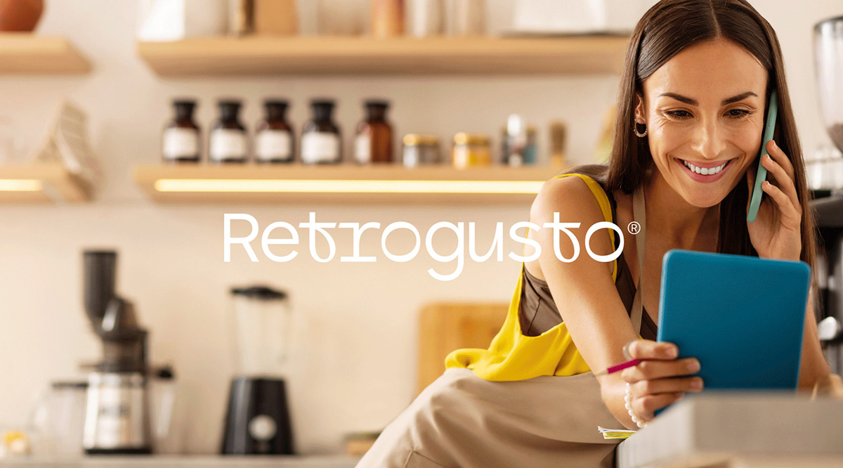
Introducing the sleek and professional new identity for Retrogusto! As a full-service business specializing in products and consultancy for the Horeca sector, Retrogusto needed a brand identity that would reflect their confidence, trustworthiness, and modern approach to their work.


The new brand identity for Retrogusto is not only visually stunning, but it also communicates the values of the company. The black and white photography showcases the passion and dedication that Retrogusto’s team puts into their work, while the circular design represents unity and inclusivity, inviting customers and clients to join the Retrogusto community.


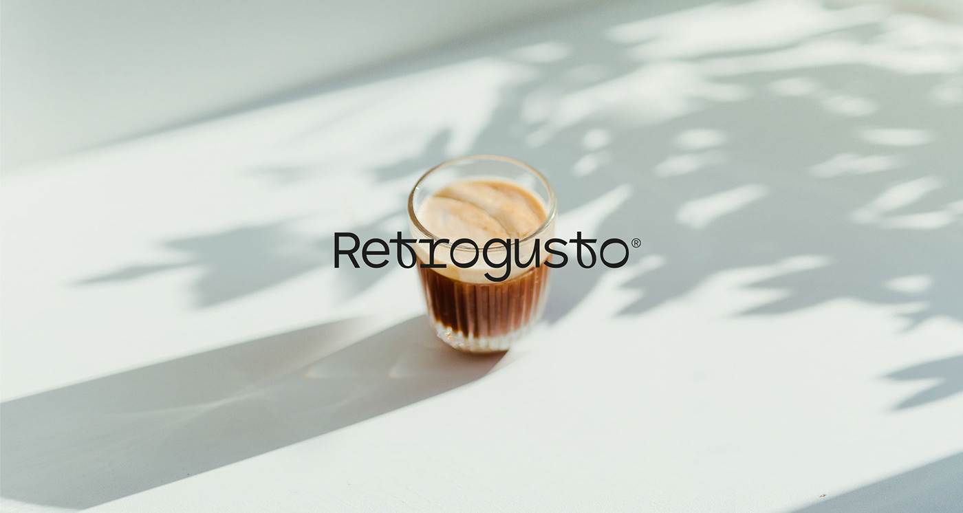
The typography used in the logo is bold and modern, making a strong visual impact that is sure to catch the eye of potential customers. The circular design also lends itself well to various marketing materials, from business cards and letterheads to social media profiles and website banners. The solid black color used throughout the brand identity is a bold and sophisticated choice, reflecting the professionalism and trustworthiness of Retrogusto. This color is used in conjunction with white and shades of grey, creating a classic, timeless look that is both modern and refined. In addition to the logo and mark, we also created a comprehensive brand identity system for Retrogusto. This system includes a carefully selected color palette, typography guidelines, and graphic elements that all work together to create a consistent and cohesive brand identity. The result is a brand that is memorable, distinctive, and instantly recognizable.


Overall, we are incredibly proud of Retrogusto’s new corporate identity. It is a testament to the hard work and dedication of the Retrogusto team, and we are confident that the new corporate identity will help the business grow further in the fields of confectionery, ice cream and foodservice.