


Color Wheel
Generate a color palette and easily bring it all into Figma
Color plays a valuable role in our daily life: it conveys feelings, changes actions, and influences every element of how humans view the world.
Intro
While we’ve worked with colors for millennia, Sir Isaac Newton presented the first color wheel in the 17th century to depict the relationship between colors. Mixing different ratios in the wheel resulted in hues that cohesively displayed all colors. Later, scientists continued to explore the wheel to find standard combinations like complementary, or monochromatic colors that could be used to depict particular emotions.
Since then, the most powerful designs have been built by paying attention to color. Want to build a product that conveys class and luxury? There are palettes for that. Change up the palette, and the end user might get a completely different impression from the product. With this color wheel picker, you can build contrasts and color combinations to find harmony for your designs.
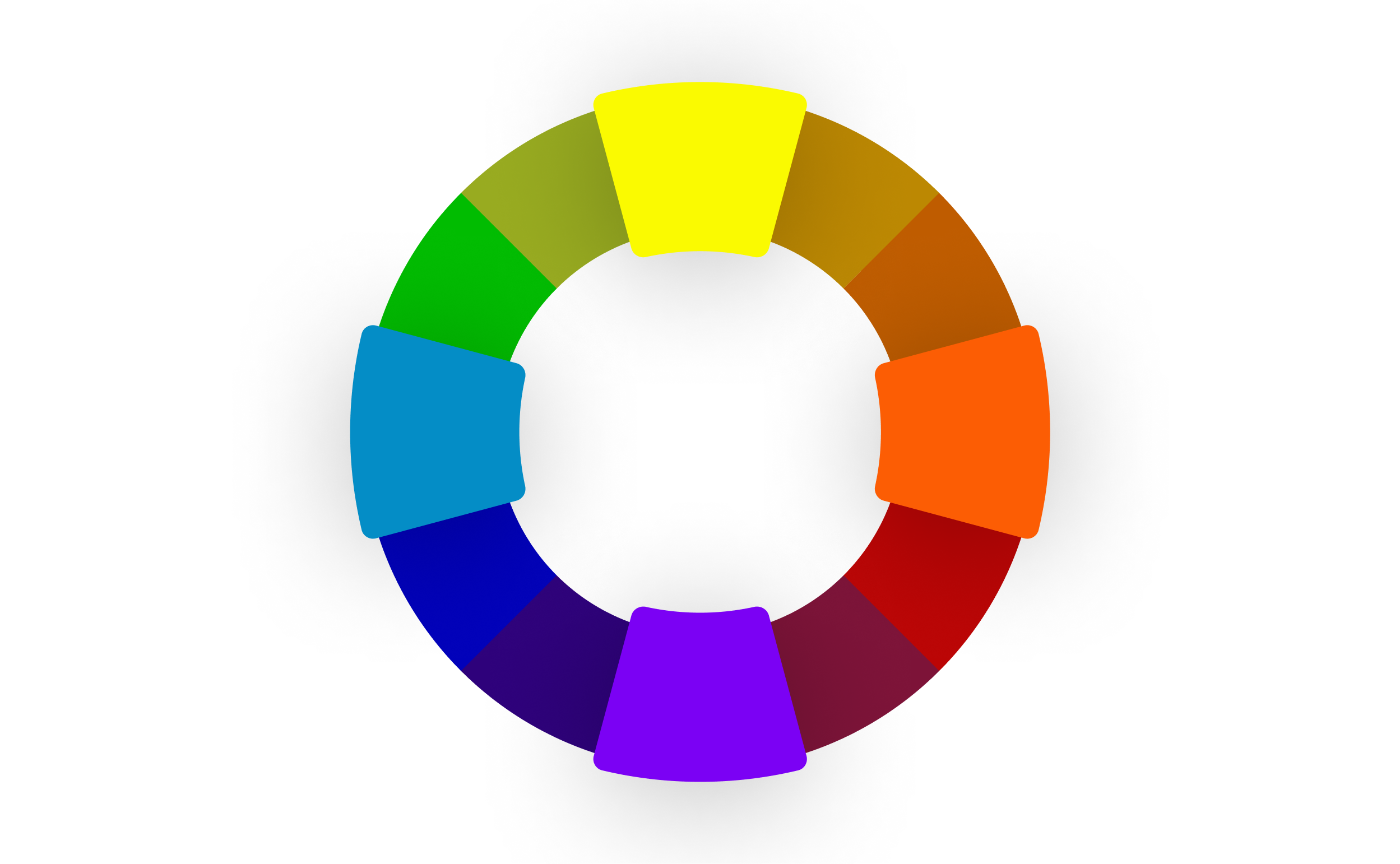
The Color Wheel
The color wheel is more than just a beautiful circular rainbow. It helps artists see the relationship between colors, in order to find a palette that best suits their UI needs. Want to build a sharp product that grabs your user’s attention? A color wheel could help you find a complementary color scheme. For something a little softer on the eyes, a monochromatic color scheme can be created. Understanding the nuances of color theory will help make your next design project stand out.

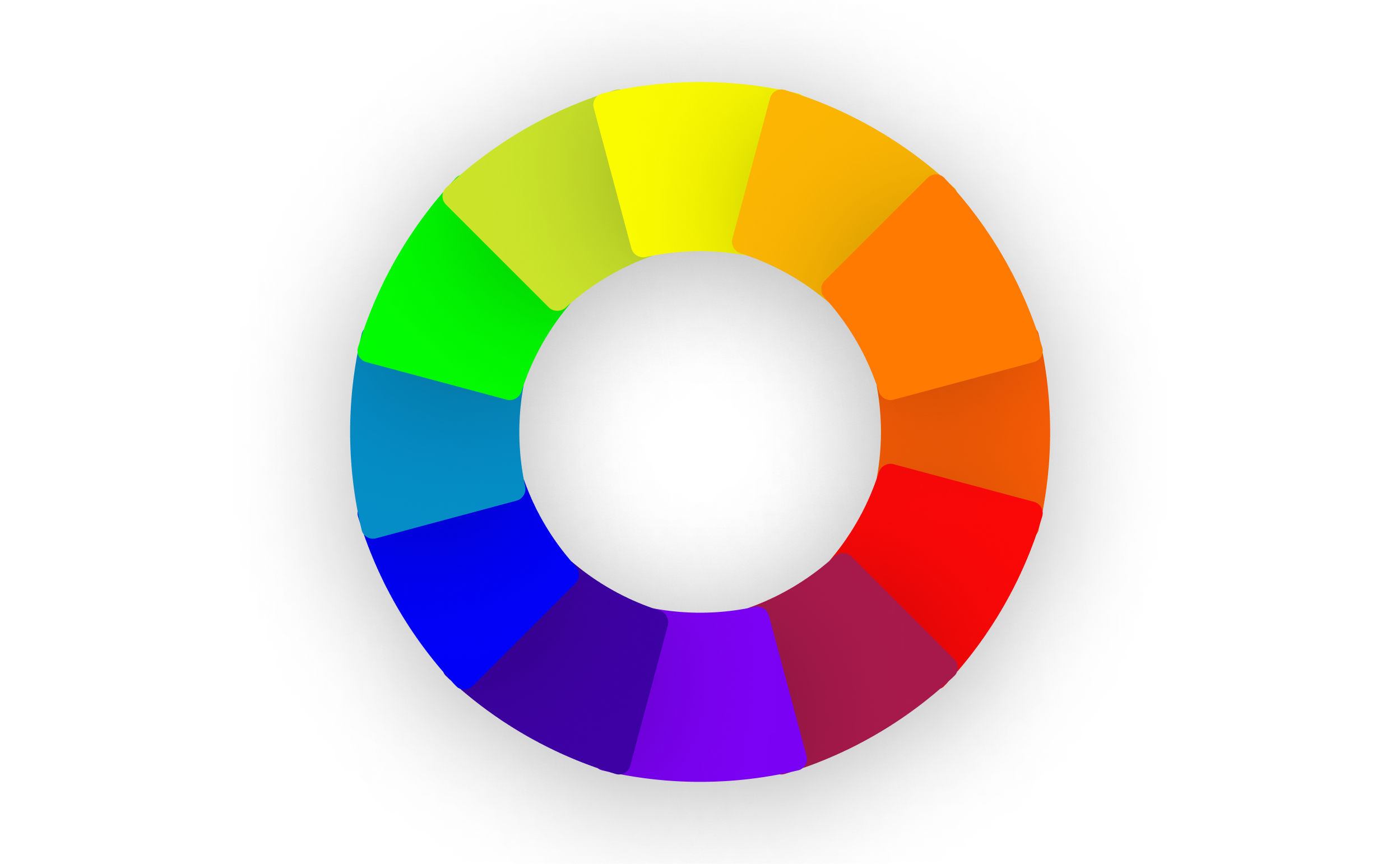
What are the primary colors (RYB)
The color wheel is firstly defined by primary colors, red, yellow and blue which sit opposite to each other on the wheel. All other colors can be obtained from mixing these three colors. These base colors are the starting point that we will build the rest of the wheel from.

What are the secondary colors
Sitting in the middle of these primary colors are the secondary colors. Purple, orange and green are the secondary colors that you get when you mix the primary colors. Want to remember how green is made? Look to the two primary colors next to it, or yellow and blue for your answer.

What are the tertiary colors
Filling in the rest of the wheel are the tertiary colors, or intermediate colors. These are the colors that you get when you mix a primary color with a secondary color. For example, mixing red and orange gives you red-orange, and fills in the missing space between the two. With a scrollable color wheel, you can adjust to the individual shade of red-orange that you want, based on your placement on the wheel. You can also mix blue-green, blue-violet, red-orange, red-violet, yellow-orange, and yellow-green to create unique tertiary colors. This granular color picking ability helps product designers find the exact shade, and accent colors for their product.

Choosing a color scheme to create color harmony
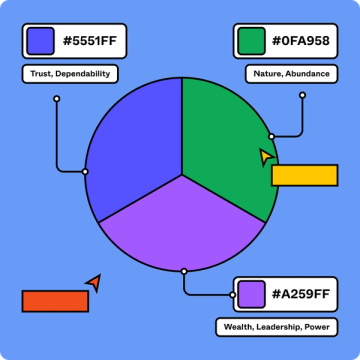
Color plays a crucial role in the way a product is accessed, perceived, remembered, and differentiated from competitors. When carefully selected with a product’s context in mind—it’s audience, industry, and intended outcomes—color is a powerful tool that can effect a user's behavior.
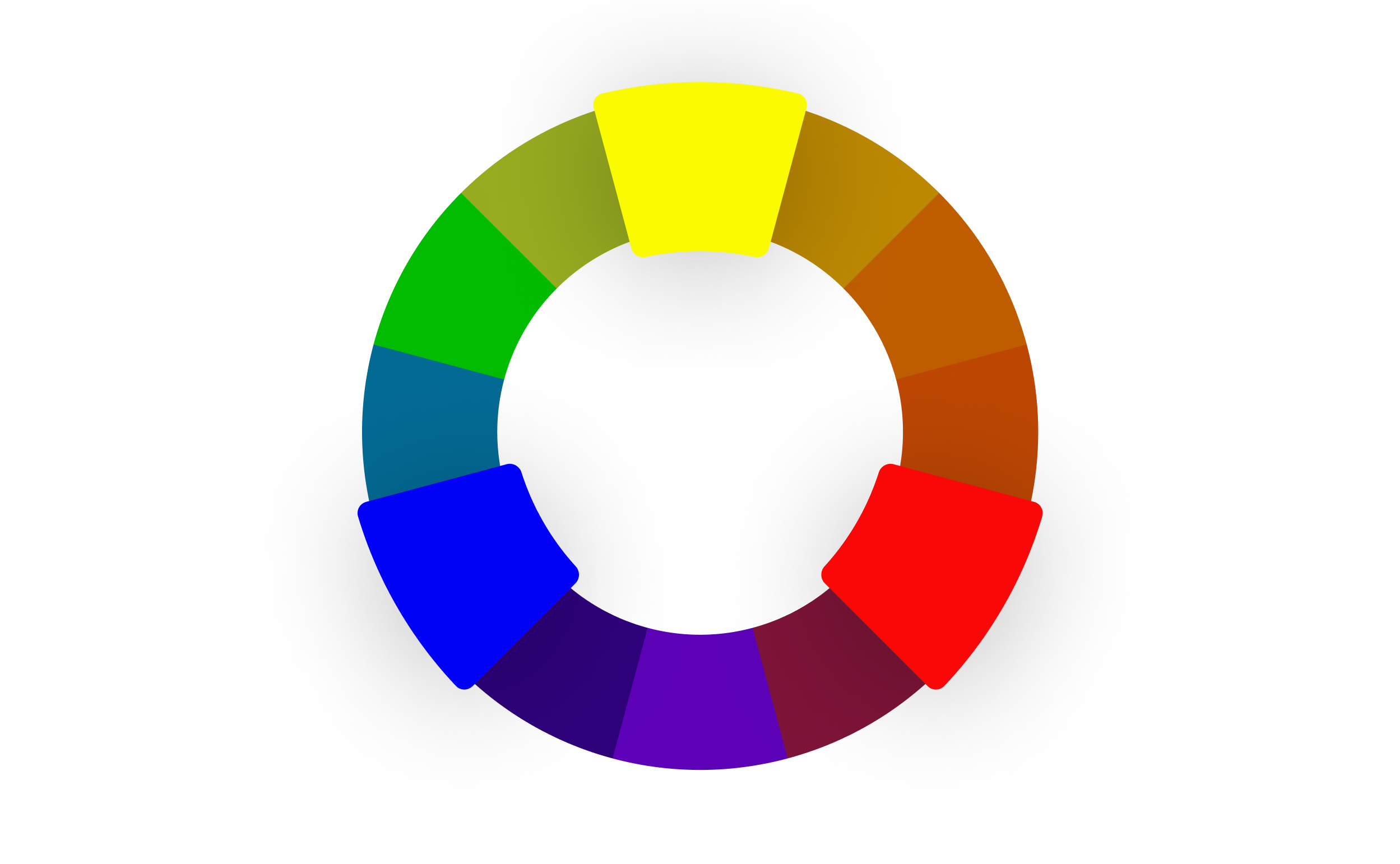
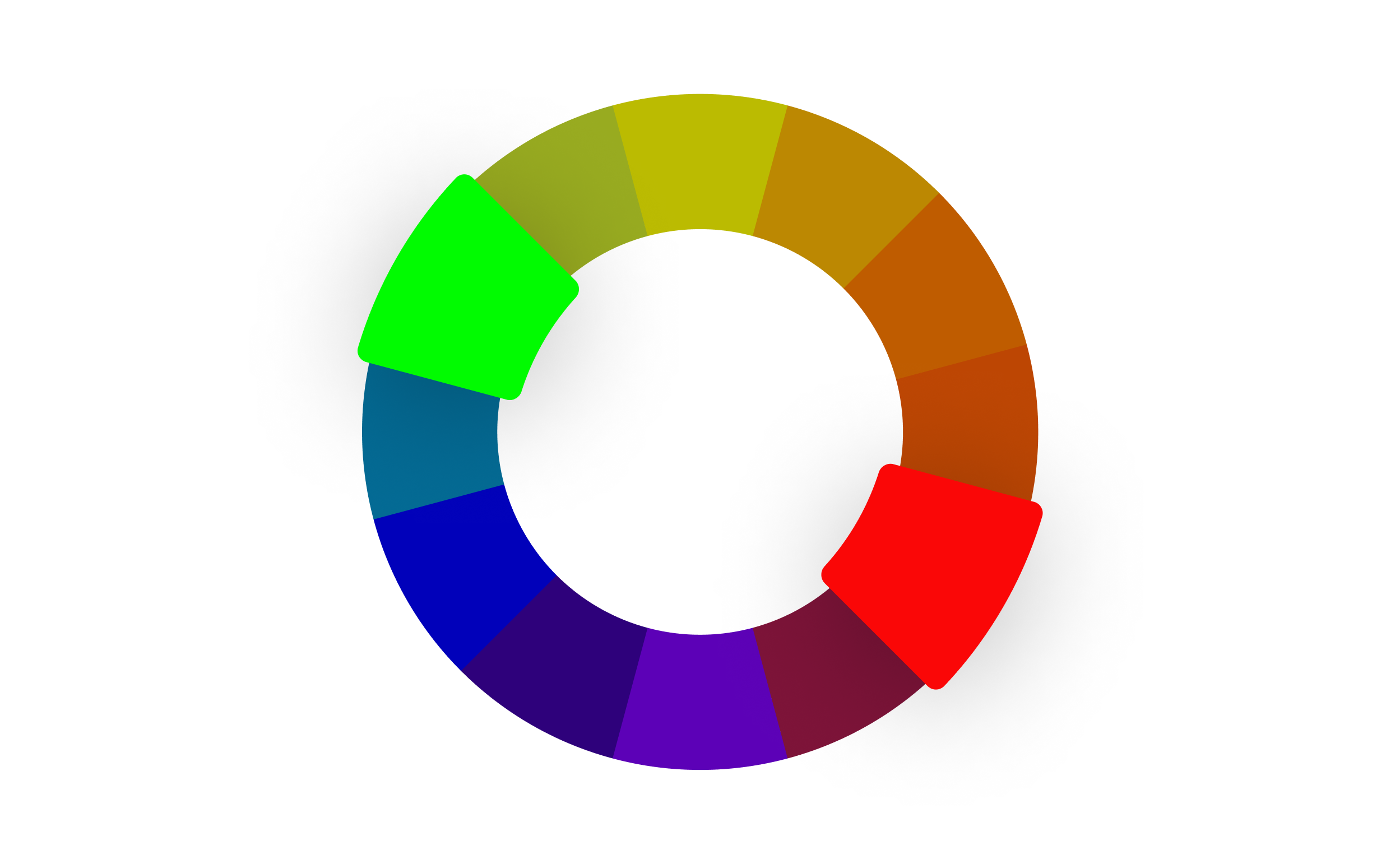
Complementary Colors
Complementary colors use colors from opposite sides of the color wheel to create a sharp contrast. If you pick a color and then travel 180° around the color wheel, you’ll find the complementary color. Some complementary color schemes are well known and popular, like red and green. These color schemes can be powerful if you want both warm and cool colors in your product.

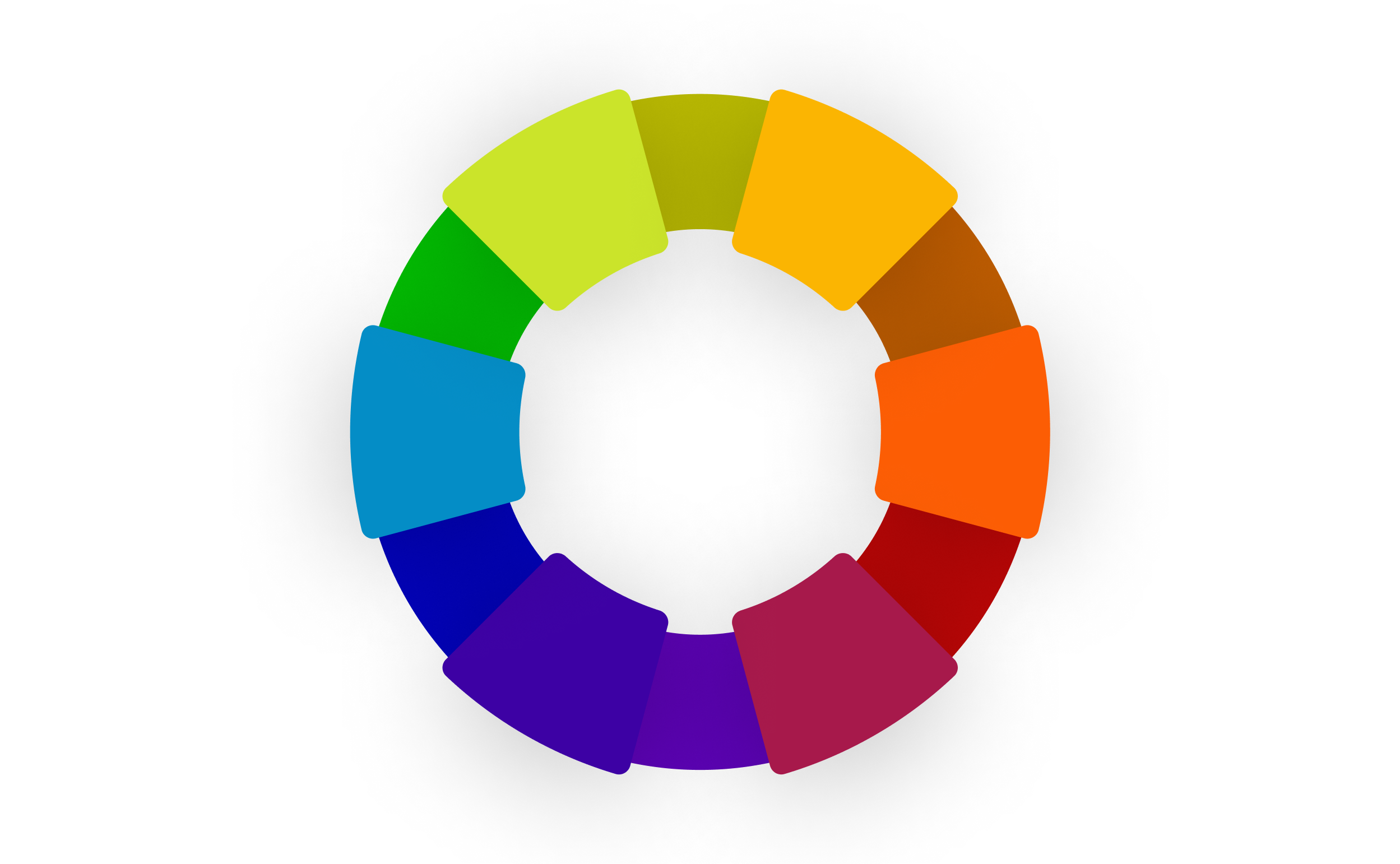
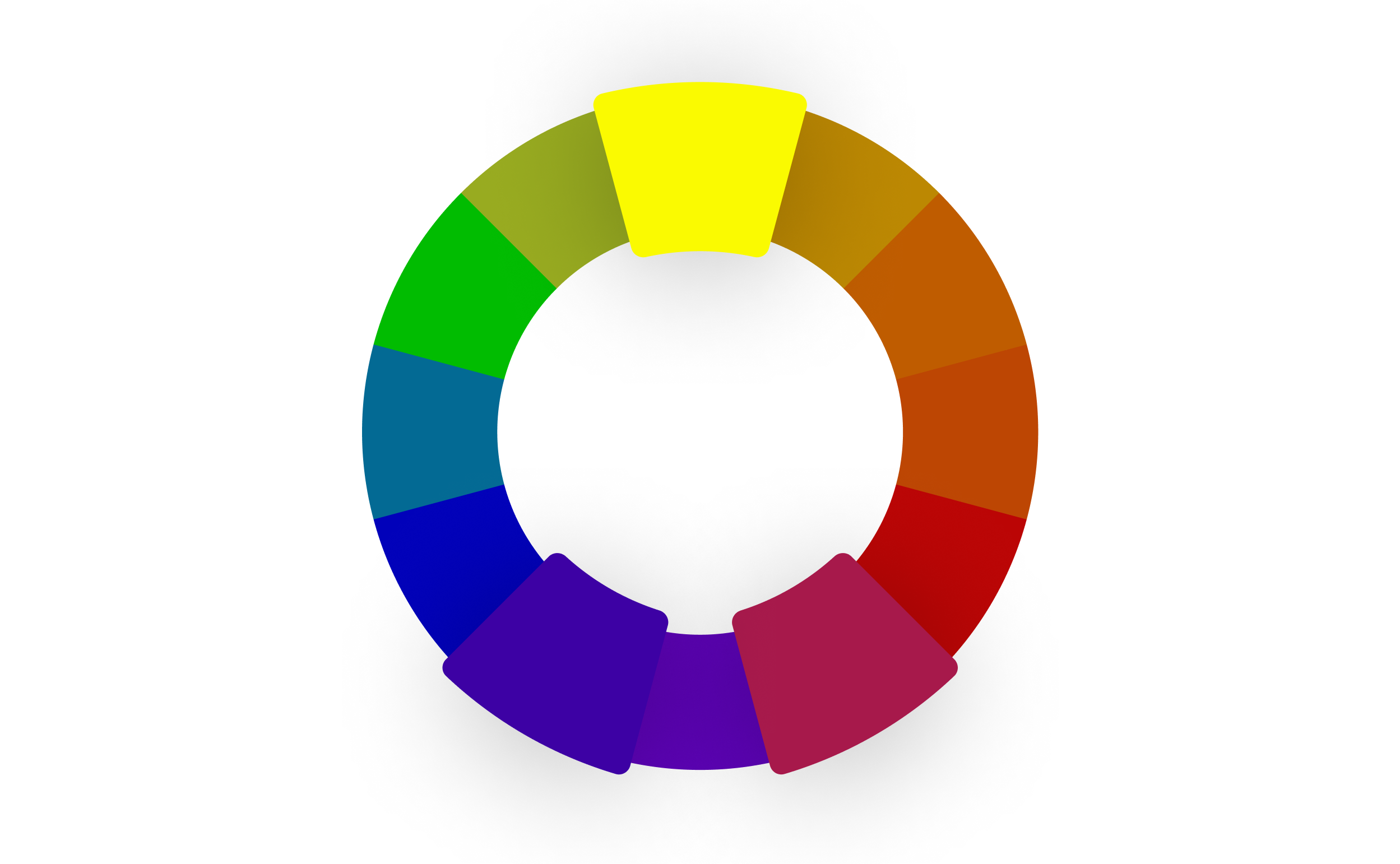
Split Complementary Colors
Split complementary colors are a variation where you combine a primary color with the two colors on either side of the complementary color. This gives you a palette of three colors and helps to create a more subtle color palette than the sharp contrast from a purely complementary color scheme.

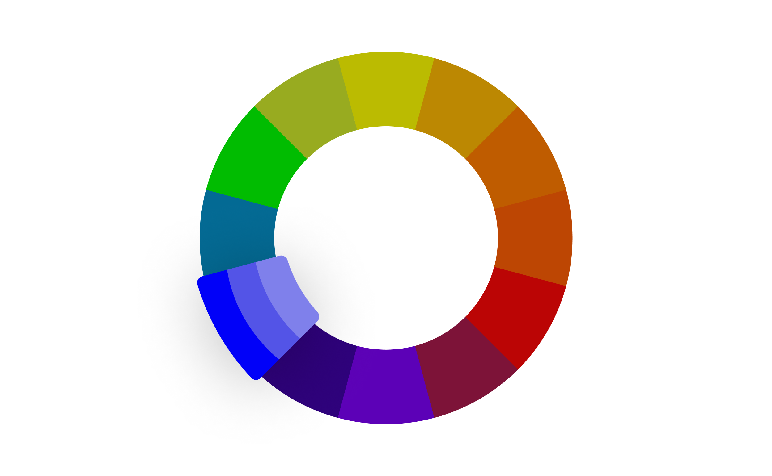
Monochromatic Colors
Monochromatic colors are probably the easiest to wrap your head around, because they’re just a lighter and darker version of your primary color. Designers often use a monochromatic color scheme to use color in a more subtle way. A monochromatic color scheme removes the decision-making complexity around how to use several contrasting colors, and generally allows designers to use color effectively in a simple way. To make a monochromatic color palette, you scale the lighter and darker versions the same amount from your primary color. In our color wheel, the monochromatic shades are 20% lighter and darker than the primary color you select.

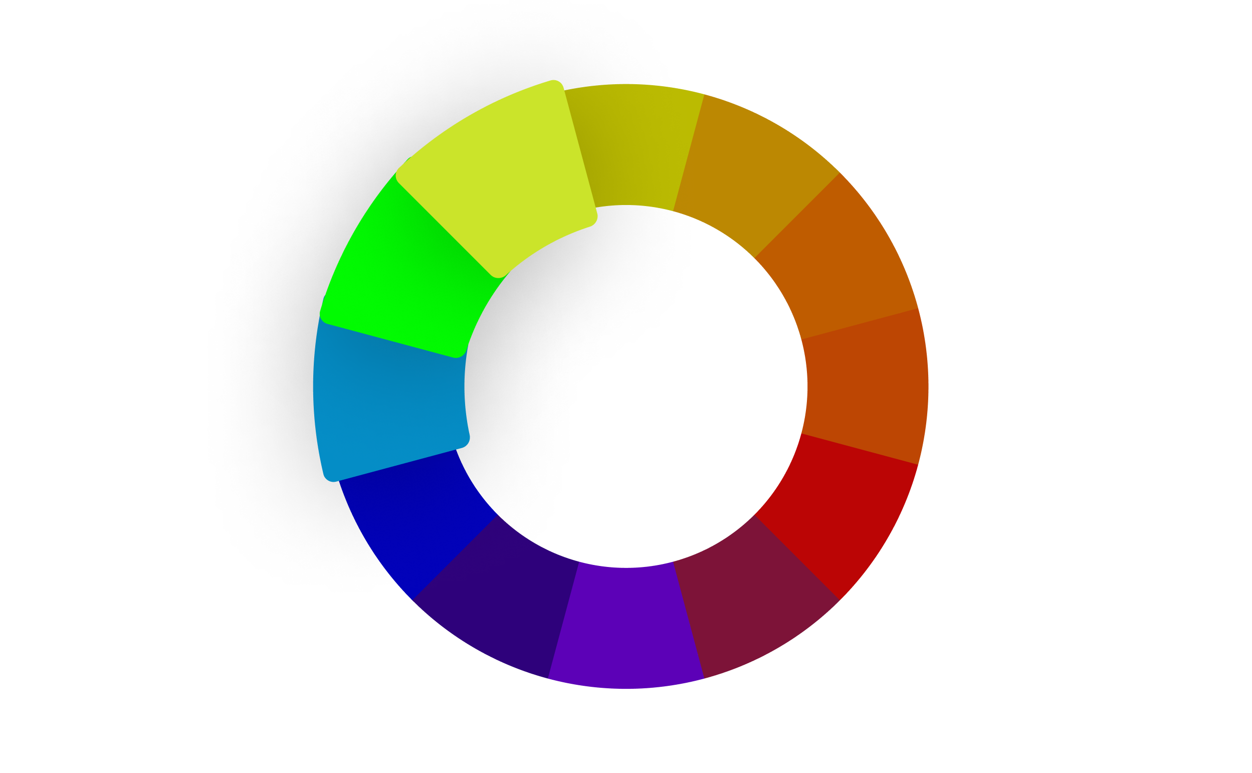
Analogous
Analogous colors are a group of three colors next to each other on a color wheel. It creates a softer, more natural color palette. Nature, after all, has lots of closely related hues. Just think about leaves on a tree, or the subtle differences in the color of the water when looking out at the ocean. An analogous color scheme is quite harmonious and can help tie different elements together in a design.

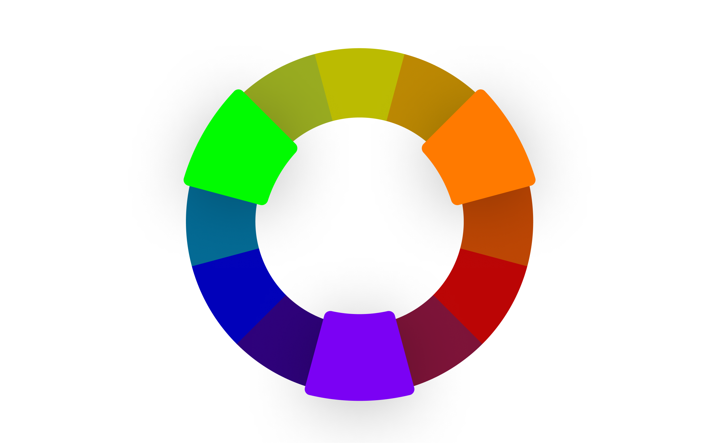
Triadic
A triadic color scheme is similar to a split complementary color scheme. While the latter gives you a striking main color and two contrasting colors on the other side of the color wheel, a triadic color scheme gives you three equally contrasting colors. The points are equally distributed around the color wheel, forming an equilateral triangle. When designing with a triadic color scheme, it’s best to pick a single primary color and use the other two as accents. Triadic color schemes tend to be more bold and playful.

Tetradic (Square)
What do Google and Microsoft have in common? They both use tetradic color palettes for their logos. Tedradic means ‘relates to a group of four’, so in this case we’re using the color wheel to select four colors. A tetradic color scheme is also known as a ‘double complementary’ scheme, because the same principle applies as with a complementary color scheme. When you play with the color wheel, you’ll notice that the four points on the color wheel form a square, with equal distances between each color.

Warm colors vs cool colors
The color wheel can also be split between warm and cool colors. Warm colors like red, orange, and yellow are known to depict feelings of intensity. On the other hand, cool colors like purple, blue, and green show feelings of relaxation. Notice how the meditation app Calm primarily uses the color blue? It’s intentionally chosen to evoke a sense of peace.
Color models
A color model is a system that helps represent colors using numerical values. The four color models used on this page are:
- Red, green and blue (RGB)
- Cyan, magenta, yellow, and key (CMYK)
- Hue, saturation and lightness (HSL)
- Hexidecimal codes
Red, green, blue (RGB)
The red, green, blue (RGB) color model is the foundation for pretty much all design that uses a screen. The roots of this color model are based in human perception of colors and the way our eyes interact with light. These ‘additive colors’ can be mixed into the array of colors that we interact with on our screens everyday.
Cyan, magenta, yellow, and key (CMYK)
On the other hand, the CMYK model is the foundation for all print design. These ‘subtractive colors’ absorb wave lengths of light, which more clearly matches the pigments found in the real world.
- Cyan (C): Cyan is a bluish-green color. When cyan ink is applied to a surface, it absorbs red light, making it appear blue-green to the human eye.
- Magenta (M): Magenta is a purplish-red color. It absorbs green light, leading to the perception of a reddish-purplish hue.
- Yellow ( Y): Yellow absorbs blue light, resulting in a yellowish color when printed.
- Key (K) or Black: The "K" in CMYK stands for "Key," which refers to the black component. Black ink is used to enhance the depth and contrast of images and text. Additionally, using black ink helps prevent the muddying of colors that can occur when attempting to create black by combining equal amounts of cyan, magenta, and yellow.
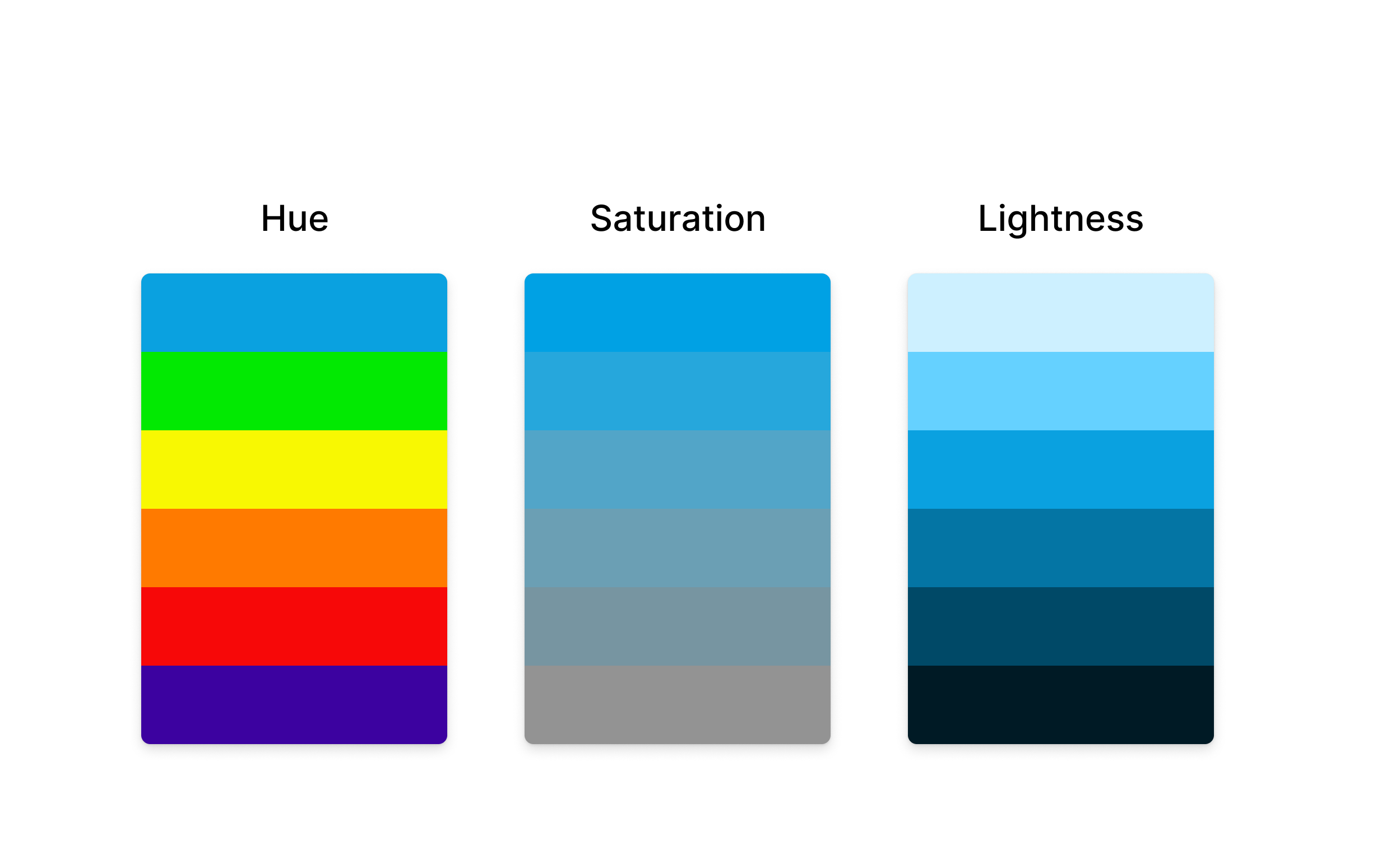
Hue, Saturation and Lightness
The color picker on this page generates colors using hue, saturation and luminance (HSL). As you move between color values, you’re manipulating these three properties.
- Color Hue: The definition of hue is kind of complex, but at its core, it refers to the colors you see on the color wheel. The color wheel is a 360 degree circle, and you can find different hues as you travel around the circle.
- Saturation: Saturation refers to the intensity or purity of a hue. At the outside of the color wheel, you can see a hue at full saturation. As you travel towards the center of the circle, the hue becomes less intense. To bring down the intensity, we mix in black and white (i.e. grey) to the hue. This makes the hue appear less prominent.
- Lightness: Lightness determines how much black or white we mix into a color. You can get pastel colors by mixing in more white, and a deeper, darker palette by mixing in more black.

Hexidecimal codes
Hexadecimal codes, or hex codes, tell your computer how much red, green, and blue to mix together to produce the color of a pixel on your screen.
Each pixel on your display is actually made up of three color elements that produce red, green and blue light. These color elements, sometimes called subpixels, are so small, they appear as a single color to the human eye.
By mixing different amounts of red, green and blue light, each pixel can display up to 16 million colors. We don’t need to display more than 16 million colors because that already covers a larger range than humans can perceive.
To generate 16 million color possibilities, each pixel can mix 256 red values, 256 green values and 256 blue values. (When you multiply 256 x 256 x 256 you get a bit more than 16 million.) Your computer tells each pixel what color to display using binary code (lots of 1s and 0s). For example, to set the red value to 200, the computer would output that value in binary as: 11001000. Binary code is not very readable to humans, so we use the hexidecimal system instead.
How does the hex code work?
A hex code needs to contain values for red, green, and blue, so it is made up of three values. Each value has two digits. So #F234A2 is actually three values:
- red: F2
- green: 34
- blue: A2
What’s the deal with the letters? While we typically count in units of 10, the hexadecimal system counts in units of 16. To represent 16 values, hexidecimal codes use numbers 0–9, and letters A–F. The letters A–F are used to represent numbers 10–15.
How to convert between hex codes and RGB
Since hex codes and HSL values are really just different ways of representing the RGB color model, you can convert between them. Converting a hex code into an RGB value isn’t something you need to do by hand very often, but there’s some quick and easy math to do it. For each of the three values:
- Take the first number (or letter) and multiply it by 16
- Add the second number (or letter)
For #E234A2, the first value is E2. It represents the number 226 ( 14 * 16 + 2 ). This number is the RGB value for the color red. And #E234A2 has the following RGB values:
- red: 226
- green: 49
- blue: 152
(You can also convert hex codes or RGB values into HSL values, but the math gets a bit more complicated!)
Color profiles in digital design: sRGB and P3
Various devices, monitors, browsers, and applications use diverse technologies for color rendering, which can result in visual disparities across them. When designing for digital platforms, it's crucial to consider color profiles, as they establish a consistent standard for defining and rendering colors based on the specific screen.
Designers oscillate between two principal color profiles: sRGB and Display P3. sRGB has been the web standard for decades. Using the sRGB standard, content creators and web designers ensure their images, videos, and graphics look consistent across the majority of consumer devices. Display P3, often abbreviated as P3, can render a spectrum of colors with heightened vibrancy, depicting 49% more distinguishable colors than sRGB. However, using P3 on devices like smartphones or laptops designed for sRGB might lead to excessive energy consumption since the device needs to work harder to render the extended color range. If you are designing for platforms like iOS or high-definition/retina screens, Display P3 is the best choice, but not all applications and software are fully optimized to handle the wider color gamut of DCI-P3.
Learn how Figma supports P3 color profiles here.
WCAG and color accessibility
In 1999, the World Wide Web Consortium (W3C) published the first version of Web Content Accessibility Guidelines (WCAG), a technical document that aims to ensure web content is accessible to all users. Recognized as the global standard for web accessibility, the W3C's recommendations hold significant sway within the web development and digital design communities. The organization publishes ongoing updates.
The current document, WCAG 2.1, expands web accessibility guidelines by addressing a wider range of disabilities, including cognitive impairments and mobile device usage to create a more inclusive web experience. WCAG 3.0 is currently in development and promises to be even more comprehensive.