The Meaning of Colors: How to Use Colors in Your Art
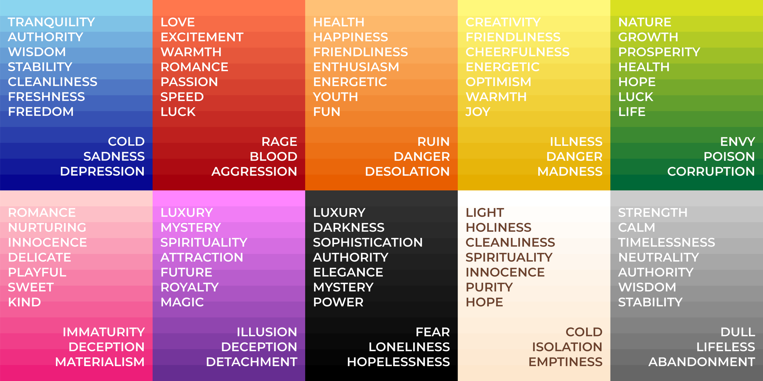
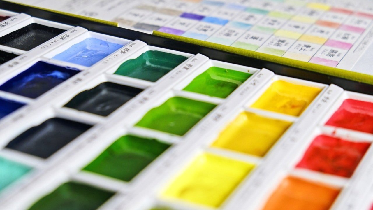
Color Meaning Chart
Have you ever been painting and thought, "Ugh, this color just isn't working for me?" I have been there many times! It can be really hard to know what color to use in your art, especially if you're new to it.
Each color has a meaning and can evoke different emotions - for example, if you're using a lot of blue in your artwork, you might be trying to create a feeling of calmness or serenity. On the other hand, if you're using a lot of red, you might be trying to create a sense of excitement or passion.
Knowing the meaning of colors can be really helpful when creating art. It can help you choose the right colors for your project, and it can also help you create a specific mood or feeling in your artwork.
In this blog post, we will discuss color psychology - the way colors make us feel. I will go over the psychology of each colour. Then, I will give you some tips on how to use colors in your own artwork!
So, without further ado, let's get started!
What is Color Psychology?
Each color has a different meaning and can evoke different emotions in people. Color psychology is a branch of color theory which studies how you can use each color to create emotion, mood, and feeling in art.
Color Psychology in history
As early as 2000BC, we started exploring the effect color has on us, and although color was used as an attempt to heal illness at first, it paved the way for what we recognise today as color psychology.
In the 20th century, Carl Jung started to study how colors affected human emotions. He hoped to be able to use colors and art to help psychotherapy patients to heal from trauma. Fast forward to today, and color psychology is a well-known field of study. Many artists, filmmakers, surface designers, and visual artists of all kinds use to create specific emotions in their artwork.
Color Psychology in Culture
Culture also has a big impact on the way that we perceive colors. Each culture has its own set of meanings for different colors.
For example, red is often associated with excitement, anger, or passion in some parts of the world. However, red is also considered to be a happy, lucky color.
Similarly, blue is often seen as a calming color, but it can also be seen as sad or depressing in some cultures.
So, when you are using colors in your artwork, it's important to take into account the cultural meaning of each color.
Color Psychology in Science

Photo by Luis Quintero
While culture has a big impact on how we perceive colors, science also has something to say about it.
Some studies have shown that specific wavelengths of light affect our emotions and moods. For example, blue light is known to have a calming effect by lowering blood pressure, while red light is known to have an exciting, sometimes stressful effect.
This is why blue streetlights are often used in areas where people might be considering committing a crime, as it can have a calming effect and dissuade them from doing anything drastic. Similarly, red emergency lights are often used in ambulances to create a sense of urgency.
Some studies even found that blue placebo pills are more effective, while pink ones taste sweet, and orange ones are described as sour even when their colour was the only difference between them.
Although we don't fully understand why color has a massive influence on us, it is a key element of our lives. And now, let's see how it can help you create even more effective artwork!
The Psychology of Colors
Now that we've covered some basics about color psychology, let's take a closer look at the meaning of each color.
MEaning of The Color Red
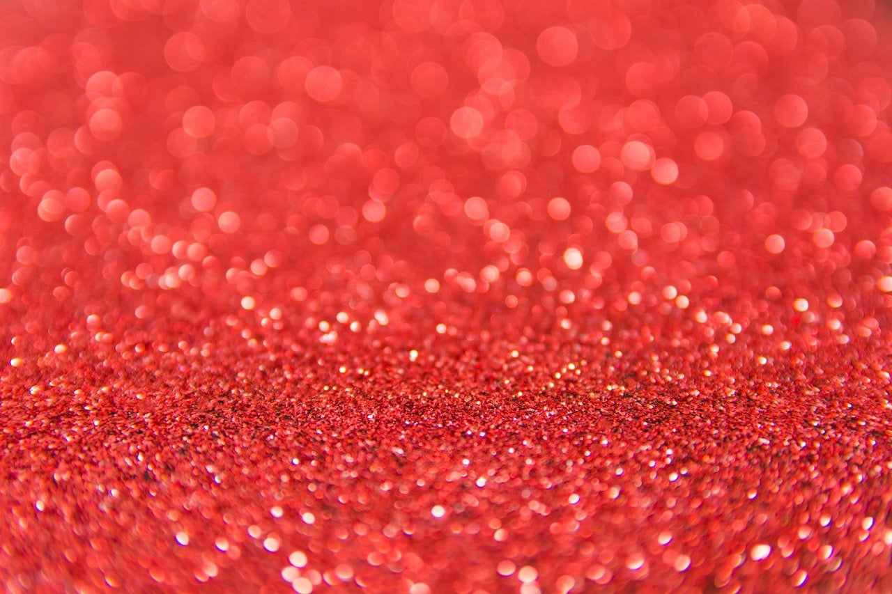
Photo by NaMaKuKi
Red is often associated with excitement, speed, blood, rage and violence. On the other hand, It is also a symbol of love, romance and passion.
In some cultures, red is considered to be a lucky color. Red is also known to increase heart rate and blood pressure, so it's often used in advertising for things like fast cars.
Red also used to be a popular wedding dress color in the middle ages because it symbolised fertility.
MEaning of The Color Blue

Photo by Nick Collins
Blue is the most popular color, and it is often seen as a calming and relaxing hue. And it is often used in logos and branding for companies that want to appear trustworthy or reliable.
Lighter shades of blue are often used to represent the sky or the ocean, so it is often associated with cleanliness, freshness and freedom.
While darker, more saturated shades are used to represent authority, stability, power and wisdom. However, it can also be used in paintings to express sadness or depression.
MEaning of The Color Green
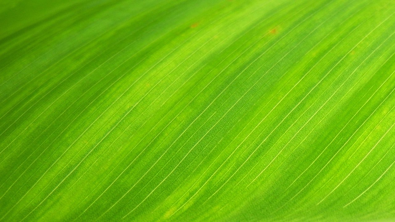
Green is often associated with nature and health, and it is also used to symbolise prosperity, hope, growth, and luck.
Green can also have some negative connotations like poison, toxicity, envy, death and corruption.
MEaning of The Color Yellow

Photo by Madison Inouye
Yellow is the color of happiness and sunshine associated with the sun and summertime, and it is often used to represent joy, optimism, and warmth.
However, yellow is also seen as a color of warning, danger, illness, disgust, and even madness.
MEaning of The Color Purple

Photo by Jonny Lew
Purple is often associated with royalty and luxury, as it was historically a very expensive color to produce. It is also the color of mystery, spirituality, and magic. Purple can also symbolise sci-fi technology and attraction.
However, purple can also have negative associations. It can represent emotional coldness, illusions and deception.
MEaning of The Color Orange
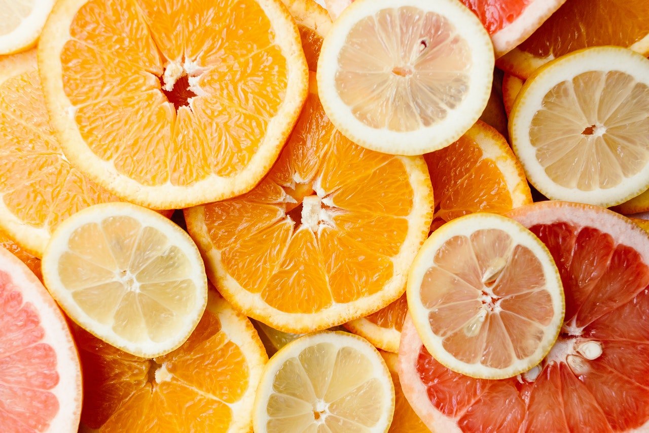
Orange is a happy, vibrant color often associated with warmth, fun, and friendliness.
Similar to yellow, orange is also considered to be a color of warning. It can be used to indicate desolation, ruin, and inhospitable environments.
In terms of emotions, orange is often seen as the color of excitement and enthusiasm. It can be used to convey happiness, joy, and youthfulness.
MEaning of The Color Pink

Photo by Madison Inouye
Pink has a wide range of meanings in art, from the delicate and sweet to the playfully innocent. It can also be used to convey a sense of romance or love. However, it can also be used to give a false impression of innocence or kindness, making it seem deceptive, mean, and materialistic.
A little fun fact about pink is that for a long time it used to be considered a manly color, especially popular for young boy's clothes, but it slowly became more and more associated with femininity since the 1940s.
MEaning of The Color White

Photo by Steve Johnson
White is often associated with purity and cleanliness, and It is often used as a symbol of innocence, goodness and a connection to the spiritual world.
In some cultures, white is seen as the color of death and mourning, while in others is seen as a symbol of life and new beginnings.
Although white is sometimes generalised to be a positive color, it can also be used to convey emptiness, coldness, barrenness, and isolation.
MEaning of The Color Black

Photo by Irfan Ahamed
Black is often associated with power and authority. It is the color of most formal wear, and it is often seen as the color of sophistication and elegance. It can be used to convey a sense of luxury, mystery and wealth.
In terms of emotions, black is often seen as a negative color, representing evil and darkness. So it can be used the create feelings of fear, loneliness, and hopelessness.
Both black and white share many of the same meanings. Both can be associated with infinity, loneliness, purity, elegance, and mourning for example.
MEaning of The Color Grey

Grey can be used to represent neutrality, calmness, dullness, and boredom. It can evoke feelings of sadness, loss, abandonment and stillness.
On the other hand, grey can also be seen as a color of timelessness, authority, stability and wisdom.
Tips for Using Colors in Your Art
Now that you know a little bit about the psychology of colors, here are a few tips on how to use them in your own artwork:
Consider the feeling that you want to evoke
When choosing colors for your artwork, always keep in mind the emotion or feeling you want to evoke. For example, if you're going to create a sense of happiness and joy, use bright and cheerful colors like yellow and orange. If you want to create a feeling of sadness or loss, use darker colors like black and grey.
You can also experiment with mixing colors to get even more specific with the mood of your artwork, For example, if you want to create a feeling of mystery and magic, mix purple and pink together, or to create a feeling of calmness and relaxation, you could mix blue and green.
Create a Color Palette
Once you have decided on the emotions you want to evoke, it's time to start creating a color palette. A good way to do this is to combine different colors and see if they match the mood you want to evoke.
To test your color palette, you can make a small color thumbnail of your illustration, that way, you can check that the colors work well together and tweak them to perfection before you fully commit to painting.
Use Contrasting Colors
Another way to create a powerful effect in your artwork is to use contrasting colors. For example, using a Complementary Split complementary Color Harmony can also be a good idea to make your primary color really stand out.
Mix Warm And Cool Colors
Mixing warm and cool colors in your artwork can have a profound impact on the overall aesthetic and emotional response of your audience. By combining warm hues, such as reds, oranges, and yellows, with cool shades like blues, greens, and purples, you can create a visually captivating color palette that enhances your artwork in several ways.
Adding Depth: Incorporating warm and cool colors into your artwork adds depth and dimension to your compositions. Warm colors tend to appear closer and more vibrant, while cool colors recede into the background, creating a sense of depth and spatial awareness. By skillfully blending these contrasting tones, you can give your artwork a three-dimensional quality that engages the viewer and draws them into the piece.
Increasing Dynamism: The interplay between warm and cool colors can inject energy and dynamism into your artwork. Warm hues exude a sense of vibrancy, excitement, and passion, while cool tones evoke calmness, serenity, and tranquillity. By juxtaposing these contrasting elements, you can create a visual tension that adds movement and liveliness to your art, making it more engaging and captivating.
Attracting Attention: Art that incorporates a mix of warm and cool colors tends to attract attention and stand out. The human eye is naturally drawn to color contrast, compelling viewers to take a closer look and explore the intricate relationship between the colors in your composition.
If you're interested in exploring the world of warm and cool colors in art, I've got a great resource for you. I recently wrote a blog post on How to Effectively Use Warm and Cool Colors in Art that breaks down all the key principles you need to know to make the most of these color techniques in your own work.
Experiment and Have Fun!
The best way to learn about colors is to experiment and have fun with them. Play around with different color combinations and see what emotions they evoke. See which colors work well together and which ones clash. The possibilities are endless, so have fun and let your creativity run wild!
Make Your Own Rules
If you are working on an art project that follows a story, you can assign a color to specific characters or even feelings you want to portray.
Filmmakers use this technique often and create their own color meanings, because you are following a story, using color strategically to help the audience associate a specific hue with a concept or character from the movie works even if the color is not used as it would be traditionally. Although this technique works better for longer projects with a narrative like graphic novels, for example, but a smaller series of illustrations could work as well.
Conclusion
Now that you know about the meaning of each color, you can use them to infuse depth and feeling in your artwork! Be aware of the emotions that each color evokes, and experiment with different color combinations to see what works best for you.
If you are interested in reading more about how you can use color in your artwork and how to create beautiful color palettes, check out this blog post about color theory which covers everything you need to know to get started.
Happy creating!
FAQ
Q: What if I want to use a color that doesn't have an obvious meaning?
A: You can always create your own meaning for a color! If you want to use a color that doesn't have an obvious meaning, come up with your own definition and use it in your artwork. As long as you are consistent with your definition, your meaning will be clear to anyone who sees your work.
Q: Can I use color to create a specific feeling in my artwork even if the emotion doesn't traditionally go with that color?
A: Yes! You can use color to create a feeling in your artwork even if the emotion doesn't traditionally go with that color. It is a bit tricky, but choosing a color that wouldn't normally be associated with a specific mood can create some very impactful results. A good tip for doing this is to make sure there are many other visual elements in your artwork that describe the mood you are looking for. This will help to ensure that the feeling you are trying to create is not lost on your audience.
Q: What if I'm not following a story? Can I still use color to create meaning in my artwork?
A: Yes! You can use color to create meaning in your artwork even if you are not following a story. However, it is important to be consistent with your definition of colors if you want your artwork to be meaningful to anyone who sees it, so it might be a good idea to use a color known to represent the specific mood you are trying to achieve.
Q: I'm not very comfortable with picking colors yet. Can I still use color effectively in my artwork?
A: Yes! You can still use color effectively in your artwork, even if you are new to color psychology. When I first started to learn about the meaning of color, I always kept a color meaning chart at hand. I also created mood boards with photos, art and movie screenshots. As long as you keep these resources at hand, they can help you choose colors that will help to communicate your ideas to your audience.