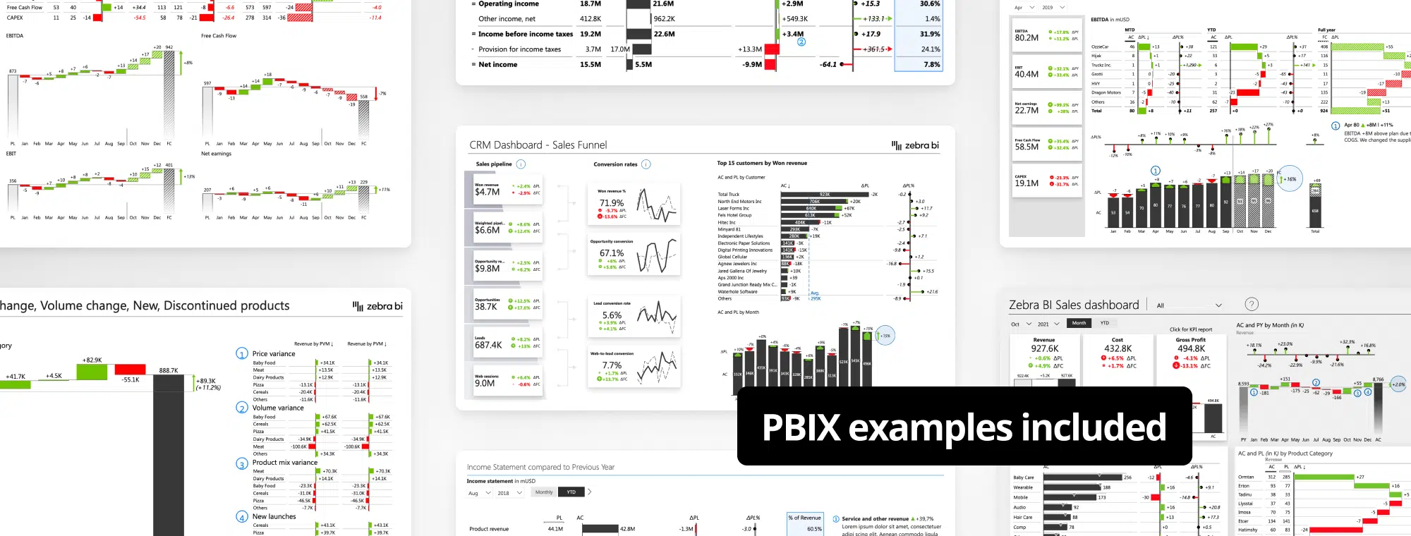
Watch video recording & Get follow-along PBIX example
If you'd like to try all of this yourself, enter your data below to get immediate access to the PBIX example used in the this tutorial and the full 1-hour video recording of the webinar.
 September 8th
 February 22nd
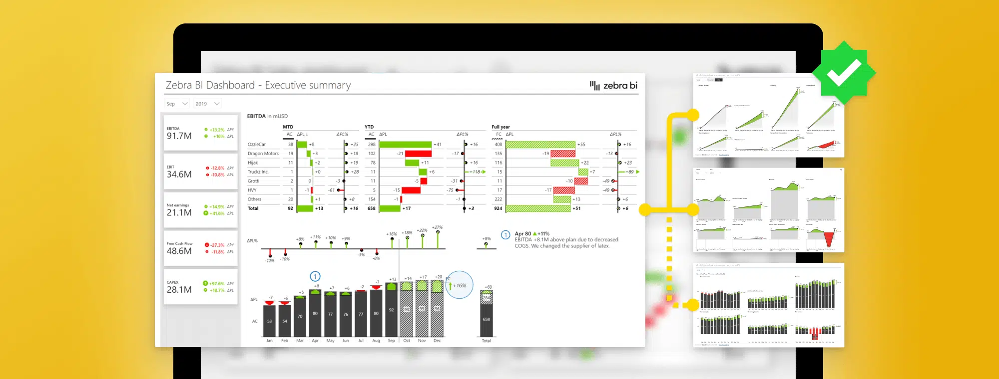
Imagine having a business meeting where you are given puzzles instead of information. To get to the KPI dashboard to round up your performance, you need to piece the puzzle together. Sounds funny, right? Well, in reality, meetings or preparing a report often consist of pure efforts to obtain and interpret the right data.
In this tutorial, we will look at how to structure actionable dashboards and especially focus on the landing page. We will tell you what to put on the landing page, where to put it, and what tools in Power BI should you use to make those landing pages really actionable and understandable.
Furthermore, just having the data communicating nicely doesn’t necessarily prompt the change you need to improve your business. But what if the clear picture, that also inspires action, is right in front of you the whole time?
The clear and inspiring picture mentioned earlier is what Actionable Reporting is about. It’s not just a fancy phrase, as it centers every decision on data. Moreover, it’s not just about translating data into information but turning data into insights that call for action.
Don’t allow your reports to just describe and summarize the metrics. What is going on, why is it happening, where you may encounter problems, and what are the next steps are the questions your actionable report should cover. The data then becomes a smarter decisions driver, rather than a static element.
Using Actionable Reporting, you won’t just improve the reporting process. Your goal is to ensure minimum action distance. Time spent between obtaining the right piece of information to actually making a decision should be as quick as possible.
Being able to understand and act upon reports rapidly, isn’t just a time and money saver, but an inspiring positive organizational change. For a fresh start, let’s see how to create an actionable KPI dashboard.
One of the things we see most often when it comes to report pages is that people do not make them actionable. They tend to focus on key performance indicators, like total amounts, gross profit margins, cost of goods sold, quantities, and others.
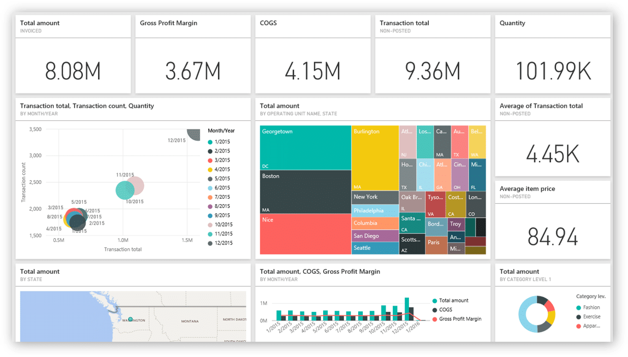
However, just having this information available does not make it actionable. Is the 8 million dollars in sales good or bad? How are you performing against the plan and your previous year? Where do you really need to focus your attention?
In short, this means that this dashboard is not actionable despite showing the most important information. Since there are no comparisons it is impossible to discern any trends or movements. The company with these numbers could be doing extremely well or be on the brink of becoming a failure. The numbers simply tell no story. Learn about the most common mistakes people make when creating dashboards.
Let’s take a look at something a little different.
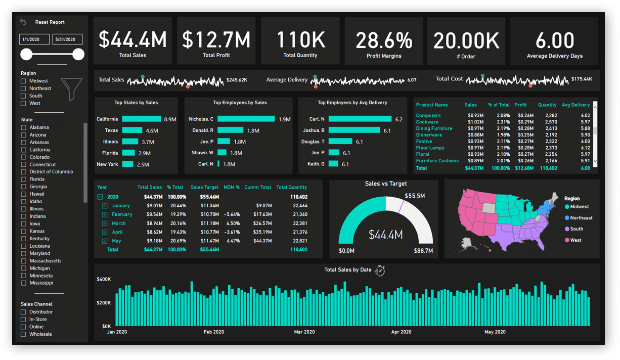
This dashboard is much more detailed. It has Big Annoying Numbers (trademark pending) at the top so we can see a pattern emerging. It has some interesting charts, like top states, top five employees, and other short charts displaying the top five elements. This is something we recommend you use.
On the right side of this dashboard, there are many filters, which means that I have to click each of them to see what’s going on. However, a dashboard should direct my attention to what matters before I click it.
Our next stop is a dashboard with the ever-popular speedometers.
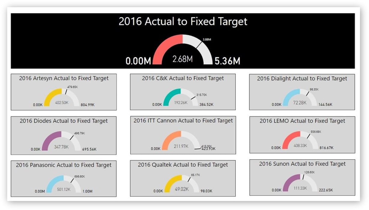
Individual charts are showing gaps but they’re not scaled. If you look at the two yellow charts, the one showing a larger gap is actually working with much lower totals, so it is probably less important than the other one.
Each chart is a different color and it’s impossible to see what individual colors mean if anything.
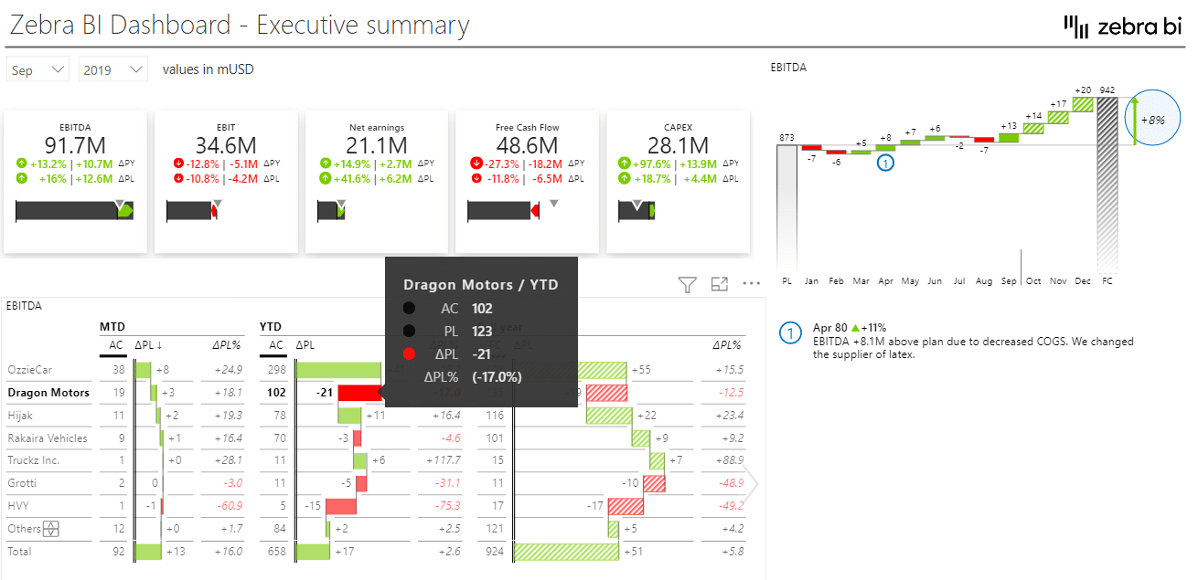
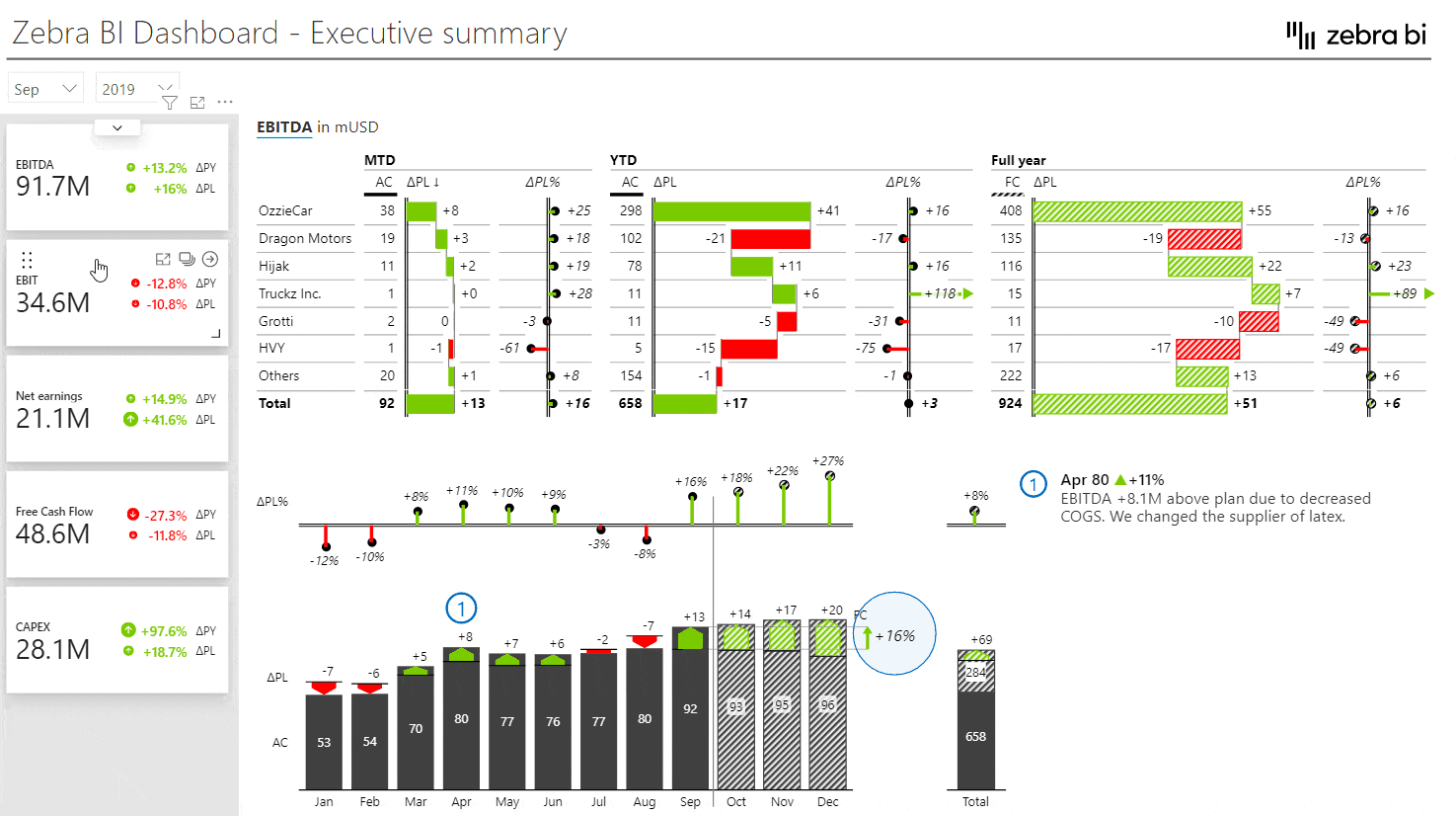
It is possible to do better. Here is an example of an executive dashboard that is actionable.
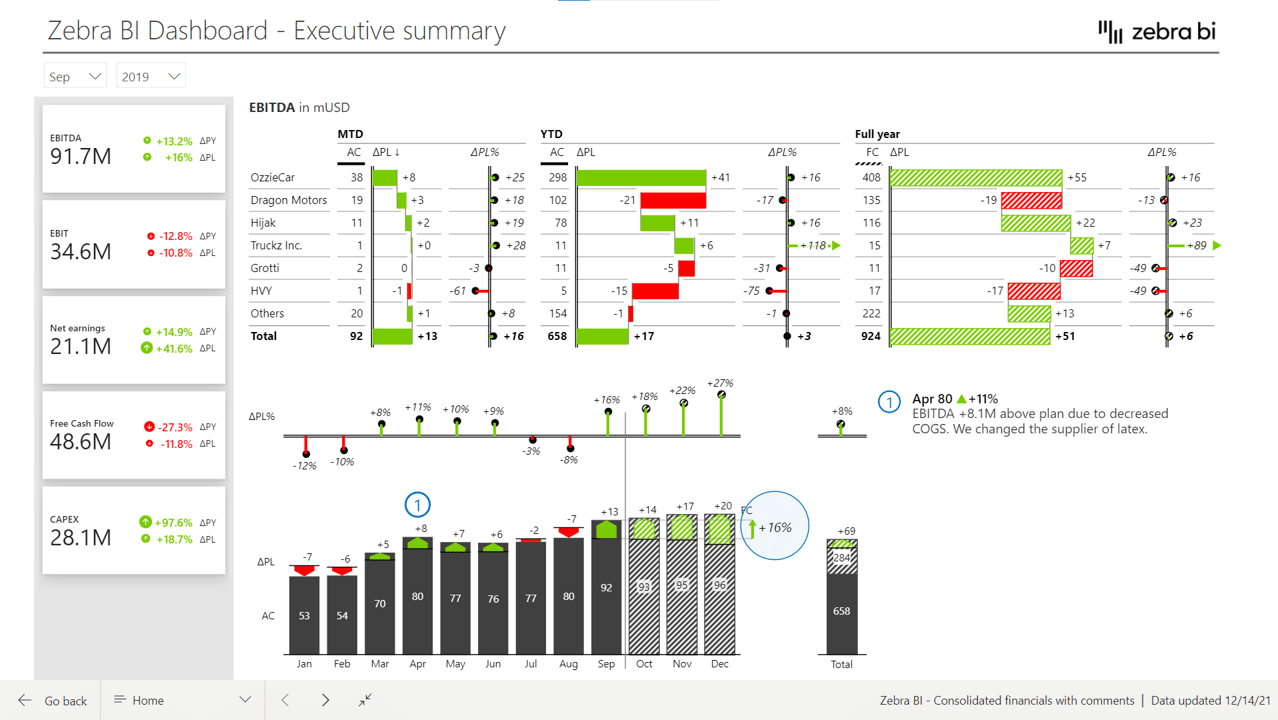
This dashboard has a KPI area showing key information about EBITDA in EBIT, net earnings, free cash flow, and CAPEX. You can click individual KPIs to filter the page and show information to date as well as forecasts and plans.
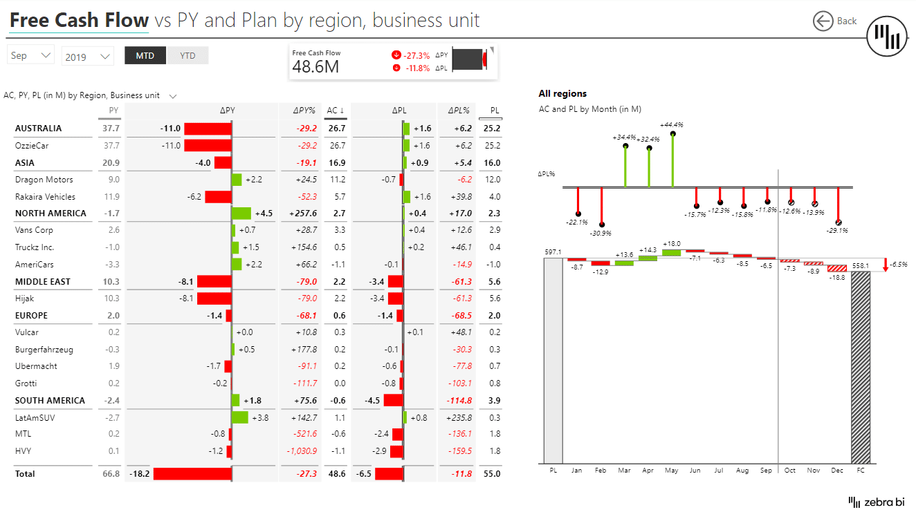
Or you could click on the free cash flow KPI that’s red and probably needs your attention. A click applies a new filter to show details about the problem area.
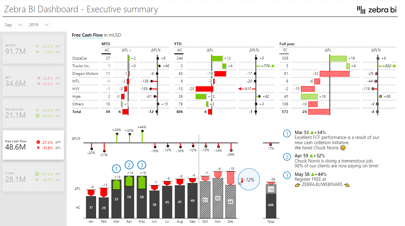
You can also drill through individual charts to locate the actual issue for poor results.
This makes it much easier to get the information you need to take action.
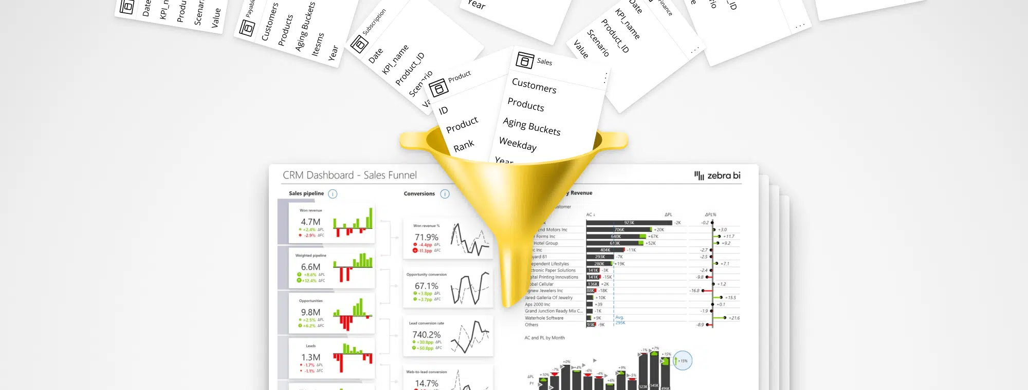
Before you can visualize your KPIs in one place, your KPIs should be consolidated. Learn how to consolidate your KPIs using 3 hyper-effective ways.
When designing a dashboard, start with a really good landing page. This is the first page your users will see. When designing it, keep your audience in mind and personalize it for them. A sales manager will need a sales overview with all the KPIs that he's responsible for. It could be revenue or conversion rates.
How do you come up with the right KPIs? The best way is to talk to the users and then think about what contributes to these KPIs. Then you might focus on a breakdown by business units, by account managers or something else.
You really should make the landing page a priority. A good landing page drives adoption and user engagement. If you do a good job with the landing page, then people will keep coming back to their dashboards.
Once you have the landing page, you need to make sure that people will be able to navigate from the landing page to detailed reports. If possible, have it available just a click away. Do not make users click a series of filters or slicers on the landing page. That’s not what it’s there for. The landing page should provide key information and links to other reports.
Make navigation available through the content. When a user wants to investigate a certain data point, the most natural thing is to click on the element. This is where you should use the drillthrough option in Power BI.
With drillthrough you can easily move the user from the landing page to a report that is automatically filtered based on the choice the user just made. From there, they can navigate through multiple pages and then return back to the landing page.
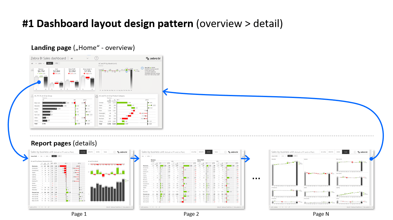
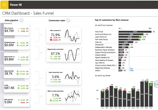
Let’s look at an example of a sales dashboard.
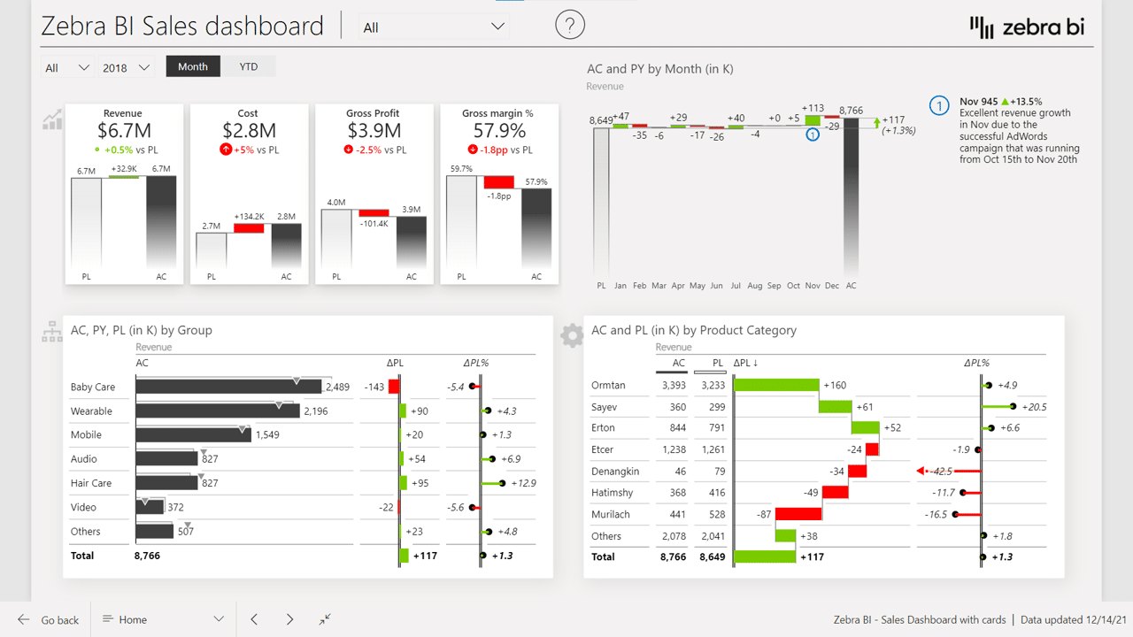
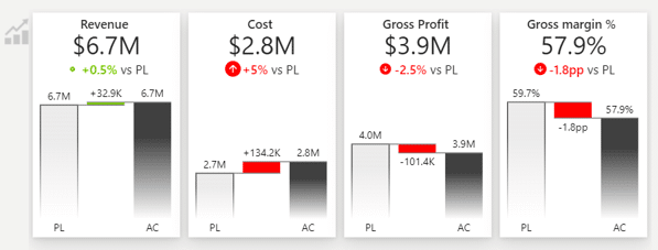
First of all, it has a KPI area that shows revenues, costs, gross profits, and margins. Instead of just Big Annoying Numbers, each KPI also shows performance versus the previous year and plan. You should put this area on the top left. Why? Because we normally read from left to right and from top down.
This is the KPI area close up:
Now, when the sales manager looks at the KPI dashboard and sees that costs are 5% over budget, they want to see why. So you should set up filtering correctly so when they click on the number, the entire dashboard changes to show just the data for that KPI.
Power BI is great for filtering, you just need to set it up correctly. It allows the user to review information with a minimum number of clicks.
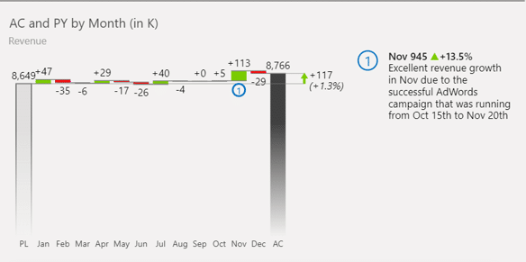
You could also use page tooltips to provide more information without clicking. Regular tooltips just repeat the values, while page tooltips can display additional insights. What really works well is a vertical waterfall chart in a tooltip.
The next idea is to use the drillthrough option, which takes you through to a detailed report on the KPI you are analyzing.
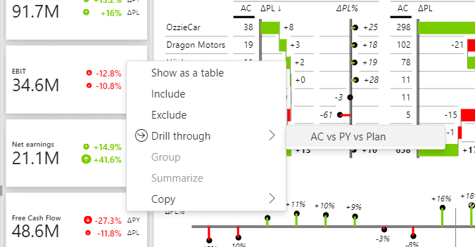
With drillthrough you can guide your user into increasingly more detail, so they can understand individual factors and trends that are shaping the KPI. However, make sure you always provide a way for them to get back to the landing page. This makes for a really user-friendly experience.
Comments are chronically missing from typical dashboards. You could use dynamic comments that are linked to KPIs and specific time periods or business units. Short comments like that provide really useful information to the reader.
The charts located around the KPI area should provide context. In addition to revenue compared with the plan, you could also include the performance of individual product categories and product groups.
Make sure you keep it short. Just show those values that contribute significantly to the final result. You can use the Top N feature to just show the top 5 products, while the others are placed under the Other category.
Also, make sure you provide a help overlay to onboard your end-users. Let them know what your report is about and how they can read it.
To recap, here is the landing page checklist:
Let’s kick off with an executive KPI dashboard.
Financial folks executives typically want to see month to date and year to date performance and the full-year performance on the same page and on the same visual so they can compare it.
This is done with the Zebra BI Tables visual and you can always take a more data-focused approach. Our advice, however, is to try to at least visualize the absolute variances in a table, because this is what really guides the reader’s attention.
We wanted to be creative with this one.
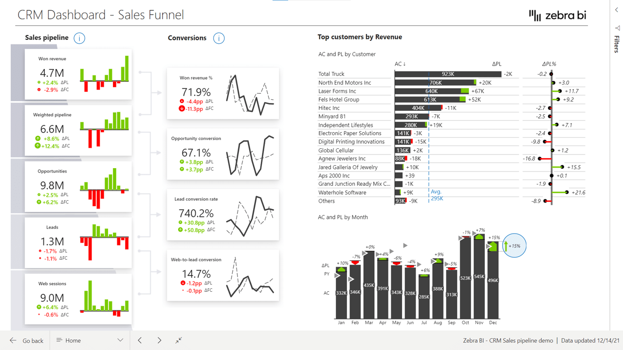
It shows the revenue, the weighted pipeline, opportunities, leads, and web sessions. We also included plans and comparisons even though it’s not a financial report. You can still set your goals and benchmarks and include them in your visual.
We also included conversion rates and put them side by side with the pipeline.
Like the other charts we’ve covered, this one also allows you to filter by clicking on the content or drillthrough to more detailed reports.
Find out more about the best tips and methods for designing your KPI dashboards.
The KPI area in this example was created using the Zebra BI Cards visual. This visual was created in response to our users’ requests. Visualizing KPIs in Power BI is quite a challenge. Usually, you don't have a lot of good options to visualize the performance of your KPIs.
This is our answer. Find out more.
Zebra BI Live Demo
Outstanding article. Most articles on the internet talk about things only at a concept level. This is something that can be used immediately. Too good. Keep up the good work.
Thank you Bhushan for your feedback. 🙂 If you are not already using our visuals you can try it out for 30 days for free or if you do, we would appreciate if you will give us your review on AppSource. Thank you. 🙂
Big Annoying Numbers (trademark pending)